A Real American Book! 2022 in Review

For more than a decade, I’ve counted my book-writing year to run from February to January, because of school break. And it’s late February, so it’s time to update you on what I’ve done all year.

I’ll start by noting that 2021 wasn’t great for writing, and my last year in review in fact arrived here two months late. You may have noted in the photo of me at the header of that blog post, I wasn’t even working on my book. Symbolism!

That sort of means that the “2022” book year was actually only 10 months.

Anyway, last year I noted that I needed to take a break from teaching, that there wasn’t enough time to do that and my other projects and also to write. I still was teaching in the spring when I stated that, so you might think the big time off would start as soon as that spring semester ended. But school is involved enough that it takes several weeks to unwind even in a normal year. The last day of classes isn’t the end of it, nor is filing final grades a few weeks later. I spent some of the summer and the fall managing syllabi and course assets for the people who were taking over courses that I had taught for many years. And there’s a big field trip the Animation department takes each September, and I did a bunch of work on that. I’ve long been involved with that project. Unfortunately, in the pandemic there were fewer people at school to help organize that trip, so yes, even though I wasn’t teaching, I was around a bit. This amounted to just about no writing in summer or fall.

That’s embarrassing. To step back from this job at the end of May and still not open up the ol’ laptop through December, basically. But there was a lot of the other normal stuff going on. And it was, somehow, a great year for writing. Here’s the breakdown:

HUB COMICS

Some days I’m at my shop, and every day I do something for it at home sitting at my computer. Plus we had four in-person events, each of which takes time to promote, set up, and run. If you’re curious, that’s Free Comic Book Day, a signing, a reading, and a party for a convention. I also took some initial steps to replace our computer and POS software, which meant research and Zoom meetings, to be continued in 2023.

And while the renovation of the shop is done, there was some construction-type work that took place behind Hub Comics that required attention. That’s done, and all good.

SHORT FILMS – HUB COMICS

Every Tuesday or so, I direct, write (or co-write), star (or co-star) in, edit, render, and post (or co-post — so many social media outlets) a one-minute video. I find that calling them “short films” is much more impressive than “60-second ads.” Here’s one with Darth Vader:

I realized after going overboard on costumes and make-up that I was definitely spending too much time on them, time better spent writing my damn book, so most of them are just me and an employee telling you about a few graphic novels. Here’s one that’s straightforward, and the right kind of silly:

These are a lot of fun to do, but I’m not sure they translate into many additional books sold, which may suggest slowing down the output or taking a few months off.

VIDEO ESSAYS – ATOMIC ABE

My creative partners in New York and a few freelance editors are more involved in the day-to-day, but I’m Executive Producer, so I get to make comments on all rough cuts. The black and white logotype below is is just a jpeg.

Rather than distract you with a live link to our winning combination of smart/funny, I’ll just state here in not-hyperlinked wording that we make video essays about film and television. I mean, you’re here for G.I. Joe, right? These are definitely not about G.I. Joe. Okay, okay, I’ll put some links in the first comment below, but if you’re wasting time on my G.I. Joe blog, shouldn’t you look at the Ice Viper painting or something? But the team researched, wrote, edited, and posted over a dozen videos, and our YouTube channel got 2.2 million views in actual-calendar year 2022. Plus two short films from earlier finished out their film festival runs and won some awards, although we’re focused on social media rather than festivals.

PODCASTING – TALKING JOE

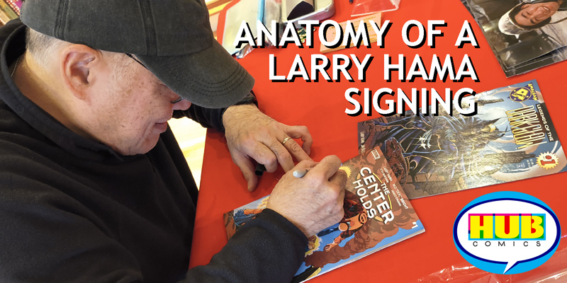
Along with host and social media beast “No Last Name” Mark, I participated in I-believe-it’s 41 episodes of the Talking Joe podcast. (Again, this is mid-April to now.) That’s about 3720 minutes of talking about G.I. Joe. Most episodes were audio-centric (but still listenable on YouTube) reviews of new IDW issues of Real American Hero or 2004-ish Devil’s Due arcs. But a bunch were interviews that “Jingle Machine” Mark set up with a killer variety of Joe alums, past and present. Highlights include (these are all YouTube links, audio-only ones are available if you’re willing to scroll) Marvel EIC Jim Shooter, writer Larry Hama, toy designer Ron Rudat, writer/artist Tim Seeley, Hasbro VP Michael Kelly, cover artist Freddie Williams II, cover artist Jamie Sullivan, voice actor/poet Bill Ratner, the entire creative team of Saturday Morning Adventures, toy marketing VP Kirk Bozigian, and more.

I do wish to point out that with several guests who have granted many interviews over the years and appeared at many conventions, like Hama, Rudat, and Bozigian, we endeavored to ask questions you haven’t heard and cover less trodden material.

OUTSIDE READING

Some years I list books I’ve read that relate to toy history, animation, and comics, and we can pretend they helped my G.I. Joe book. I did read this year, but nothing that quite connects. Oh, David Bianculli’s The Platinum Age of Television and American Daredevil: Comics, Communism, and the Battles of Lev Gleason by Brett Dakin were great.

PANELS

Along with Claudia Covert, Special Collections Librarian, and Bill Adler, Music Journalist and Hip Hop Documentarian, I participated in a panel at the Fleet Library at Rhode Island School of Design called Collecting Comics. I definitely mentioned G.I. Joe (also, spot the G.I. Joe book in the photo), but this connected more with teaching and selling and curating comics than with toy/comics/cartoons trifectas.

BLOGGING

Let’s get back to things related to G.I. Joe. I posted 7 articles here at A Real American Book! That’s not many, but once again, I’m counting the year as a 10-month span. Ideally I’d post every two or three weeks, with a mix of art you’ve not seen and musings on G.I. Joe. I like how that last one, about final issues, turned out. A medium-length opinion piece that doesn’t require too much managing of scans and jpegs and fact checks made for a nice change of pace.

CONVENTIONS

I attended Assembly Required and wrote all about it.

INTERVIEWS

Separate from Talking Joe, I conducted one interview with that guy who helped build that particular website. I need this for Chapter 13 (or 14?). Indeed, one interview is a tiny number, but that’s been the natural trend the last few years: more writing based on existing interviews, less need for new interviews.

WRITING

At last! A lesson I needed to relearn is that I need to get out of the house. Home is where I order books for my shop, or post to social media, or get distracted by a dozen things that aren’t writing. Most weekdays since the new year I have gone somewhere, most often a cafe a few subway stops away, opened my laptop, and worked on my G.I. Joe history book. Some of those sessions involved checking transcripts, which isn’t dramatic, but is important. For example, that sculptor I visited some years ago. I already had a draft of the paragraph on him that I wanted to add to Chapter 6 or so, but at his home I turned on the recorder and let it run for five and half hours while we chatted and looked at toys and paperwork. Will any of this make it into my book? Probably not. Did I need to make sure? Yes.

More importantly, two interviews that “Funky Bunch” Mark and I conducted for Talking Joe turned out to fill in gaps, so I had those episodes transcribed. But the meat of this entire blog post is the new writing and rewriting I’ve been doing.

For many years, when people have asked “how is the book going?” or “when is the book coming out?”, my reply has been that in addition to finishing the final chapter, I also need to revise the first ten. They were written so long ago that A) some new information has surfaced that needs to be incorporated and B) I wrote the back half of the book with more detail, and wanted to bring up the first half to match that. I’ve been intimidated about doing this, because I’ve been saying that Chapters 1 through 10 are “finished” for a long time — finished text and finished layouts. But that’s not true. They were never finished. They were finished enough for a first pass of the book while I was still writing the final chapter, not exactly knowing the shape of the whole thing. They were “finished” for 2009 or 2012, and it’s hard to go in and alter something actually finished or merely-in-quotations “finished.” But were always going to need more work. And that has finally started.

Anyway, what have I done all year? Added that art director guy to Chapter 1, a full new page. Added a new paragraph to Chapter 2, better introducing that figure designer, and another paragraph introducing that comics editor. Chapter 3 got a whole page on packaging and package art and a whole page on that jingle writer. Added two-thirds of a page to Chapter 4 on that theme song, and four paragraphs on the early issues of the comic, and paragraphs on video games. In Chapter 5 I highlighted a paragraph that may need to be cut down or moved earlier, and added a page on video games. Added and changed a few paragraphs on that comics editor and comics writer and some early/middle issues and the company that owned that company in Chapter 7. Found that place in Chapter 8 where that director’s quote needs to go. Added a paragraph on that comics writer’s philosophy in Chapter 9. And dramatically, I’ve gone back into Chapter 20, which was always missing a key voice. It’s the big wrap up, and now I have that material, so I’ve added many paragraphs and am hammering it into a first draft.

Also, most of these chapters have a few notes-to-self in them, like “MOVE TO PREVIOUS CHAPTER?” or “IS THIS WHERE YOU BRING BACK IN [SO-AND-SO]?”, so I’m starting to manage those.

WHAT’S NEXT

More writing. Sending out forms to nice people who’ve lent materials. Getting published. But 2022 was good for writing.

7 Comments

Filed under Behind the Scenes, General Musings, Talking Joe podcast

G.I. Joe #300 and Thoughts on Final Issues

Note: While this writing has been posted after G.I. Joe issue #300 went on sale, it was written before that date.

– – – – – – – –

After a healthy, 12-year run, G.I. Joe is ending. Again. But this time, it doesn’t hurt.

Continue reading

Leave a comment

Filed under Back issues

Assembly Required 2022 – The Real American Book! Convention Report / Part 3 of 3

In Part 1, Tim arrives in Des Moines, has dinner with Ron Wagner, and explores the convention hall.

In Part 2, Tim enjoys the Friday portion of the convention, chats with friends, and starts learning the G.I. Joe Deck Building Game. A bunch of folks get dinner, and then on Saturday Tim does more chatting, game-learning, and he attends a panel.

SATURDAY CONT’D —– —– —–

We walked a few blocks and trickled into Up-Down Arcade Bar. I like that smart, elegant sign! To enter, we went down to the basement level that was an arcade with a bar, and then from within we could go back up to ground level to the second bar-with-a-few-more-games. Click any photo to enlarge:

Continue reading

1 Comment

Filed under Convention Reviews, Uncategorized

Assembly Required 2022 – The Real American Book! Convention Report / Part 2 of 3

In Part One, Tim flies to Des Moines, arrives the day before the convention starts, and just after 4pm, when the Early Showroom Access Begins, is about to enter the exhibition space for Assembly Required 2022. [Jump ahead to Part Three]

FRIDAY, CONTINUED —– —– —–

I went in and immediately bumped into Chris McLeod. Host of The Full Force podcast and livestream, and past co-host of the very podcast that I now co-host, McLeod is a convention buddy from even before that. And while we have talked online in the pandemic as he rejoined Talking Joe for a few guest spots, it’s funny and sad that this is the first time we’d seen each other in person in three or four years since we live an hour apart. Chris lamented “why is it we have to travel all the way to Iowa to see each other?” Here’s a photo of Chris McLeod from later that evening, click any photo to enlarge!

Continue reading

Leave a comment

Filed under Convention Reviews

Assembly Required 2022 – The Real American Book! Convention Report / Part 1 of 3

—– Jump to [Part 2] or [Part 3] —–

With the demise of the official JoeCon, and HasCon not returning after its initial outing, I knew I needed to shift gears in my convention-going. I had heard good things about a trio of smaller shows for years, Joelanta, JoeFest, and Assembly Required. It can take some sorting through to differentiate them, especially as there’s some naming similarities. You could be forgiven for conflating Joelanta and JoeFest, as they sound alike. They’re also both held in Georgia. But Joelanta spun off into Toylanta, so that’s now two separate shows, and Assembly Required is run by Codename: Iowa, which sounds like it might be another con, but is the organizing body. And then the pandemic hit, and in-person events were canceled, and Codename: Iowa ran an online substitute called SNAKE Armor. Lots of names and shows! And when they started up again in 2021, I wasn’t quite ready to head back out. Until now.

Assembly Required is in its 11th year. The show has several factors in its favor. One, all signage and branding, both in person and online, is gorgeous. That’s because, it turns out, that showrunner Brian Sauer is a graphic designer. Just look at this webpage.

And just look at that logotype, the bold and clean “Assembly Required” in white with red and black outlines, above. Isn’t that a show you wish to attend?

Continue reading

2 Comments

Filed under Convention Reviews

Remembering Andre Blais

I’ve gotten a little used to posting remembrances of G.I. Joe alums from the worlds of animation, comics, and toys, where the departed were born in the 1940s or ’50s. It’s sad, although it makes sense. But I was caught off guard this summer to learn that Andre Blais had died. He didn’t work on G.I. Joe, but for me, he worked around it. Longtime readers of this blog have “met” him, as Andre was my photographer from 2008 to 2017.

That’s a funny term, “my photographer.” We only worked together 15 times, so that’s just one or two sessions per year. But every time I retrieve printouts of the early sample chapters or a PDF on my laptop to show someone what my book looks like, there are Andre’s images. I would spend many hours in the days before a photo shoot gathering toys, thinking about textures and props (or not thinking about textures and props), and emailing Andre and book designer Liz with questions and ideas. They worked at the same studio. That’s how I “found” Andre. He was already there. And after each session I would await a PDF contact sheet, and then the big, uncompressed tiffs, the fruits of our labor. Andre would have spent a week or three turning his RAW files into something that looked good for the client, painting out dead pixels and adjusting color. In a few cases, I would pick a particular shot and ask for a bit of touch up. (Can you take the glare off Stalker’s thigh?)

And months or years later (oh boy, have I been taking forever to get through this book!) when it was time to link a photo from a particular photo shoot, I would pour over that contact sheet and decide which take, which select, would go into the text. For each chapter I make a big, complicated list with notes for designer Liz — what images go roughly with what paragraphs, what images should be after a page turn, or if three images could be smaller and grouped together. By this point, I wasn’t emailing Andre, but I was staring at his work and filled with the satisfaction of having hired a professional. A talented professional. (For a moment in 2005 I considered taking all the photos myself, but just a moment. You can tell a good or lucky amateur shot from a pro’s one. That makes all the difference, even for something basic like a small plastic man standing in front of a sheet of construction paper.)

Some of Andre’s effort was “copy work,” merely photographing a toy in its packaging in a neutral way. We’d spend time deciding on a background color, and any curve or ding in the package was an opportunity for distracting light reflections, so simple shoots were never simple. And some of that copy work was Andre photographing oversize original artwork that wouldn’t fit on my scanner. And that was straightforward enough that on one occasion I left a bunch of art with him and picked it up some months later.

Part of what made our collaboration feel like a bigger deal is that it wasn’t always just me driving to Pawtucket. Twice Andre and I met elsewhere at someone’s home, me having driven from my part of Massachusetts, and him from Rhode Island, to shoot a toy or prototype in their living room. That’s because that nice person was willing to let us in for a morning, but not interested in letting me schlep their valuable artifact to Andre’s studio. (But two times former Hasbro guys did let me schlep their artifacts over, which I returned the next day.)

And once, in 2015, Andre and I met in Texas to photograph a collector’s wares. We flew in separately on Saturday and started shooting, all three of us went to dinner, and Andre and I crashed at a hotel. The next day we shot more, and then headed to their airport to take our separate flights back to MA and RI.

Andre had two jobs. One was full-time photographer and videographer for Gladworks, that firm that’s designing my book. The other was his own wedding photography business. Wedding photography is hard. It’s a kind of photojournalism. When people think of this business, they imagine the staged images of the wedding party standing and looking at the camera. What interests me are the candids, those moments of someone talking to someone else, or someone telling a joke and someone else laughing, or a young kid fidgeting with their fancy clothes. My own wedding took place near my wife’s family, far from our home. We hired a pretty good wedding photographer. I remember sitting in her studio, trying to explain how I wanted the candids to resemble movie publicity photos, sort of effortlessly casual, and yet somehow brilliantly lit and staged. She nodded. Our photos turned out well enough, but I remember thinking of Andre’s photography website and all the gorgeously composed wedding photographs there. And sort of wondering if we should have hired him instead. (And flown him out to California? Yikes, that’s prohibitively expensive. Was he even available?) You have to be invisible to cover someone’s wedding, somehow capturing all the obvious moments without getting in the way or blocking the view. Or during the reception, you have to see everything, and somehow capture all the best moments — the best friend talking with the other best friend, a bit of foreground greenery stepping in from the left and out of focus; the friends from back home standing around and talking in a mini reunion; three older family members sitting and not quite looking at each other but sharing the same warm expression. Looking over his online portfolio in prepping for this blog post, I am very slightly jealous of those lucky couples around New England who had Andre Blais shoot their weddings in the last decade-plus.

One time, maybe around 2016, Andre and I were on a lunch break. We’d been shooting G.I. Joe toys on a cyc in the Gladwords studio room. I was probably eating a tuna sandwich. He pulled out his phone and showed me his new side business. Weddings are tiring, and being a successful wedding photographer means you have no weekends from April through October. Here was a way for Andre to make money while sitting at home! He was starting to upload his images to a few stock photography websites. He had an account. Whenever he went somewhere interesting, he’d be on the lookout for a striking image. Certainly a professional photographer is going to do that anyway, but Andre was looking for images that people or companies might license. You’ve probably landed on those stock image websites when Googling for something specific, stumbling onto a gymnast with a watermark, or a close up of jewels with a watermark. Now imagine you’re putting together a brochure and you need three people smiling in front of a tree, or a kid playing in a sun-dappled sprinkler. Or you’re producing a film and you need a neat sunset as a background plate. Then you’d head to one of these stock sites.

But with the spread of high definition both as a standard, and as something that people casually shoot with that device in their pocket, amateurs and indie filmmakers might need underwater imagery of fish, or that neat sunset not as a still, but as a continuous 30-second clip. Andre knew that common categories were crowded — puppies, smiling kids, athletes in action, flower close-ups — so he was trying to bank quirky and unusual clips. He showed me how many downloads he’d had, and where geographically the downloads were happening. He told me this was starting to ramp up, and rattled off a dollar amount that I can’t recall, but a nice little chunk of change he’d made for uploading and letting-a-stock-company-do-all-the-work with a dozen or three clips. One was, I think, a ’50s wind-up toy robot teetering in place in front of… a glass bowl of… fruit? The robot’s shadow or its reflection on the table was dramatic. Andre explained he took that robot or a few other interesting props wherever he went, because you never knew where you’d see something striking, and he could turn it into a quirky, unusual image or clip — not a kid running through a sprinkler in the grass on a bright summer day, but maybe a low-angle close-up of that toy robot with the sprinkler and the suburban house out of focus behind it. It was incredible to hear about this. I knew Andre had a great eye (my Joe toy pics), and was a crafty problem solver (color and BG choices for those pics), but he was a great businessman, too. And here he was solving a creative problem people didn’t know they had. And a pleasant kind of double-dipping, as Andre might already be on a paying job and could step aside for a minute and shoot something to make him more money, no one offended or the wiser. Did he then aim his camera and videotape some old Americana signage on the wall or a close-up of the pat of butter on his pancakes, while on this very lunch break? I don’t recall, but let’s say “sure.”

Now and then when I’m out and about, or traveling, and I see some overlap of weird but amazing elements — a hotel swimming pool populated by frolicking kids and relaxing adults, one set of legs straight up from the water as a teenager handstands and a few pool toy animals inadvertently migrate toward him or her — I vaguely think of Andre catching such an image, and naming and tagging it (“underwater walk”?), and profiting from it. And I smile.

My main memory of working with Andre is a composite of all of our “regular” shoots (the ones where we didn’t travel), looking for ideas in the junk at Gladworks. The above photo is after some office clean-up, and you’ll note the background is just office stuff. At times it was much more cluttered. But in those shelves and boxes were samples of tile, and paper, and sometimes baskets (Gladworks put together a grocery store wholesaler’s catalog, I think, so Andre one time had just shot a bunch of canned food and plastic fruit with fake grass and baskets on checkered tablecloths). I never prepared fully for our photo shoots. I’d have an idea of which figures would be in front of what kind of background. Sometimes I brought props, but mostly we used Andre’s collection of colored paper or dug around the studio for glass tile, or those baskets, never wanting to quite repeat ourselves. One time he said we should drive to Lorraine Fabrics, a discount shop nearby out of the 1950s. We bought some small samples, a textured yellow-sand piece bigger than a napkin, a pale blue sheet with an almost metallic shimmer, and it felt like art school again. Adventure. New places. Problem solving.

Some time in 2017, Liz told me that Andre had moved to Florida. I didn’t get to say goodbye, but I sent a text after the fact. (My book has survived without him — Gladworks hired a wonderful photographer and we had a shoot in late ’17.) I’m not sure what Andre was up to down south, but I think it was a good move.

Designer Liz tells me that more recently he moved back and was shooting for Hasbro. Ha! I don’t have any specifics, so I can’t speak to this brand or that brand, but the full circle is striking. He had avoided the big H previously. We would chat about product photography — here was Andre taking pictures of toys for me, and he knew people who did that for Hasbro locally, but he didn’t want that. Maybe it was having regular hours, or maybe the money was better combining the full-time photography/videographer Gladworks job with the fulltime-weekend-freelance-owning his own wedding photography business, but Hasbro was lucky to have him. And I wonder if, unknowingly, some toy I see online or in a Hasbro catalog this past year or in the coming months is his.

To Andre’s family, I’m thinking of you. Besides that great eye of his — the wedding couple kissing, leaning a bit forward toward each other, but on a curvature, reflected in the side window and door of the limo that will whisk them away, all in crisp black and white — I’ll miss his willingness to lie on his stomach (not precisely depicted here, but close enough), outside, to capture a dramatic low angle.

6 Comments

Filed under Book Behind the Scenes, Photography

Silent Interlude Redux: a Review of the G.I. Joe 40th Anniversary Special, Part 2

In Part 1, I offered some context for the new G.I. Joe 40th Anniversary Special via a trio of Marvel Comics “Tribute” issues wherein top artists of today each redrew a page from a classic Marvel story. I started making an analogy that comics like these resemble popular song remakes. I’m going to return to that analogy later, but since the selling point of this new G.I. Joe work is each new artists’ take, and the ability to see this story anew, first thought I would riff on each page.

There’s an inherent challenge to a comic like this, and that is somehow showcasing the new artists in a way that doesn’t distract or detract from the original work, and keeping something of the new artist’s own style, that it doesn’t get completely subsumed in the remaking process. For example, page 1 is by Tom Feister. That name calls to mind a particular type of photo-referenced art and a particular color treatment, think G.I. Joe Origins circa 2009.

I like this new Silent Interlude page 1, but nothing about it says to me “Tom Feister.” Partly that’s the page composition. There’s no front-on figure work, and most comics artists who took on this Larry Hama layout were going to disappear in it. Maybe an inker with a strong signature style, think a Klaus Janson or a Bill Sienkiewiez, would show through, but name any 23 current Marvel/DC/Dark Horse/IDW artists redrawing a Cobra CLAW flying in the mountains with two pairs of legs peeking through and I wouldn’t correctly guess them. So my comment that Feister disappears here is not a criticism. He draws the layout with no changes or embellishment. It’s handsome, and as per the original and Hama’s strengths as a storyteller, clear.

None of IDW’s Real American Hero issues written by Hama have had story titles, and somewhat in that spirit, and in saving time/money on a letterer (as with the 1983 original) the words “Silent Interlude” don’t appear on page 1.

Where this page falls down for me is the color. I’m on record as not being a big fan of J. Brown’s work on Real American Hero, so I’ll keep this short, but let me point out three things: 1) The original is sunset. It’s striking. Part of why that is striking is contrast. Pink (clouds) contrasts with green (mountains), and blue (sky) contrasts with brown (mountain). There are two colors in the sky, one for clouds and the other for actual-sky. There’s a different color for the mountains. And that time of day is absolutely certain. Yet in Brown’s hands, all sky and cloud and mountain are the same light purple. No contrast, and I can’t tell what time of day it is beyond “night time.”

[Left to right: “Silent Interlude” original separations on newsprint, 1983; “Silent Interlude” reseparated by Digital Chameleon using the original color as exact guides, 2002 (and used for all IDW reprints since); new art and color, 2022.]

2) Brown treats objects inconsistently. Here’s a zoom-in on the purple rock abutting the grey castle on page 1:

The highlight on this rock should also be a highight on this castle. It is not. If your response is that this is a nitpick, my counter is that this is what colorists do, they render light across space and surfaces, and they lead the eye. Brown often colors as if there are additional, invisible light sources all throughout a scene, and this rock/castle bit is but one example.

I mocked this up with real objects, a grey box and a purple piece of paper. Either the highlight can affect neither or both, but it should be consistent.–

But that third example above with the dark box and the brightened paper is what I see here:

This comment isn’t about one sliver of one page. This kind of light treatment happens all throughout the comic book.

3) Ugly gradients. Now certainly a color in and of itself can’t be ugly. As a kid, brown and green Crayola markers were the least interesting to me in those 10-packs. But now I keep a variety of brown Tombo brush pens near my sketchbook, to work both as colors in and of themselves but also to affect other colors. And certainly one needs brown for all sorts of objects — trees, skin, the cloth of a Cobra W.O.R.M.S. driving his Maggot tank. The same goes for grey-blue-purple or peach-pink-grey. Right? A color isn’t ugly in and of itself, it’s what you do with that. But this gradient, from grey-blue-purple to peach-pink-grey, is unattractive and distracting:

Here it is in situ, a distracting background swatch:

For some reason, the background grey-blue-purple matches Scarlett’s costume, while the peach-pink-grey almost matches her skin and does indeed match Storm Shadow’s. Rather than popping from the background, these foreground characters “rhyme” with it. Here, let me try something:

Not the best solution, as maybe the flat background doesn’t agree with the rendered characters, but at least there’s contrast, returning to point number one.

Then, two panels later, there’s so much activity in that background that it distracts from Storm Shadow’s mental anguish and the subtlety of his physical motion. Rather, that little electric storm of blue says “HEY, LOOK HERE AT THE TOP OF THE PANEL BY THIS GUY’S HAND!!!!” Storm Shadow’s inner conflict is adequately captured in the line art and needs no background exaggeration. And then, panels 3 and 4 below have the same color treatment, whether light can enter through the portal or the portal is closed. In both, the background is a) not rendered in a curve as per the shape of the prison cell, but as a flat marbleized texture, and b) the same muddy-violet regardless of the amount of light pouring in.

I get it, color need not be literal. It can be emotional. Certainly my yellow background above is not literal. But J. Brown uses every emotion all of the time. I don’t think his approach is a fit for G.I. Joe. And that’s all I’m going to say on the colors.

Let’s get back to me riffing on the pencil-and-ink artists and return to each art page, one at time.

FREDDIE WILLIAMS II

Page 2 is Freddie Williams II. This is a great bit of follow-through on Editorial’s part, because I’ve been a tad disappointed that someone of Williams’ stature has done so much 1980s-toy and licensed work (18 full issues Batman/Ninja Turtles and another dozen between He-Man/Thundercats and Godzilla/Power Rangers) but has only done covers for G.I. Joe. Where’s the love for interior pages? Finally we get one. Williams wrote a fascinating book on drawing comics digitally, and while his ink washes are far too much for my tastes and his covers often get too busy, he’s a earned his place in this comic book. Bonus: No ink washes here!

Williams is the first artist to fundamentally diverge from Hama’s original layout. This is not something I would do were I involved in the 40th Special, but to Williams’ credit, his take is as dramatic and clear — no net change up or down.

TIM LATTIE

Page 3 comes from Tim Lattie. He’s drawn two G.I. Joe covers, but no interiors to this point. One of those covers was for a reprint of Yearbook #2, presumably linking Lattie’s cartooning to Michael Golden’s. Lattie’s “Silent Interlude” page continues this cartooning approach, something you’d expect more from an “Animated Adventures”-type series than a “regular” one. He’s concerned with curves and rounded shapes (like I said — “cartooning”) more than anyone else in the tribute. It’s attractive, but the first jarring shift from one style to another, from Williams’ page 2 to Lattie’s page 3. That is part and parcel of such a tribute comic, and doesn’t affect my enjoyment of any one page, but does affect how I take in the project as a whole, like the second verse of a song performed by a different band.

ALEX SANCHEZ

Page 4 is Alex Sanchez, who has drawn a few covers and two entire issues of G.I. Joe. What sticks out most to me with his previous Joe work is how much his layouts and approach to drawing resemble Travis Charest. Sanchez doesn’t hide this fact in interviews, Charest is indeed an influence. I don’t see that here save some detailing on Snake-Eyes and the plane, but Sanchez is of course playing by a strict set of rules. He makes a few panels smaller so he can increase the size of the main Snake-Eyes-Falling panel, not an unreasonable change. I’m not sure why SE’s left arm is aiming back, though. It gets lost in the inking.

BRIAN SHEARER

Page 5 is drawn by Brian Shearer. Best known as an inker of many IDW Joe issues, Shearer not-just-inked but penciled and inked issues #253 and #277, and his work is much more open than most Joe artists. It’s not cartoony, but is in that direction. He sticks close to the 1983 layouts.

DAN SCHOENING

Page 6 belongs to Dan Schoening, who drew a regular issue of Joe in the style of the Sunbow cartoon, which led to a 4-issue miniseries set in that animated world. Schoening has drawn a load of Ghostbusters comics, and is something of a chameleon. I don’t have a sense of what his default or base style is, so I had to check who drew Page 6, as I couldn’t tell on my own. Schoening makes a tiny but dramatic change, placing not a Cobra Soldier atop the castle, but a Crimson Guard. I’d be up for this kind of update, except that it creates a continuity error a few pages later, as Snake Eyes is going to fight three Cobra Soldiers in that spot, not two Cobra Soldiers and one Seigie. It’s small enough that some readers won’t even notice.

(I know I wrote that I was done commenting on color, but J. Brown overloads the page with green light from every monitor and screen. Okay, back to the pencil/ink artists.)

CASEY MALONEY

Page 7 is drawn by Casey Maloney, who drew a bit of the Chuck Dixon run in 2011 and one Real American Hero issue of G.I. Joe quite recently. His work is closer to Brian Shearer and Tim Lattie in that it’s more open and his proportions are ever so slightly cartooned. A question I had concerning this page was how the background in panel 1 would get inked. In the 1983 original inker/finisher Steve Leialoha shows the artist’s hand with a sketchy, unfinished approach. The thick black lines reveal some of the paper beneath, equally suggesting a starry sky and the cross currents of rushing wind. You are aware of it as ink on paper. In Maloney’s hands, while those tiny white slivers and triangles still recall an artist making marks, colorist J. Brown adds a white glow-fuzz to each, so they are definitely stars. No other stars appear in panels 2, 3, or 4, but I’m going to let this inconsistency go since there are definitely stars on the previous page.

MARIA KEANE

Page 8 comes from Maria Keane, who has inked a bit of G.I. Joe recently. This is an unusual way to “meet” her, as we’ve not seen her pencil G.I. Joe before. This is the 7-panel bobby pin page, and Keane makes only the slightest changes to posture and posing. It is with this page that I start to wonder if the 40th Anniversary Special is less fulfilling as a comic book and more interesting as an exercise, if it’s less that the sum of its parts, even if all those parts are strange and wondrous. I don’t write that to pick on Keane, as when this comic was solicited I briefly imagined myself redrawing this very page and thought “Oh, but I can’t change anything.” More on this later.

ADAM RICHES

Page 9 is drawn by Adam Riches, who’s known for Hasbro G.I. Joe toy package art — both original and recreations — as well as a few variant comic book covers. Were I contributing to this book, I would be sorely tempted to sign my page as well! As this is the only page with an artist’s signature, it sticks out a little, but in the context of this remake, where I’m always aware that I’m reading a redo of an old comic, it’s fine. This reminds me of the occasional comic where the artist signs all the splash pages, a practice I lightly disagree with. Covers, yes. Final page of a big-deal story arc or the artist’s final issue ever, sure. Page 9? Not needed.

Riches winks at the whole affair, turning Destro’s chess pieces into actual G.I. Joe action figures. They’re colored in grey and white, alluding to marble or ivory, but they are toys, right down to the arm rivets and leg joints. This reminds me a little of the difference between the real world of 1995 and 2005. When the film Toy Story was released, those characters were all invented toys. By the time Toy Story 3 hit theaters, a generation of kids had grown up with Buzz and Woody action figures and plush toys, and so our reaction to the film was subtly different. Of course there were G.I. Joe action figures when “Silent Interlude” was first introduced and 1983-Destro reflected over his chess set, but 38 years later everyone reading (and drawing!) this Anniversary comic is acutely aware of Real American Hero as a generational, nostalgic proposition. There’s no room to make a joke in this special, but Riches finds a way. When I first saw this last month I rolled my eyes, but in re-reading the story since then, I find it sweet and quite funny.

ALEX MILNE

Page 10 is one of the two most interesting of the whole batch. That is because it’s drawn by Alex Milne. He was a robot-drawing wiz, a discovery during the Dreamwave era of Transformers comics. The details were impressive, but the storytelling got lost. In 2006, he pitched in on the end of Devil Due’s third G.I. Joe vs. Transformers crossover, but taking a casual glance, he may have only drawn robots. Somewhere just before the transition to IDW Publishing, something clicked with his page layout, and Milne was on a path to being the best Transformers comic book artist ever. More and more detail, yes, but clear storytelling and great acting. Humans aren’t a big part of his ouevre, especially in the extraordinary More Than Meets The Eye series (10 paperbacks plus three essential tie-ins). However, a version of G.I. Joe was wandering around the Hasbro-verse post-“Revolution” in Transformers continuity, and Milne was briefly reunited with best-Transformers-colorist-ever Josh Burcham to fill-in on issue #4 of Optimus Prime in late 2016. All of the pages are great, but I still wasn’t fully convinced Milne could pull off humans, humans acting, and Joes specifically, until then. He can indeed draw humans:

And then Flint flies a Skyhawk! I’m skipping that page. Here’s the one that follows:

Milne would certainly nail the vehicles if he became series regular on Real American Hero, amiright? Oh, also, he did a V-Wars one-shot for IDW. I’m not sure why, but Milne’s acting and action in that entire comic book are a tad stiff. Maybe it’s the script, maybe it’s because vampires are kinda stiff. Interestingly, in the 40th Anniversary Special, Milne’s page is the closest to Hama’s originals, with the least amount of changes. I don’t want this to become a blog post about Transformers, but A) Alex Milne exaggerates and slightly cartoons his Transformers, which is an amazing feat. B) Josh Burcham knew the key to coloring complicated scenes of robots covered with detail and overlapping each other was to color less, not more. C) Please someone hire Alex Milne and Josh Burcham to make G.I. Joe comics.

Where was I? Oh, right, the G.I. Joe “Silent Interlude” tribute issue!

NETHO DIAZ

Page 12 belongs to Netho Diaz. This is bittersweet, as it’s likely Diaz’s swansong on Joe, minus a variant cover or some end-of-year/series-finale-issue-#300-surprise. Diaz’s decent-sized association with Larry Hama’s G.I. Joe, from the “Rise of the Arashikage” arc in #246 to #250, to the Silent Option miniseries, some of “Snake Hunt,” to a pair of self-contained issues since, are a ramping up in kinetic excitement for Real American Hero. Loads of detail. His storytelling at the start was not strong, but he brought a visual flair and amount of detail that would be right at home with the house style of, say, DC Comics in the last ten years. If not for that Thunderbolts fill-in upcoming, I’d bet Diaz would be drawing Green Lantern or Detective Comics in 2022. Clearly he was never going to stay at IDW for very long, as the lure of higher profile work would call. Here’s a nice reminder of how good we had it for a dozen-plus issues.

Diaz adds a torch to the background of panel 1, another small continuity glitch I’ll chalk up as “interesting.” He draws Snake-Eyes regularly in the bottom two panels, a change from the original issue #21, where the ninja commando is drawn and colored light and almost translucent, like he’s moving too fast to see. It’s a small story change, but I prefer the original.

BILLY PENN

Page 13 is a contribution from Billy Penn. This guy drew a great issue of Joe last year and then immediately returned to his day job, so like Diaz, I’m quite aware that this is likely it for him on Joe. Penn inks his G.I. Joe more like a 1980s comic book, and is one of the most thoughtful storytellers — I mean page and panel layout — of the last 12 years of Joe comics. Penn flops the angle on Hama’s panel 1, a change I wouldn’t dare, but he pulls it off. He pushes his third panel in closer, which adds some immediacy to this Cobra Soldier falling to his doom, but since the subsequent panel hits a similar note, I prefer the original Hama breath-pause of pulling back on that third panel. Penn’s final panel manages to lose some of the urgency of the moment as all of those Cobra Soldiers don’t look like they’re rushing. I still like this page, and love the balance of gritty realism and weird cartooning he pulls off. Someone came into my shop recently and wanted to read a new issue of G.I. Joe. I heartily recommended #287, seen above.

KEI ZAMA

Kei Zama draws page 14. This is a fun pick, as some of you regular readers of the current Real American Hero series may have missed Zama’s contribution. She drew the 2019 G.I. Joe Yearbook, but more recently we know her from most-of-two-years on Optimus Prime (at the finale of the previous Transformers continuity, that ended with Unicron), and a (speaking of metal bipeds with guns) Death’s Head miniseries for Marvel. Zama’s storytelling was not always clear on the former, and there are some occasional chunky bits to her anatomical drawing — style over form — but she sticks close to Hama’s 1983 layouts and slightly shrinks three panels so the exciting one of Snake-Eyes at the end gets increased real estate.

While two-thirds of the way into this comic may not be an ideal place to wrap up this post, I will be back soon with riff-thoughts on the final nine pages, the cover, and an overall reflection on the object.

[Jump to Part 1] – [You Are Reading Part 2] – [Part 3 Coming Soon]

Leave a comment

Filed under Comics Reviews, Reading comics

Silent Interlude Redux: a Review of the G.I. Joe 40th Anniversary Special, Part 1

I can’t write about this week’s double-sized G.I. Joe comic book special without first looking back a few years at something similar published not by IDW, but by the House of Ideas. In 2020 and 2021, Marvel Comics created a precedent with a trio of oversized remake comics. These were Fantastic Four Anniversary Tribute #1 (that premiere issue plus the wedding of Sue and Reed from FF Annual #3), Captain America Anniversary Tribute #1 (Cap’s origin/Red Skull’s debut from 1941’s Captain America Comics #1 plus Cap’s return in Avengers #4) and Giant Size X-Men Tribute #1, a double-sized redo of just that original issue from 1975). But these weren’t reprints.

The idea was to have current, popular artists each redraw a page from the originals, but to maintain the original scripts. The experience would be new, yet familiar, with a decades-old Joe Simon or Stan Lee or Len Wein script underneath modern drawings, the coloring of today, and re-done word balloons and sound effects. This is the beginning of the remake comic, and I wonder how long until we get several a year, with DC trotting out a “Case of the Chemical Syndicate” redux (sort of already done in 1991’s Detective Comics #627, but that involved new scripts) or IDW paying all these great modern Ninja Turtles artists to redraw the 1984 Eastman and Laird debut. To an extent, we’ve all lived with something comparable for years, as artists have drawn “homage” or “tribute” covers, swiping the pose and arrangement of well-known images but with new characters. It’s one thing when an artist cheekily “swipes” themself, like Todd McFarlane drawing black duds for the cover of Amazing Spider-Man #300, and then a month later, redrawing that same image with the web-crawler in his red-and-blues.

And of course, McFarlane did it again with Spider-Man #1 and #13. But it’s another thing when Phil Gosier adopted that Spidey haunch for the 1994 G.I. Joe Special Edition comic that ended the Marvel run for Real American Hero. Yes, cover “swipes”/”homages” have been here forever, and while they used to be rare and special, now there are several every month if you count up all the American comics publishers.

Name a famous cover, like the Byrne/Austin “Days of Future Past,” that McFarlane 1990 adjectiveless-Spider-Man, or the Lee/Williams adjectiveless-X-Men #1 from a year later (at this moment as I type this in 2022 being redrawn with Spawn characters by McFarlane of all people), and you can probably name several “swipes” for each. I think those were once fun, but there are too many, and too often lesser artists are riding on the coattails of greater talents. Imitation may be the sincerest form of flattery, but if Dynamite or Scout publishes four of these a month, with Vampirella and her pals taking the 1984 rooftop Ninja Turtle poses or whatever, it starts to lose its resonance. There’s the Mona Lisa, and there’s the Mona Lisa as a print available from the museum gift shop, and there’s the Mona Lisa duplicated in a repeating pattern on an umbrella. The umbrella designer isn’t saying anything important. Da Vinci was.

But covers are not interiors, and one full-frame image is not the same as 22 pages of panel continuity.

I was intrigued by those Marvel tributes, because it makes a kind of sense. Marvel artists often briefly draw in a Jack Kirby-style for a flashback, and everything post-Kirby and -Buscema and -Kane and -Romita Sr. and to a lesser extent -Ditko is in effect a love letter to them. Remaking a whole comic allows us to both appreciate the artistic heights of the original, as well as to see it through a new lens. I don’t know about you, but what a thrill it would be to have Kevin Nowlan, Chris Samnee, Takeshi Miyazawa, Marco Checchetto, and others redraw pages originated by Dave Cockrum! Because they and many others did just that for the X-Men Tribute. Cockrum’s style is a little old-fashioned, so some 2020-flair will inject new life into that foundational X-story. But an important question arises: Does this experiment run the risk of diminishing the original? I don’t mean that it would make me dislike “Second Genesis,” that killer tale that introduced a whole new mutant roster and the island of Krakoa, but is there a mismatch? Might it be more distracting to have all these disparate talents trying to make something cohesive? Does 2021 art fit a 1975 script? Is it impossible to enjoy one of these tributes on its own?

There have been X-Men comics that brilliantly split up the art chores, Uncanny X-Men #273 and X-Men Annual #1, notably. In the former, the best X-artists ever each take three pages in a row so Jim Lee could get ahead for the double-sized anniversary issue arriving two months hence. Joe Rosas, then regular colorist, handled the whole issue, so it’s all cohesive. And switching from Whilce Portacio to John Byrne to Rick Leonardi to Michael Golden (yes, it’s a murder’s row of eye-pop in this somewhat transitional story — wrapping up the last arc and setting up the next) works because most handle a discrete scene and they’re all incredible talents. Importantly, they’d all worked on that series, so this was a welcome return. Jim Lee provided layouts for the Annual, so while the art-style jumps are much bigger — P. Craig Russell’s art nouveau and Brian Stelfreeze’s architectural shading and Mark Texiera’s dimensional grit — it has an internal consistency. And while each creates sequential pages, they’re all in different amounts, so it’s a little distracting.

One is more successful and the other is less so. But now imagine if these two X-issues had divided up the contributors one page at a time. That’s a lot more shifting for the reader. And now imagine the colorist wasn’t the same all the way through. Here’s two pages from the 2020 X-Men Tribute, click to enlarge:

The first page is Rod Reis, who draws and colors his own work. It’s energetic in that post-Sienkiewicz style for which he’s known. Cool! Modern! The second page is penciled by Javier Rodriguez and inked by Alvaro Lopez. Rodriguez draws in a slightly reduced, “retro” style here, with less detail to more closely align with the look of a 45-year old story. He also colors himself, deciding to further make this page retro, not with the gleaming white of modern paper, but with a yellow tint that suggests the off-white newsprint of the 1975 original. That’s a cool decision, but these two pages slam up against each other. Reis and Rodriguez are certainly their own best colorists, but they’re subtly working at cross purposes here. Every page is different. Too different.

In flipping through these three Marvel Tribute comics, I decided that as much as I wanted to buy them, because they’re fun, and indeed a celebration, they’re also too distracting to enjoy. A music analogy: I was at a concert recently for a favorite rock music guy. It was powerful and visceral, as live music always is, but I was too aware that I was at a concert. Either the volume was too high, or with my earplugs in I was too aware that I wasn’t hearing everything. And either I could stand too far back but with an unobstructed view, or just thirty feet from that Famous Guy, but with a massive pillar blocking the rest of the band. I couldn’t ever entirely relax because I was constantly aware that I was at a venue seeing a live show. I had a great time, but just staying at home and listening to a CD on headphones would be the purest way to experience that music. Reading a Marvel Tribute issue is an exercise in never forgetting that I am reading a re-draw of an important comic. Flipping through it, now that I can do! But sinking into it? Impossible. Maybe I just want to re-read the 1941 original, the 1961 original, the 1975 original. Or a traditional reprint of them.

I’m going to return to a musical analogy, but let’s finally shift to G.I. Joe.

I will buy anything Joe that IDW publishes, both for myself, and also to stock at my store. I vote with my dollars as a reader and as a retailer. IDW has been a good steward of the G.I. Joe brand, and I was excited when this was first announced. Let’s check in with that solicit, click to enlarge:

Just in case that jpeg isn’t loading, here are highlights, followed by my reactions:

“SL Gallant, Netho Diaz, Andrew Lee Griffith, and many more!” Great! All those guys have turned in excellent work on Larry Hama’s monthly in the last few years, so they deserve to take part in this celebration! I wonder if anyone who drew IDW’s non-Hama continuity (sometimes called the “Chuck Dixon-verse”) will show up? (The answer: yes.)

But I immediately noticed that there are superstars and then there are superstars. Three artists out of 21 listed! There’s a likelihood that whoever your favorite artist is wasn’t going to contribute. Oh, there are many reasons, like so-and-so is under contract at DC or at Marvel and isn’t allowed to draw for another publisher, or the deadline is tight, or drawing for IDW’s page rate isn’t going to excite some talent. But you know what? As much as I want this single issue to break through and sell a million copies to all those readers and collectors and speculators who haven’t paid attention to G.I. Joe since 1994 (or earlier!), maybe this is actually just for the 7,000 of us who are paying attention to Larry Hama’s modern G.I. Joe monthly series, and damn the non-fans and lapsed fans. With that in mind, I made a mental guess of who else had drawn for Real American Hero since 2010, and when the final contributor list was made public earlier this week, I was pretty close. Music analogy: You don’t want to get back into our favorite band now that they’re reunited all these years later? Then that band’s new mixtape is just for me.

A sidenote: While I’m excited to see everyone’s contribution, from an SL Gallant (who has drawn more G.I. Joe than anyone ever!!!) to a Kewber Baal, who’s only ever drawn one G.I. Joe comic (and it’s so recent, you still haven’t heard of him), the two names that most jumped out to me are Antonio Fuso and Alex Milne. Why? Keep reading!

Another promise made in the catalog solicit: “Additionally, the issue will contain stories and essays by creators who were influenced by Hama.” Wow! That sounds amazing! Finally, some scholarship in this most famous of ’80s comics! As a G.I. Joe researcher/historian/nut, I am hungry for that! But I’m sorry to say that whoever wrote this copy was either hoping, or some things did not come through by deadline-time, because there are no such “stories” in the Anniversary Special, just the main story redo and a reprint of the original “Silent Interlude.” And there are not “essays by creators who were influenced by Hama.” Rather, there is one, a singular and not plural. This is a pet peeve of mine, when books promise loads of bonuses, only to under-deliver.

Titan did this with its Marvel Transformers reprints around 2002 (which, besides the complaint of this paragraph, I rather like), with each volume’s back cover promising “incredible background material.” You mean a credits page? An ad for the next volume in the series? No, that must not be it. Oh, you mean a couple “Story So Far” pages? Hey, Titan editor, do you think that counts as “incredible”? Maybe this is my fault for mentally swapping in “bonus” for “background,” as in “bonus material,” but I was hoping for some preliminary or rejected art or script pages, or an interview. Regarding the G.I. Joe Anniversary Special, any promise of multiples that results in a single amount is a disappointment. But hey, one essay is still something, right?

But I’m cautious about essay contributor Chad Bowers showing up here. He’s also the guy who wrote dialogue for Snake-Eyes: Deadgame. Uh, yeah, I guess that was influenced by Hama, but that was a Rob Liefeld vehicle, who in terms of writing and drawing and storytelling might be called an anti-Hama. That miniseries may have been a PR win, and moved some units, but it’s not going to turn anyone into a Joe fan or return any lapsed fans to the fold. But what a relief, Bowers’ essay is great, and everything you’d want it to be. It’s personal, it puts the original “Silent Interlude” in context, and it comments on that story’s legacy. He does earn his place in this 40th Anniversary Special. But surely there was a call for other contributors. Did no one else respond to what must have been Editorial’s “Since you were influenced by Hama, do you want to contribute a story or essay?” Or maybe Bowers was the only person who was asked, which stings even more. Bowers wrote text pieces on G.I. Joe and Hama in the 2019 Sierra Muerte miniseries, so that we have heard from him recently does make me wish for other voices here. I see so many comics professionals, people who wrote or drew or write or draw, effusively reply to Hama when he posts on Facebook, like “I learned so much from you,” and none of them are present in the Anniversary Special. Here’s one from a comics and animation pro (who even contributed to G.I. Joe a bit), name removed, from May 2021:

Larry, I see you as a mentor who gave me a shot
at the big time in comics and taught me much. Yes
sometimes I would show you a comic page and you
would tell me [it] sucks and laugh about it. Then
you would lay tracing paper over the page and explain
why it sucked and how to fix it. I also see you as
someone [whose] credibility I never question. Anybody
I know that actually knows you gets you and admires
you as much as I do.

And there are all those comics journalists who write for well regarded fanzines, comics criticism magazines, and established blogs — I had hoped that one of them would be included. As much as I didn’t want IDW to further double dip — we’ve got a lot of “Silent Interlude” reprints out there (one as recent as 21 months ago), I would’ve just included Mark Bellomo’s essay from the Silent Interlude 30th Anniversary Edition hardcover.

And now for that final promise: “as well as a fourth wall-breaking short story written by Larry himself, celebrating his unparalleled four decades of work on G.I. Joe: ARAH.” What!? An auto-bio yarn by Larry Hama? That’s amazing! Even if it’s only one page (I was hoping for six, but realistically guessed it would be four), that could be fun, and revealing, and maybe emotional! I know Larry, and he has a great sense of humor. Does “written by Larry himself” mean someone else would draw it? Or maybe it would be a text piece, an essay. But maybe Hama, who cranks out dozens of sketches at conventions, and who recently broke down in pencil dozens of entire Deathstroke issues for DC, was going to write and draw this! Some years back he posted to Facebook a two-panel gag comic, a funny interaction he had with a cab driver. Just pencil, like his cover sketches, and lettered in his pleasing, scratchy handwriting. Click to enlarge:

I’ve always wanted to see more, but drawing is a bit hard for Hama with arthritis, and he’s mostly getting paid to type plots and scripts. But comics or prose, this 40th Anniversary autobiographical story was going to be great! Or at the very least, an interesting failure! But alas, it doesn’t exist, or didn’t make the deadline.

As a reader, I can be disappointed that the advance solicitation for the G.I. Joe 40th Anniversary Special didn’t deliver on some of its promises. And as a retailer, I can be as well, because it’s harder to sell. But I have another tool in my toolkit, which is that IDW can authorize Diamond, our distributor, to make this returnable for credit. The sales terms for most publishers selling through Diamond Comic Distributors is that if a book is late, if the cover is different or if the interior contents are significantly different than what was solicited, then the book is to be made returnable. The idea is that I can’t sell it in the quantities that I expected back when I ordered it, and it’s the publisher’s fault, so they should be responsible. I don’t know if the G.I. Joe 40th Anniversary Special has been made returnable. I get the sense that no one notices these discrepancies — essay/essays and the Hama story — except me, and I get the sense that no one cares, both of which make me sad. I also don’t wish to punish IDW. This is supposed to be a celebration! I want IDW’s sales people to worry about selling the next issue rather than back peddling on the last one. And I want IDW’s editorial folks to spend time making the next issue of G.I. Joe rather than explaining why this one didn’t deliver. IDW is already losing the G.I. Joe license, do I actually want the company to pay me back (however indirectly) for the significant quantity of this eight-dollar comic that I ordered? No, I don’t. I will not ask Diamond to make this returnable. But this just adds to my complicated feelings about this Real American Hero comic book.

One last comment on this object, overall, before I get into the guts. It’s called the 40th Anniversary Special. But “Silent Interlude,” the original issue #21, is from 1984, so this is the 38th anniversary of that story. If you’re going to use the name 40th Anniversary Special, wouldn’t it make more sense to publish a remake of issue #1? Certainly a remake of “Operation: Lady Doomsday” isn’t going to sell as well as one of “Silent Interlude,” and I’m not actually suggesting the more-accurate “38th Anniversary Special” should be on the cover of this comic. Heck, the 40th Anniversary Special even reprints the cover to issue #1 as a full page interior for some reason. But then the immediately following pages are behind-the-scenes for this #21-remake, and there’s nothing about 1982 or G.I. Joe issue #1 anywhere.

As a title and its relationship to the object, what we did get feels a little off, and that on top of my earlier comments about what’s not included adds a lot of baggage to my experience of this book before I’ve even read the first page. But whatever anniversary we’re celebrating, and whatever content I was expecting, it’s a double-almost-triple-sized G.I. Joe comic book, which is always exciting!

As for what I thought of the actual interiors, check back in a few days for Part 2.

2 Comments

Filed under Comics Reviews

A Real American Book! 2021 in Review

It’s been a full and yet challenging year. Ha! Even the fact that this post is two months late is a commentary on that fact. But a remnant of the school-teaching calendar is that I consider February 15th to February 14th, rather than Jan. 1 to Dec. 31, to be my book-writing year, and here we are. Were. Are.

In December 2020 — that is, a little over 12 months ago — I was interviewed by “Funky Bunch” Mark for the Talking Joe podcast. He was interested in my book. I admitted the previous year hadn’t been great for writing, as pandemic challenges, teaching, and my shop renovation took up much time and mental space. But I was certain that 2021 was going to be different! But those three elements have continued, and in terms of just researching and just writing and just editing, I don’t have much to report.

It’s striking to see the great strides that a few hard working peers have made in the realm of G.I. Joe publishing. And I’m encouraged by the positive responses their various outreaches and crowdfunding campaigns have netted. Maybe that bodes well for a book like mine. Certainly the 40th anniversary would have been a good year to launch A Real American Book! into the world, but there’s still a chapter to write, several chapters to edit, and several to redesign. But something has shifted that will make part of ’22 better for sitting at the computer and flicking my fingers across the keyboard. More on that below.

A G.I. Joe Thing I Did This Year: Posted 10 articles here at the blog. That’s an okay number. To my eye, there are three glaring omissions, interview excerpts with and remembrances of a few important G.I. Joe alums who passed away. I just didn’t get around to banging those blog posts into shape. Maybe in this new year. (I keep trying to post short articles, like one rare image with a 50-word paragraph, but as you can see from the Rob Liefeld tome or the Marie Severin thing, it’s difficult to not expand — more context, more examples.

Non-G.I. Joe Things I Did This Year That Are Good or Interesting-

I finished the 16-month renovation of my comic book store. You know this part already, but the pandemic shutdown and the slowing of in-person commerce right after that offered a window of time to rip out some walls, floors, windows, electricals, and everything-elses. A year ago in the ’20 Review, I was only halfway done.

I shot, edited, uploaded, and posted 55 short films. To keep customers, as well as family, friends and internet well-wishers up to date on the renovation, I made use of my phone, Premiere, and social media. This was nice, because I got to scratch that filmmaking itch, plus my acting itch, and also to put on a different hat and be dumb on camera. By contrast, teaching and comics retail are serious. These video works are all one-minute in length, and by “short films,” I really mean “ads,” but they are informative ads with little to no hard sell. Posting these to YouTube, Facebook, the shop website, and then handing them over to an employee who runs our Instagram meant that merely rendering a final mp4 was never the last step on a Tuesday night, but we get nice reactions so it’s worth it. Here’s one from April ’21:

And all of them, in order, are here.

Re-opened my store. The renovation basically ended in mid-August, and we moved and unpacked 180 boxes and set the shop for the not-so-grand reopening four days later. As this is a G.I. Joe blog and not a Hub Comics blog, I’m keeping these non-RAH paragraphs short, but you probably know that everything is harder in the pandemic. Ordering merch, communicating with customers, wrangling employees, it’s all slower, more expensive, and/or heavier. We said goodbye to a wonderful staff member (who is fine, thanks), and have contended with Marvel and Penguin Random House and DC and so-and-so-Distributor and what you might call Distributor Wars Two. (Remember 1995?) But the customers have been kind and enthusiastic, and notice the great work by our contractors and their sub-contractors.

Almost capital “F”-finished the renovation of my store. That reopening date of August 14th, 2021 was also Free Comic Book Day, but we’d only actually gotten to “92% finished.” The fall and winter involved many punch list items and filled the progress thermometer up to “98% finished.” That’s new seating, reworking our internal forms, window blinds, fixing some water damage, rehanging the TV and resetting the A/V, cutting three inches off a table and putting it on casters, installing bookcase end caps, and more. The punch list continues. Even as I write this, today I’m coordinating with our electrician for next week and our handyman for the week after.

My company produced 27 video shorts. Most of the credit goes to partners Nick Nadel and Kevin Maher. If you want to see two of our two best bits, here’s a local TV ad gone off the rails. And you must like the ’80s if you’re here, right?, so here’s a video essay on an ’80s show that didn’t make it. Also, our marquee animated short got into 15 or so film festivals. It’s three and half minutes long and funny.

Co-hosted the long-running Talking Joe podcast. It turns out that “Funky Bunch” Mark was in need of a new on-air partner right when he was interviewing me. It was the pandemic, and so making internet friends from home made sense. Further, reading and then expounding on G.I. Joe comic books new and old was right up my alley. Two or three locals sure know about my strong feelings on printed Joe tales, and now the whole internet can, too! Plus I can get my name out there to a different audience, and bring in my own to Mark’s existing pool.

While I habitate the role of grump in our duo/trio — two hosts for current comics, three for older ones — most of the credit should go to Mark as well as “Disavowed” co-host Jay Cordray. It’s one thing to show up with a microphone and Talk Joe. That’s easy. It’s another to wrangle the audio feed, invite and manage guests, and to edit and post a two- to three-hour episode every week! Mark does that. Additionally, episodes also now have a bit of a visual component, our YouTube videos in case you like watching a podcast. Not us gesticulating to the camera, but graphics and comic panels that correspond to our chatter, and Mark edits and posts half of those! And Jay does the other half! You think editing a 60-second film every week is fun-but-tiring, man, think about content that’s 120 times as long! And on top of alllll that, Mark and Jay share and post all this to social media. I am grateful to Mark for the opportunities, both to explode my strong feelings about comics to a wider audience, but also for connecting us with killer guests, both current and retro. I take the art (and commerce!) of comics seriously, and it’s lovely that Mark and Jay are willing participants when it comes to construction, analysis, design, history, and context. An issue of G.I. Joe is not just an issue of G.I. Joe.

We’ve never met in person, so therefore we’ve never recorded in the same room, but you might pretend it looks like this.

I’ll post a separate blog “article” here with images and marquees for each of our episodes.

But to put a fine point on it, on the subject of G.I. Joe and with Mark and Jay, I recorded about 5,580 minutes of audio this year. Plus a few hundred more for when we continued to chat with guests after hitting “Stop.”

I read a book. In previous yearly Reviews, I’ve often recounted several pop culture histories that could directly or indirectly benefit A Real American Book! But it was just one in ’21. Douglas Wolk’s All of the Marvels doesn’t mention G.I. Joe, but it does mention Transformers, so it almost counts.

I taught History of Animation each semester. I had handed off my other classes recently, but this one is vitally important to me, the course I could not drop. I didn’t originate it, but I do think I evolved it and it evolved me in the last decade and a half.

But while my connection to this university where I’ve worked for 17 years is strong, I also need some time off, so this will be my last term teaching, at least for a time. I’ve thought about this a lot, and there are many feelings about being available to pursue other jobs and projects, yet feeling a tad bereft about leaving important moments, connections, and lessons behind. Yet it is time for something else. I may return, or teach elsewhere, but to loop back to the opening paragraph above, for now I need more time and mental space to work on my G.I. Joe book. And so this summer and fall look and feel open and sunny and wonderful for staring at a monitor and pounding the keyboard.

And so: A month back marked the actual anniversary of Marvel Comics’ G.I. Joe issue #1, and more recently saw the 40-year date for Hasbro’s first Real American Hero toys arriving. I appreciate that many G.I. Joe-friends marked these passages on social media. I thought of commenting, or making my own post. Then I thought I should turn that into a proper, full-blown blog post here. Then a few days went by, and the moment had passed. Plus there was this blog post to finish, and that Part Two post about Marie Severin, and three others I’ve started on. And then I needed to grade some school work, or format the weekly comic book store email to customers, or something like that. Which loops back to the beginning, that this has been a difficult year. Oh, it’s been a great year for my store, and satisfying for the educator in me, but I’ve talked a lot with my therapist about writing my book, or not writing my book. And now it’s time to get back to it, not just “working on” but actually finishing.

Leave a comment

Filed under Behind the Scenes, General Musings, Talking Joe podcast

Andy Mushynsky ink art – G.I. Joe #28

Last month I posted a photocopy of Marie Severin’s pencil art to a single page of G.I. Joe issue #28, cover dated October 1984, and offered a small, incomplete professional biography of Severin. If you haven’t looked, head over there first, as this new post is a companion piece.

When I think Andy Mushynsky, I first think “He inked Rod Whigham’s run on G.I. Joe,” but he also contributed to Spider-Man pages and covers, that of the Amazing, Spectacular, and Web of variety, and others, plus Topps’ Zorro. And there’s a G.I. Joe gap in the first sentence of this paragraph, as Mushynsky didn’t just ink Whigham, but Ron Wagner after him and Frank Springer before. In total, Andy Mushynsky inked 31 issues of A Real American Hero! Plus 10 of Special Missions.

The one that concerns us today is #28, that single issue penciled by Marie Severin. You’ve seen some pencils, and now here is a photocopy of the original art to that same page 18 with inks by Andy Mushynsky. Click to enlarge.

Mushynsky was born in West Germany, studied English Lit at Colgate, and worked in publishing, social justice, and art direction. Through a connection with his studio mates, Mushynsky started inking for DC Comics, and then for Marvel on series like Power Man and Iron Fist and Vision and the Scarlet Witch.

In a 1985 issue of David Anthony Kraft’s Comics Interview with Dwight Jon Zimmerman, Mushynsky refers to that Avengers maxi-series, stating that “I’ve discovered that because the super-hero characters are so much less detailed than the G.I. Joe characters — who have all these weapons, ammo belts and a multiplicity of details for each character — that the inking goes much more quickly. And the fact that the super-heroes have more open forms enables me to use more line-weight variations…. The Vision and Scarlet Witch is turning out to be a lot more brushwork, which is fun. And when I get tired of the brush, I can go back and pick up my pen and do little G.I. Joe figures.”

He does make the point that it’s a challenging series.

Leave a comment

Filed under Back issues, Comic Books, G.I. Joe Behind the Scenes