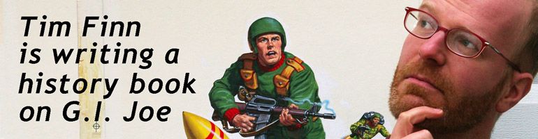
It’s an exciting time to be a G.I. Joe or Transformers fan.
Continue readingFiled under General Musings, Reading comics
In Part 1, I offered some context for the new G.I. Joe 40th Anniversary Special via a trio of Marvel Comics “Tribute” issues wherein top artists of today each redrew a page from a classic Marvel story. I started making an analogy that comics like these resemble popular song remakes. I’m going to return to that analogy later, but since the selling point of this new G.I. Joe work is each new artists’ take, and the ability to see this story anew, first thought I would riff on each page.
Continue readingFiled under Comics Reviews, Reading comics

Part 1 – [2] – [3] – [4] – [5] – [6] – [7] – [8] – [9] – [10] – [11] – [12] – [13] – [14]
In our last episode, Tim and his brother Kevin placed their biggest mail order of G.I. Joe comics yet, and the excruciating wait began…
My grade school had half-day Fridays every single week, so I would have lunch at Roy Rogers with Betty, my family’s housekeeper/nanny/second mom, on the way home. And my brother, in 9th grade at a different school, didn’t get home until 4 or 5pm, whereas I was already playing Dig Dug on our IBM XT and watching Dennis the Menace at 1. On a Friday after what felt like months, where every day I longed to see a package awaiting me at my front door, Betty and I pulled into the driveway, my neck still careening for an angle on the screen door in case THIS WAS THE DAY.
Indeed the screen door was just a tad ajar, but in no way the amount needed to make room for an eight-foot tall box of comics. And there had been a few false alarms — small packages for my mom, or all our regular mail bundled together with a rubber band, so I wasn’t going to get my hopes up again on the short flagstone walk to the front stoop. But there it was anyway, another modestly sized, tightly taped East Coast Comics box!
I have no recollection of getting it inside, or forming half-words to Betty to express its significance, but soon I was kneeling on the bed in my parents’ room, an odd place for the unpacking operation, but one that makes its own sense. Betty watched soap operas downstairs in the family room, and from an early age my brother and I knew we weren’t allowed to join in. (At the time soap operas showed the occasional sex scene, all tastefully under the covers, really nothing more than prone kissing – tame by today’s standards. But nonetheless we were chased out of the room if we lingered too long while fetching an action figure or an afterschool Pudding Pop.) So that room was out.
My room was too narrow for stacks of loose comics so large they threatened to asphyxiate me should they topple over. What I needed was a big space to spread out so I could take in all the G.I. Joe goodness at once. We watched TV on our parents’ bed, and sometimes read for school there, so it was atop the brown 1970s bedspread and before the orange, brown, and white tulips of Vera Wang’s wallpaper that I gingerly dumped 40 new G.I. Joe comics out in front of me.
I’ve alluded to this a few times before here at Real American Book, the unattainably nostalgic feeling of reading during that first year of collecting comics. This was when a comic took 45 minutes to finish, when I would read every page three times, and then read the comic again. When I was legitimately concerned that whatever deathtrap or point blank pistol promised inescapable death to Snake-Eyes, to Ed Marks, to Daredevil on the cover might actually happen. I was worried Snake-Eyes would step on that landmine on the cover of G.I. Joe #63 even though I had already read issue #s 90-95 — starring an alive and well Snake-Eyes! (Okay, not always well, since he got hot ash thrown in his face in #95.) But here now was an almost overwhelming tableau of those images, Marvel’s 1980s cover stock and color saturation popping off that bedspread, yellows that blinded, red that promised of blood, white in the steely eyes of determined heroes, flamboyant purples for villains, dangerous green jungles, ultramarine skies. Like an amateur card dealer I shuffled the comics around with the palms of my hands, over and over, prepping for a game of Go Fish that would never finish, would never start. These cover images, most drawn by Mike Zeck and Ron Wagner, are indelibly burned into my brain, and the power they hold, supported by the interior narratives, multiplied by the unassailable guilding of nostalgia make most other comics dissatisfying by comparison.
There would be no buyer’s remorse for this splurge. Only the satisfaction of having half-completed an entire run of Marvel G.I. Joe in one fell swoop.
I must have spent a half hour just looking at them, moving them around, arranging them, picking some up, flipping through them. Looking at them. Looking at them.
While I was still curious how 40 comics hadn’t needed a box bigger than a coffin, that concern faded, and the entire stack went with me into my bedroom. I sat propped up against two navy blue pillows on my lower bunk bed, Prince’s Batman soundtrack playing on my boom box. (Oh, how I’ve tried to keep the ‘80s from overwhelming every paragraph of this blog. Oh, how I failed on that last sentence.) And there I read comics for hours.
I should note here once again how memory misaligns. For years I’ve remembered this big order as my second, but the date (12/15/89) on the one I showed in part 14 of this story means this bigger order had to be our third. And I remember it arrived in the spring of 1989, but the Batman album didn’t street until June 15 of that year. And I wouldn’t have bought it opening day. But school got out in early June, and not only did I come from school that East Coast day, I must have told Will all about it the following Monday. Right? So how was I listening to an album that I hadn’t bought yet? Could I be conflating a later reading session with this victorious day of postal receipt?
Regardless of the answer, I have no memory of Kevin coming home later, and me telling him the good news, and him sorting through the stack, taking in the pulp bounty for himself. But I do remember both of us spent hours that weekend reading, me prone on the family room floor, elbows digging into our soft yellow shag carpet, and Kevin lying on the couch, a tall pile of comics on the coffee table between us. The coffee table where my father kept his coffee table books, the ones that indirectly seeded the idea for A Real American Book.
And though the dual afternoons offered us much in the way of thrilling narratives, double crosses and death-defying escapes, it doesn’t quite compare to that break in the tension storm when my months-long anxiety at last broke, and that giant East Coast Comics order finally arrived, on a spring Friday afternoon at the end of 6th grade.
I still think about that day when I listen to Batman.
Part 1 – [2] – [3] – [4] – [5] – [6] – [7] – [8] – [9] – [10] – [11] – [12] – [13] – [14]
Filed under Prehistory, Reading comics

Photo by Jamie Meditz
Not much touted here is the fact that I own a comic book store. It’s a recent development, and with our renovations still ongoing (shelves, paint, lights, awning, website), it’s a little harder to blog and write. On the plus side, our customers always have IDW’s full line of G.I. Joe comics and graphic novels to choose from. Both myself and the store are in this week’s issue of DigBoston, a free arts and nightlife newspaper, and I manage to give some attention to Real American Hero.

 A longer version should be online in a week. Thanks to interviewer Corey Estlund, photographer Jamie Meditz, and art director Scott Murray for the kind coverage.
Filed under Back issues, Hub Comics, Reading comics

Part 1 – [2] – [3] – [4] – [5] – [6] – [7] – [8] – [9] – [10] – [11] – [12] – [13]
In our last episode, Tim stretched out this story of getting into G.I. Joe comics by also including Marvel super-hero books like Uncanny X-Men. This week he gets back to G.I. Joe. Sort of.
After that first mail order in the early summer when my brother Kevin and I got 11 G.I. Joe back issues for $22, we were hooked on the process. New Jersey-based East Coast Comics, the fine retailer that had filled that first order, was smart to include an updated catalog (a pamphlet, actually) with it, and some months later we gathered our pennies and plotted to fill more holes in our G.I. Joe run. At this point, the series is on issue #95 or thereabouts, so we’ve got 70 comics or reprints to track down. Several options offered opportunities to get those comics, each just uninteresting enough that I will probably blog about them individually on upcoming Fridays – finding other comic book stores, attending our first comic book convention, sampling a mail order company beyond East Coast Comics. But for today: Our second and third mail orders.

This probably doesn’t mean anything to you, but for me this image is all nostalgia: The handwriting of my 11-year old self, my mom’s signature, specific G.I. Joe gaps we were attempting to fill, the fact that I still didn’t understand what “Alternates” were – (second choices in case a comic was sold out, so East Coast didn’t have to issue credit slips), and the fact that we were trying out a new series (Nth Man, Ninja Turtles Teach Karate).
Also, memory is funny in how often it turns out to be wrong: This scan concretely places when we bought issue #36 of The ‘Nam, meaning I was incorrect a few weeks back in this very blog. I must not have bought that issue at the Montgomery Mall Waldenbooks as 6th grade began. Apparently it arrived by mail a few months later. I have no recollection of receiving this box, although I do remember thinking Solson’s TMNT book was an amateurish affair, remarkable considering how amateurish the production in Mirage Studios’ actual Teenage Mutant Ninja Turtles was. So this must have arrived right around Christmas of 6th grade. Anyway, there it is, what was probably our second ever mail order.
But let’s skip a few months ahead to spring of 6th grade. The first two mail orders have arrived quickly. Kevin and I have saved up enough money to place a big order, and with East Coast selling many issues for less than a dollar, this was not going to be 10 or 15 comics. No, this time we ordered 40 G.I. Joe back issues. It was bold, exhilarating, and nerve-wracking. Even though we were clearly comics buyers by now (Joe, The ‘Nam, Marvel super-hero books, Ninja Turtles), it’s still a transition from being boys who spent money on toys to boys who with our own money bought things to read. (Chapter books and the occasional Garfield collection were paid for by our parents.) This shift represented, in a very real sense and not just symbolically, us growing up and away from childhood. We bought toys and played with them for a few more years (me much longer than Kevin), but toys’ days were numbered the moment I bought that first Joe comic. (Except for me becoming a vintage toy collector, another topic for another day.)
My friend Will (Hi, Will), also in 6th grade with me, was becoming a comics reader as well. And comics had a certain currency in my tiny classroom. One friend talked about Wolverine. I drew a cutely terrible Batman parody in my notebook. And new G.I. Joe issues did appear each month concurrent to all this. But as the weeks went by, I got anxious about this big mail order. Why was it taking so long? Why was it taking weeks when the earlier order had only taken one? Was the package lost somewhere en route? Did East Coast abscond with our money? Was the parcel stolen from our front stoop? During lulls in class I would fantasize to Will about what it would be like to open a box with 40 comics in it. To instantly more than double the size of our collection.
The specific scenario I kept painting went like this: Arriving home one day, I’d notice our screen door propped open, even though it always closed shut on its own. Something must be in the way, something I couldn’t see from the car. We parked. I approach cautiously. Now the box is revealed: It’s eight feet tall, cardboard, sealed with packing tape. It can only be one thing. It can only be an East Coast Comics parcel bursting with comics. Literally, the box edges are no longer straight, parallel, and perpendicular, as if the comics are forcing their way out, the packing tape starting to tear, like a cartoon container for some magical energy, some tazmanian devil, some pressurized tank ready to explode. Inside the house I cut it open, but a tidal wave of newsprint pages and glossy covers, G.I. Joe comics the likes of which I’ve never known, surge out as if from a fire hose, like an avalanche, pushing me back, smothering me, the sound like the crash of beach surf!
Will and I said this to each other in a stage whisper, as I’d act it out in my seat, making the rumbly sound effect for the shower of comics. It was a vignette we’d quietly pantomime for each other, sitting in our seats during a lull in class. Will’s enthusiasm only reflected back on me, and the wait only became more difficult.
WHEN WOULD THE BOX ARRIVE?
Filed under Back issues, Reading comics

Part 1 – [2] – [3] – [4] – [5] – [6] – [7] – [8] – [9] – [10] – [11] – [12] – [13]
In our last episode, Tim went on a tangent from describing buying G.I. Joe comics and this week the tangent expands!
The title of this series of articles refers to G.I. Joe issue #90, and how scanning just a few pages kicked off a sequence of events that turned me from a G.I. Joe fan who liked reading into a comic book collector/reader for life. And how one issue of G.I. Joe became the next one, and then the older ones, and all the newest ones, and then The ‘Nam.
But something had to bridge my brother and I into the Marvel Universe proper, since Joe and The ‘Nam were both in their own universes. Kevin and I didn’t know anything about super-heroes, which is what most of Marvel and DC Comics publish. To put this in context, it’s important to remember than in the 1980s, super-heroes had no cultural footprint. My 2nd grade sticker album had a Colossus sticker (from a junk store or a birthday party favor), but I had no idea who he was. The Superman films crashed and burned with the embarrassing Quest For Peace. The Incredible Hulk was relegated to a few made-for-TV movies that were more dramatic than super-heroic. The 1966 Batman TV series showed up in reruns some summers, but it had little effect on us. Spider-Man and his Amazing Friends was over, and we hadn’t ever watched it anyway. I didn’t pay attention to the Amazing Spider-Man newspaper strip, but if I did I would have noticed how little happens. This is still a decade and a half before Marvel’s live-action films, starting with Blade and X-Men, shook up Hollywood. It’s still years before Fox’s Spider-Man cartoon, Fox’s Batman: The Animated Series, and any live-action Batman sequels.
So rather than super-heroes plural, we only had a sense of Batman. Certainly the Batmania of 1989 was enough for our pop culture appetite, but in terms of comic books, there was no entry point. Whatever was needed to get us into DC Comics hadn’t happened yet. But in the pages of G.I. Joe and The ‘Nam were checklists and ads for other Marvel books. And the Marvel logo on the top left corner was familiar, so if we were to try out something super-heroic, it would likely be Marvel. So as 6th grade was winding down, a full year after we started G.I. Joe, Kevin led the way into the Marvel Universe, tugged by the giant gun and overwhelming coolness of this:

And what a perfect entre. The Punisher isn’t a super-hero, but he interacts with them. As a Vietnam vet, Frank Castle was the bridge to the other two comics we read – one about Vietnam and the other with occasional flashbacks to it. And again, we were boys who liked guns. The Punisher may get slammed or ignored for being a one-note vigilante book, but that’s an unfair judgment. Even the stories lacking pathos are exciting action tales, and a handful of stories from the 1980s – notably Grant and Zeck’s “Circle of Blood” and the odd Mike Baron yarn – are smart and compelling. And to my surprise, Garth Ennis’ 2004-2008 run on the character comprises some of the most satisfying comics I’ve ever read. (But they’re bloody and grim, and not for everyone.)
A month after Punisher War Journal #19, we picked up (the regular) Punisher with issue #35, which happened to be the start of a 6-part, biweekly-shipping story arc. Two months later, we took the super-hero plunge with Uncanny X-Men #268. (Which doesn’t modestly flaunt super-powers since the three spotlight characters in this one issue don’t fly or shoot eye beams.) Another two months later it was Daredevil, with issue 286. Again, another grounded hero. While Matt Murdock does have enhanced senses, he doesn’t fly and he doesn’t shoot eye beams, and his costume is as restrained as super-hero tights go. And even if he had been over the top, we were primed by now. Somewhere in there was Wolverine #24 as well, a character a friend in school had talked up. (And written a paper about.)
I don’t want to overdo it on this street-level, depowered bit. Super-heroes with fantastic powers could well have grabbed us earlier, and we would likely have accepted it. Sci-fi and fantasy were a-okay in ours books. I loved Transformers and Tron, Kevin was getting into Dungeons and Dragons, and we both liked the animated G.I. Joe: The Movie, even with its 40,000 year-old Himalayan snake man who wants to conquer Earth. Make that re-conquer Earth. But the path is worth noting, that we didn’t jump into super-heroes immediately. It probably says more about culture than us. Had we been born five years later we’d probably have been watching Ninja Turtles and Power Rangers instead of reading the black and white Turtles book and ignoring Power Rangers.
During that first year, while purchasing only 6 monthly comic book series our collection went from one comic book to more than fifty. You’ve already read about that first mail order shipment, but what was different about the next one? Tune in next week to find out!
Part 1 – [2] – [3] – [4] – [5] – [6] – [7] – [8] – [9] – [10] – [11] – [12] – [13]
Filed under Prehistory, Reading comics

Part 1 – [2] – [3] – [4] – [5] – [6] – [7] – [8] – [9] – [10] – [11] – Twelve
In our last episode, Tim and his brother Kevin are interested in Vietnam, and have started reading comic books!
Marvel published a monthly series called The ‘Nam. I didn’t really know what that was, but I could put two and two together: The title design was a military stencil font, those three letters looked like the end of the word “Vietnam,” and there were Army guys in green on the covers. While comic books starring super-heroes were grabbing some attention from Waldenbooks’ two spinner racks at our local mall, we hadn’t made that jump yet. G.I. Joe was “realistic” in a way Uncanny X-Men (whatever that was!) was not, so if we were going to start reading a second comic book (third, counting our truncated following of Joe’s spin-off book G.I. Joe Special Missions), it needed to be similarly grounded. I had been flipping through this ‘Nam comic for two months now. Issue #36 had had a particularly compelling cover:

I hadn’t experienced any racism in my life, but I knew what it was. A friend of the family had been singled out a few times, and in grade school we talked about the Reverend Dr. Martin Luther King, Jr. every January. There we even had a short play about mean parents not letting their kids befriend kids of other races that we performed each year. And the nation’s capital was the next city over, so the 1963 March on Washington was referenced on local TV news and in the pages of the Washington Post probably a tad more than in the, say, Los Angeles or Anchorage media. And as much as racism was a real topic that we talked about in history class, it wasn’t anything anyone talked about in any day-to-day fashion. There was a heaviness to it, as if it was taboo. So to see it a) on the cover of a comic book, and b) on the cover of a war comic, was surprising to me, a white suburban 6th grader. The ‘Nam #36 was on-sale the same month Kevin and I got back from summer camp and bought G.I. Joe #92, our second real issue of that series, so we hadn’t passed the tipping point — we were still only buying a G.I. Joe comic book, not just any comic. But by the time issue The ‘Nam #38 came out two months later, we had 20 or so comic books, and this cover was most compelling. (If a little lurid for what was an otherwise tastefully done book.)

This moment, buying The ‘Nam (in what I believe was the last week of) the first month of 6th grade was the tipping point. This is where Kevin and I went from enjoying more G.I. Joe stories than we could get from just the TV cartoon to becoming regular and devoted comic book readers; When we started buying a second, regular, monthly comic book series. (So by a certain definition, it’s The ‘Nam #38 that was “The Comic That Changed Everything,” rather than G.I. Joe #90.)
This title, because of its higher quality paper stock, color separations, and limited distribution, was pricier than G.I. Joe. It was $1.75 rather than a mere dollar. But the dam was starting to burst. Kevin and I just liked comics. We liked stories, we liked art, we liked reading. With this purchase it would no longer be confined to G.I. Joe stories, G.I. Joe art, G.I. Joe reading. So I bought this issue of The ‘Nam, and tried to read it on the way home (but I get lightly car sick if I read, so I gave up after a page or two). At home I discovered it’s a great comic.
Before I could buy the next one, however, I bought my first graphic novel. Long before DC had any kind of backlist, back when Marvel had only published about fifteen trade paperback collections of famous runs of comic books and didn’t really know what they were doing (as evidenced by the ISBN number ending up on the spine of Marvel’s 1989 The Power of Iron Man and other cutely poor editorial and design choices), Marvel did have three modestly-priced graphic novels reprinting the first twelve issues of The ‘Nam.

Next to the two spinner racks of individual comic books, Walden had a larger spinner rack of graphic novels (whatever those were!). That included the second and third ‘Nam books, and for whatever reason, I found the cover of the third one the more compelling. After hovering around for a few weeks, I bought it. Excellent art, tight scripting, compelling characters, and the shocking death of a major character. Regular readers had known him for nine months. I’d only known him for twenty pages and yet it was an affecting surprise. And soon I bought the other graphic novel, and then issue 39, and 40, and somewhere the first volume, and then we were regular readers, meaning we now collected a second comic book monthly besides G.I. Joe.
But to be honest, besides all this grand talk of pathos, characters, and dramatic tension, my brother and I were still just boys who liked guns. G.I. Joe and The ‘Nam had those in spades. So it was only natural that the next comic book title we tried out was replete with fire arms as well.
And what Marvel series in 1989 was all about guns? Tune in next week to find out!
Part 1 – [2] – [3] – [4] – [5] – [6] – [7] – [8] – [9] – [10] – [11] – Twelve
Filed under Prehistory, Reading comics

