Mike Zeck needs no introduction. Here’s a short one anyway. He’s best known for four things: a three-year run on “Captain America,” the 1986 “Punisher” miniseries that made Frank Castle into a real character and not a Spider-Man foil; and 40 or so unbelievable G.I. Joe covers. His career in comics is bigger than that, but you only asked for a short introduction.
What made those G.I. Joe covers so great is what makes all of Zeck’s work great. He is a master. Mike Zeck is the best action artist in comics. I didn’t say that, Steven Grant, a regular collaborator of Zeck’s, did. (But I can’t fine the quote, sorry!) Mike Zeck draws dynamic scenes, explosions, and muzzle flashes. But he’s also an expert at lighting, anatomy, facial expressions, and page layout. His work is energetic, but he can do quiet stuff, too.
Mike Zeck’s G.I. Joe covers benefited from a collaborator: Larry Hama. (Him again!) Hama thumbnailed cover sketches, often three during lunch, and one became that month’s G.I. Joe cover. So while Zeck’s Marvel and DC covers were the tops, we need to include Larry Hama when discussing the G.I. Joe covers.
That out of the way, let’s look at Zeck’s gorgeous cover — inked by regular collaborator John Beatty — to G.I. Joe issue #44.
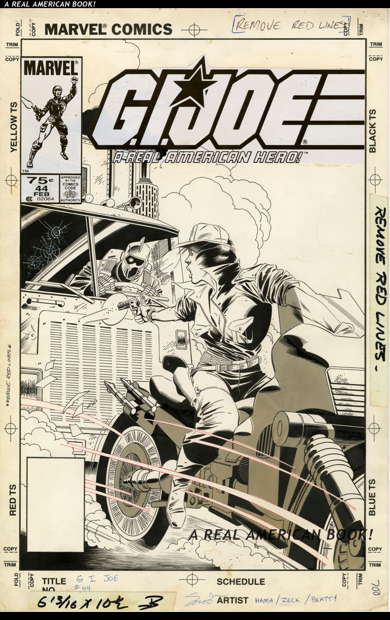
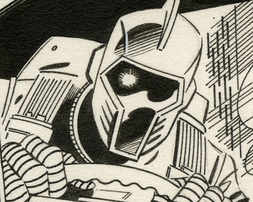
I love the layout, the STORY of the cover. It’s subtly terrifying to have this unblinking, untalking drone driving a leering, looming vehicle after our hero, and a motorcycle versus an 18-wheeler stands no chance. Lady-Jaye’s pose is dynamic, and the image starts to feel claustrophobic. There are no other cars visible, but I’ve always read this as LJ being trapped — other cars or a highway barrier keeping her where she is, right in front of that cab. And her gun is ineffectual. As a comics reader, however, I never loved the art here. The B.A.T. is off-model, a truck instead of a proper Cobra vehicle feels like a missed opportunity, Lady-Jaye’s open shirt seems uncharacteristically exploitative for G.I. Joe (which is pretty sexless to me), and the Silver Mirage’s wheel is flat. (Thin, not flat-tire flat.)
But when I saw the original art, everything changed. That it is an artifact of my favorite era of G.I. Joe is no small part of this. It’s not bleach-white and universe-black like a Photoshop bitmap, it’s faded and stained. You can see brushstrokes and pen marks. Real ink, up-close, has a particular power. Without the color, John Beatty’s energetic inks shine. And you can see where Beatty’s red lines have been removed so that the printed color has no lasso:
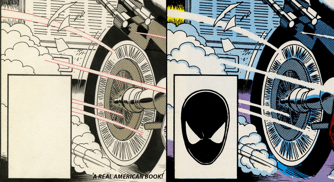
And zip-a-tone:
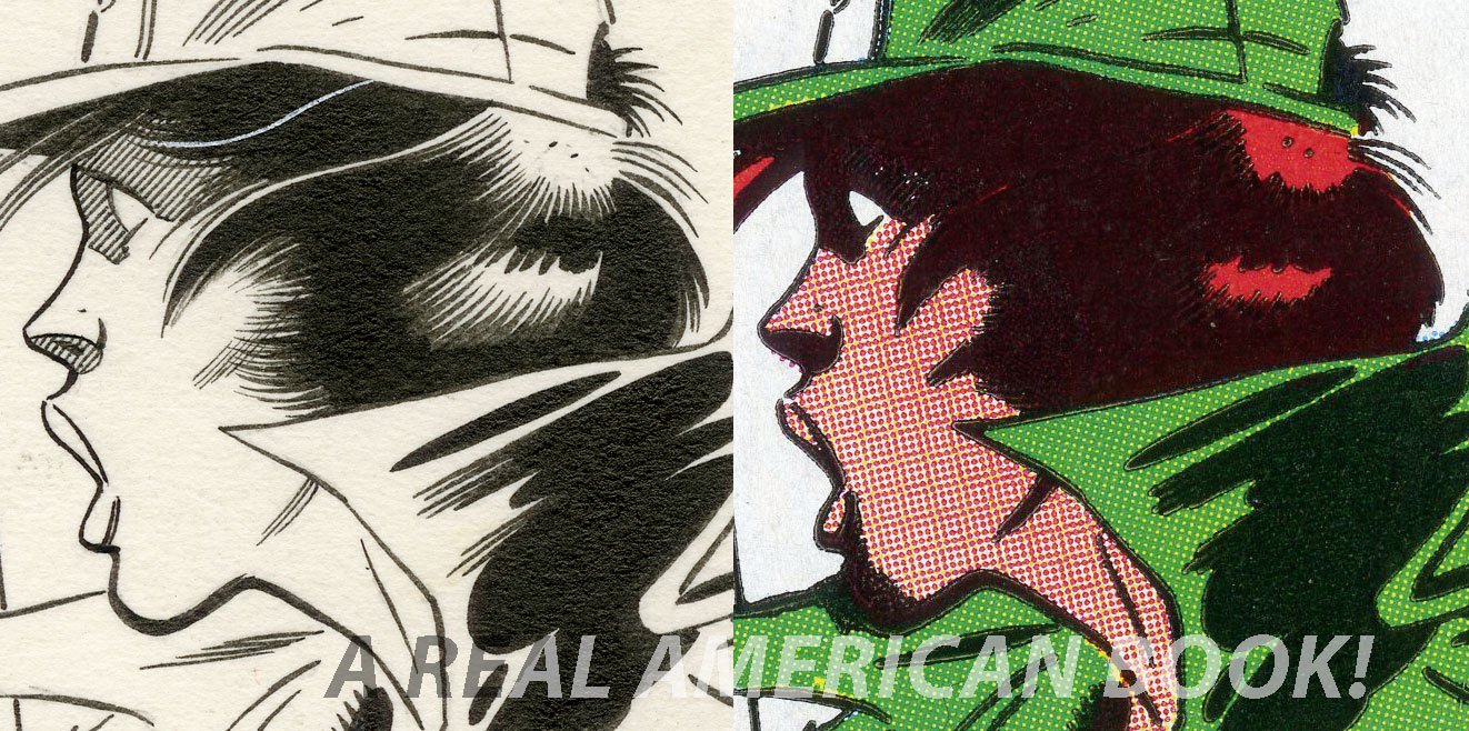
 Actually, Zip-A-Tone is a brand name that became the generic (Kleenex for tissue, Ziploc for sandwich bag), so we should call it “screentone.” But Tim, you ask, what IS zip-a-tone? It’s a clear, adhesive shading tool. Before scanners, camera-ready art had to be either fully black or fully white — no greys. So to create the illusion of greys, artists would stipple, or feather, or hatch and crosshatch. Or apply screentone — sticky sheets pre-printed with dots or lines. Sadly, screentone shrinks with age. If you look at my light blue arrows in the image above, you can see where the plastic is constricting away from the ink line. (Or maybe it was just cut a little carelessly? Certainly that’s the purple arrow.)
(Sean Michael Robinson, lead on the herculean Cerebus restoration, has more on this — scroll down and start at the one-word paragraph that says “Why?”)
And Zeck’s stellar hand shows through here better than in reduction and reproduction. Partly because there’s a dark color there, and also because Zeck was drawing more detail that could be reproduced at the time — note the delicate hatching around Lady-Jaye’s eye:
And partly because Mike Zeck is a master.
What does Mike Zeck‘s G.I. Joe work mean to you?

Got to see his work in person at the Cartoon Art Museum. He’s certainly one of the all time greats!
Awesome entry, Tim. I actually hated this particular issue–I think it’s a pretty lame episode–but I’ve always thought the cover was pretty fun!
I never knew about zip-a-tone/screentone, but it turns out, that is a pretty important part in comic art to me. That zip-a-tone stuff is the thing that kinda embodies “comic art” to me and is sort of the spirit that I feel is missing from comics printed today.
Total side note and off topic: in the Sunbow episode, “The Invaders”, the Joe team works together with members of the Oktober Guard. While the Joes shout “Yo Joe!” in usual fashion, the OG counter with their own battlecry. Something that sounds like “nu pagodi”. Any background on this?
I’ll refer to Bill below, since this is out of my territory.
Regarding the Oktober Guard battle cry, it is indeed “nu pagodi” (“Ну, погоди!,” literally “well, just you wait!”) It’s used kind of weirdly in the cartoon since the gist is more of someone swearing revenge for having their plans foiled.
I’m not absolutely sure, but I highly suspect someone at Sunbow used it as a reference/homage to the old Soviet cartoon series of the same name.