I’ve been looking forward to this issue for most of a year. Anniversaries like this are uncommon in comics. If you’d told me in 1990 that, while anticipating issue #100, someday I’d get a 250th issue, I would not have believed you. I was already thrilled we hit #200 and #225 after IDW Publishing picked up the book in 2010 and started from where Marvel’s numbering had left off. This comic currently has a low circulation (6,000?), a far cry from 1985, when it was roughly 58 times that. (Yes, there’s digital, but that’s a drop in the bucket.) [CORRECTION: 6,000-7,000, see comments below.] So I’m always ready to hear that this book is being cancelled again. Every issue is a gift, particularly an anniversary one. Recent issues have sold out and gone to second printings, and with variant covers, news outlets taking note of a particular new character, the buzz of an anniversary, certainly #250 sold well, so I’d like to think the series is on an up-tick.

Writer Larry Hama starts off things by recapping the theme and plot of the previous issues in three efficient word balloons on page 1. This may feel like a redundancy when one reads several issues in a row in a collected edition, but I don’t mind. I’m not reading this in a collected edition, but instead, month-to-month. Budo’s involvement in the narrative is still a puzzle. He’s a samurai, but he’s on the ninja-centric mission to rescue the ninja Dawn Moreno from evil ninjas. And he’s only been in about two issues of the Marvel run and about two issues of the IDW run. Perhaps Budo is about to become much more important after all these years?
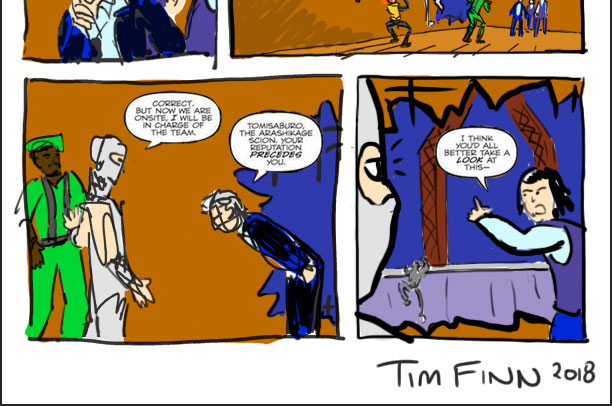
Hama also reintroduces us to Inspector Harada, a Japanese cop. A fun Hamaism: Harada is part of the Ministry of Occult Martial Arts, meaning he can be a regular cop who investigates the Red Ninjas. I suspect Harada’s character, name, and likeness is a reference (or references) to someone from history, or Japanese novels, or film — Hama writes that way — but I don’t know. Harada is the smartest guy in the room, full of surprises, and cool under pressure, so I like him even though such a non-toy character draw attention from all the Joes and Cobras in these issues.
Recent new pencil artist Netho Diaz nicely differentiates facial types and draws in what I consider a post-Jim Lee “hot” style. That means a lot of detail and texture (lines, hatching, cross hatching), energy, and verve, all of which is appreciated. G.I. Joe has long leaned towards crisp, traditional American Adventure Style art (think Ron Wagner and Rod Whigham, all in the tradition of Joe Kubert, Jack Kirby, and Gil Kane). Those traditional styles often mean standard rectangular panels without much splash, but they make up for a lack of punch with strong panel-to-panel storytelling. It’s exciting the handful of times Joe has been treated to a “hot” style, but here’s the problem. Such artists often emphasize big, splashy art over storytelling. Unfortunately, this is the case for Diaz. Page 2 has one of those distracting moments where too much is being said for how much action is taking place, note panel 3:

Here’s my standby example of that problem, by the way, Lee/Claremont X-Men #1, 1991.

That’s a lot of dialogue happening before the thing that the image depicts actually happens, a disconnect between art and script.
If right now you’re thinking “That’s a nitpick, comics have ebb and flow between dialogue and art, and one panel might have a lot of dialogue while another doesn’t.” That is true. But comics can also be precise, and, getting back to G.I. Joe #250, it’s silly that Stalker says all of that and Harada replies as these people are rappeling downward.
You could argue that Hama, who dialogues over pencil art after providing a plot to his artist, wrote too much dialogue for the fast act of zipping down a line from a helicopter. But I believe that fault lies with the artist, who gave too much real estate to this action. The plot does not want a big, sexy, action shot of five people zipping down into view. This is a panel that acts like a cover, like a splash page:

But it actually needs to re-establish the room that Harada and his two officer subordinates are in, and to give breathing room for the five new arrivals to have a dialogue exchange with the three people already there. Note how unclear the room is:

All we get is a snatch of empty floor, seen from far away in the first panel; a blank background in the second panel; speedlines in the third panel; a tiny sliver of background wall with… a picture frame? on the wall, and some blood? in the fourth panel; and almost nothing in the final panel. Diaz is giving too much space to characters and not enough to background. He’s not balancing figure-in-ground. We need to see the interior. Here’s my take:
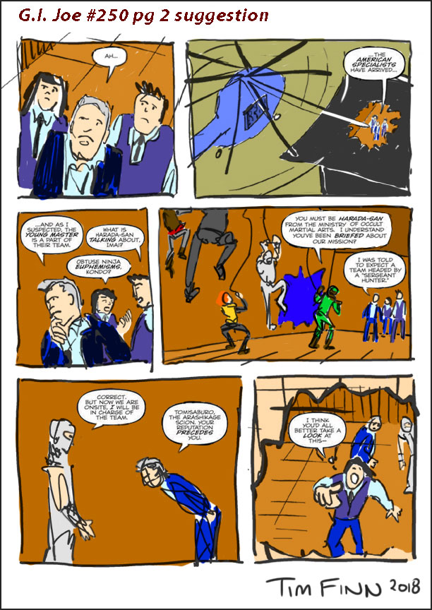
Art and Storytelling are different. Diaz’s art is great, that’s for sure. But I want to better establish the room, where everyone is in it, where everyone is in relation to each other, and that gash in the wall, which is primary to the final bit of dialogue. We need to see that gash clearly before Imai leads us to it, so I show it in panel 4 before it’s needed.
My take could still be improved and clarified. Three problems: One, we don’t see the Joes entering through the hole in the ceiling. We do see them entering, but you might construe that as through a door after landing on the ground outside the building. Two, based on where Storm Shadow and Harada are, we should see that gash in panel 5. It would be behind them. Three, we should also see Stalker in panel 4 since he was walking ahead of Storm Shadow in the previous one. Here’s a revision:

Netho Diaz draws exciting Joe comics, and that gives me a visceral thrill. Unfortunately, on every page, subtly or overtly, Diaz prioritizes splashy character poses over clear acting and placement of characters in environments. Here’s another example, on the confusing transition from page 2 to 3. Here’s that last panel you’re now familiar with:

And then page 3:
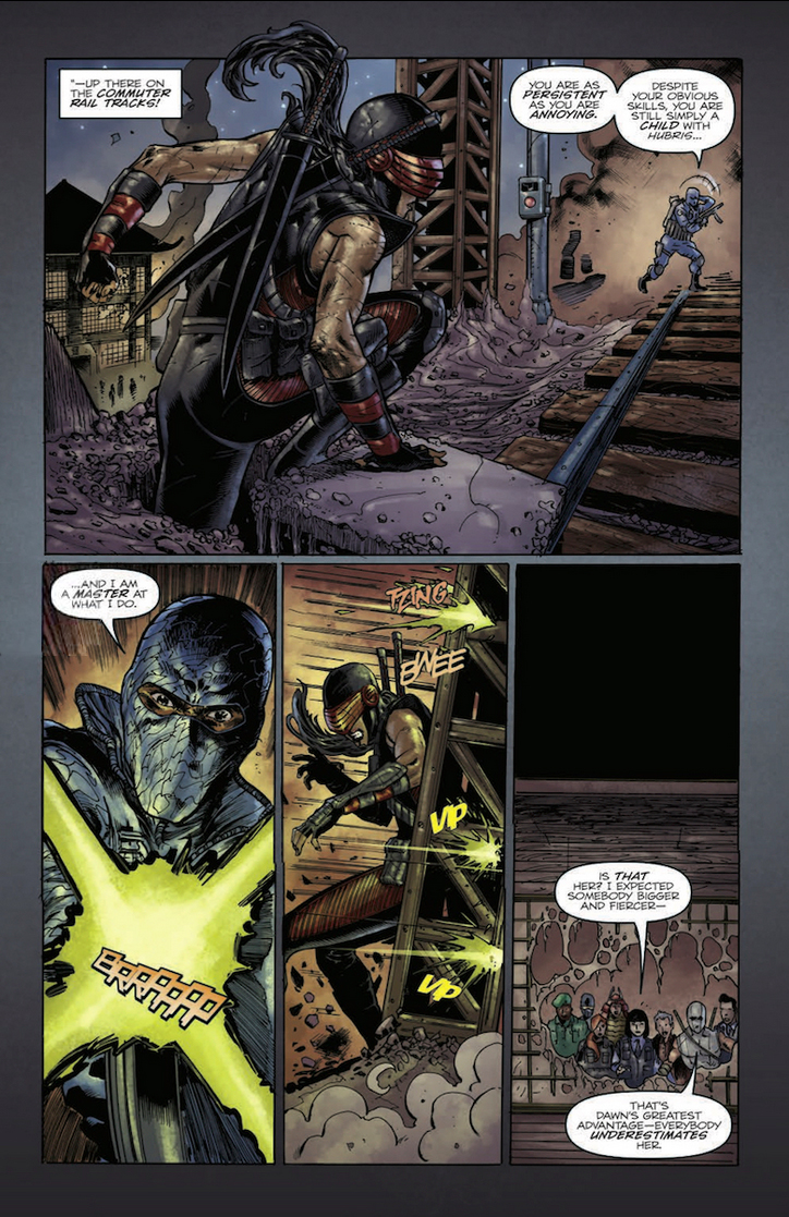
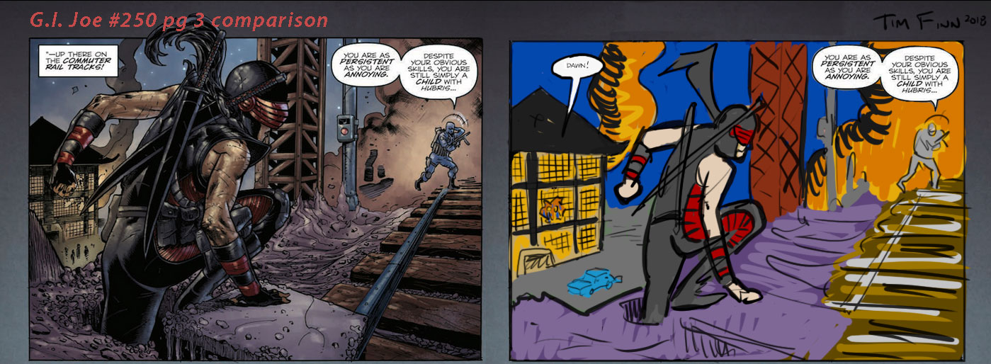
We’re supposed to connect the Red Ninja dojo with the train tracks, to know that they’re not only in proximity to each other, but that you can see one from the other. The first panel above makes Dawn so big that there isn’t much space to see the dojo. Did you notice the tiny broken window in the distance next to Dawn’s hand? Yeah, me neither. Here’s the three Japanese cops and the five Joes:

It gets to the point where Hama has to add dialogue to make up for the unclear art. Imai doesn’t say “Check it out!” She says “Look at this up there on the commuter rail tracks!” When a character spells out what should be clear from the art, the art isn’t doing its job.
Just like connecting the three cops and the five Joes and the room on the previous page, the dojo and Dawn-on-the-tracks need to be better connected.
Here’s a solution, starting on the previous page with a revision to its final panel, flipping the “camera” so that we see Imai and the gash in the wall and the tracks beyond:
And then page 3 panel 1 would look like this. Once again, it’s about shrinking characters and emphasizing background.

Not drastic. All I did was make the dojo bigger and Dawn smaller. Compare:
Another problem. There’s no car with those people in front of the dojo.

Why do we need a car? Because–
 –on the next page, Storm Shadow jumps out of the window in pursuit of Dawn, landing on a car. Where is the car? Was it always there? I don’t know. There’s been no car in this issue. I’m still excited about Netho Diaz’s art, and I don’t want this seemingly nitpicky review to read like a nasty swipe. But drawing is only half the job in comics. Visually telling the story is the other half, and I look forward to Diaz getting stronger there.
A whole other factor regarding the art is the color. Milen Parvanov has colored this current story arc. I like the work more than the series’ previous 100 or so issues, but Parvanov’s approach is, like Diaz’s, too busy for me. Photorealistic art seems to demand highly detailed color, but it all becomes mush. I’m going to zoom in on one panel. Technically it’s two, but it acts like one:
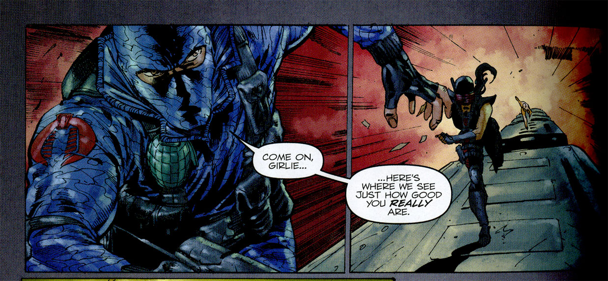 Firefly’s costume has two problems. First, it’s given only one fill color. I’m not referring to highlights or shadow, I mean the fabric — it’s all one color. Those camouflage lines aren’t decorative, they’re meant to lasso areas of dark fill. Parvanov is ignoring the squiggles of the camo. Second, Firefly’s costume is grey, not blue. The blue doesn’t look bad, but I don’t see a need for it. At minimum I’d like the camo to be actual camo, so I’m adding a dark fill to some of the camouflage:
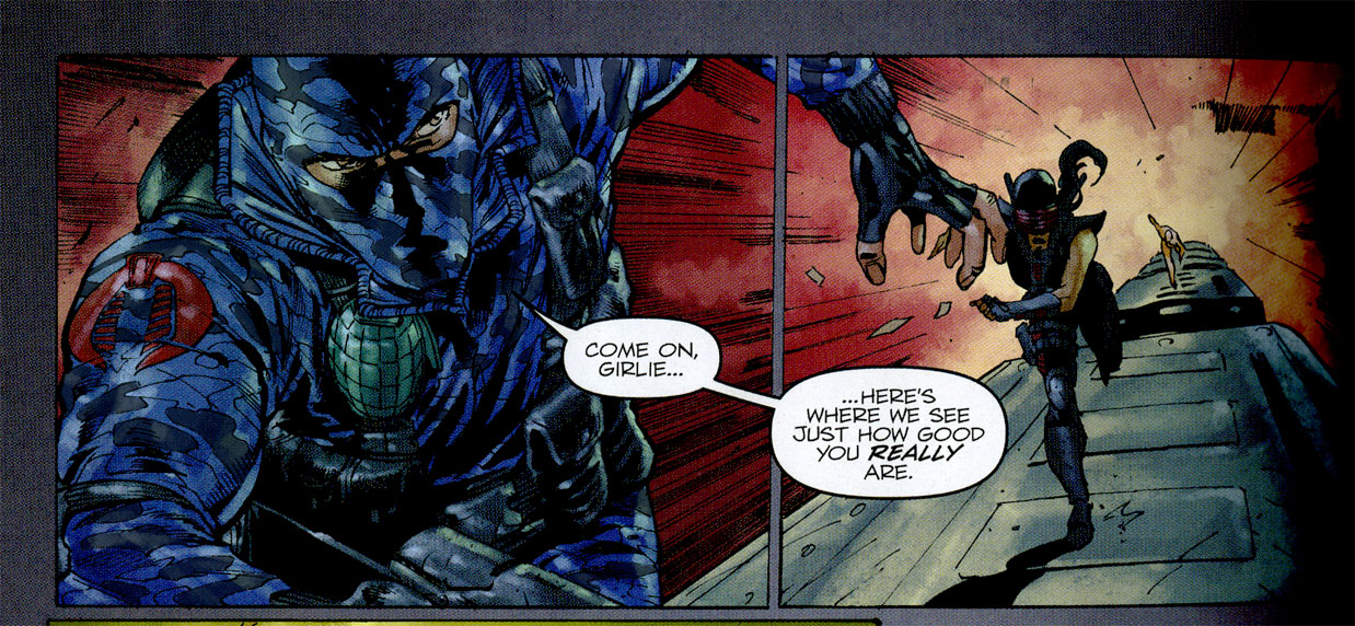
My tweak now makes an overly busy Firefly even busier, but that’s down to inking competing with aggressive coloring and too much rendering and too many highlights. To be fair, I scanned this panel from a printed comic, rather than grabbing a digital page from the internet, so the contrast is increased, a slight exaggeration from how the comic looks printed when you’re reading the comic itself. But try this:

Less is more.
That’s my take on the colors. Again, more realistic art seems to want more realistic colors, but I contend the opposite. The more complex the art, the less complex the color should be, otherwise they’re competing. Now, you can argue that my color is too old-fashioned, or not exciting enough, but I think importantly that it supports the art in a more fitting way. But you know what, it may not be a fair comparison since I’m using Firefly’s original greys and not these new blues, and I’m not using a red background sky. So howabout Parvanov’s color choices, but still with a less rendered approach?
I find this satisfying and not distracting.
Back to the story. Hama recreates a scene from the well-loved G.I. Joe issue #27 (September, 1984), and uses it to good effect. Questing for revenge, and giving that up, has long been a theme in Hama’s G.I. Joe, and Storm Shadow and Dawn Moreno demonstrate it to great effect here, neutering Firefly with an act of mercy. (Also rattling around in my head the week I read #250 was another Larry Hama G.I. Joe story. It was published by Hasbro and included with two action figures in 2008, and coincidentally featured Storm Shadow committing a shocking act of kindness against Firefly. That story is probably out of continuity, but again, it’s nice to see these recurring themes, and while Firefly is freaking out with a suicide bomb on the train in Tokyo is issue #250, I kept thinking “they’ve got to do something to save this guy, like that other time they saved him, even though he’s been terrible to them.”)
Two things I didn’t like about issue #250:
1) Snake-Eyes Sean Collins didn’t do anything. I was hoping that this would be some kind of clash between replacement Snake-Eyes and surprise replacement Snake-Eyes. (Actual Snake-Eyes died in issue #215.) Or that Sean get involved with the chase on the train. Taking down Cobra’s resident saboteur wasn’t Collins’ vendetta, but he was conspicuously on the mission, and he doesn’t do anything. Maybe if the story were longer, which leads me to–
2) This issue was not double-sized.

I want comics that hit multiples of fifty — #50, #100, #150 — to publish double-sized issues. In fact, G.I. Joe #50, #100, #150, and #200 were all double-sized. That allowed for longer stories with bigger stakes, or back-up tales, or pin-ups, even a double-length letter column. Issue #250 was solicited as “oversized,” and arrived for an extra dollar with an extra 4 pages of comics and 10 pages of ads. This doesn’t feel like the big-deal anniversary it should be.
One thing I’m on the fence about:
Zartan. It turns out that Budo is actually Zartan in disguise. Zartan is here, the ace in the hole for the mission, so that he can surprise Firefly and remove him from the board. They have a history. This may have worked better under the pencil of a storyteller with more experience than Netho Diaz — I suspect the climactic scene with the dead Soft Master’s sudden appearance and that final tunnel with the low overhang didn’t wow me because of the visual storytelling. I’m trying to reconcile this, that Hama made a smart decision to include Zartan, and his manner of doing so. I suppose the Joes needed to smuggle him into a crime scene (he’s a bad guy!), so he was in disguise as a Joe, one (their resident samurai) who would match with the story. But something about it felt off. For a second I was worried that the Soft Master was actually back from the dead, and appearing out of nowhere. (This sometimes happens in comics, even G.I. Joe.) Then I realized it was Zartan, and then, a month after reading it, I thought that it was a good plot twist.
Something I loved:
The final page, with Scarlett telling Dawn she can join the Joes when she’s older and properly trained. That’s a nice beat. And then Stalker’s observation that then there’ll be two Snake-Eyes. That’s great. More Dawn Moreno in training! More dead Snake-Eyes flashbacks! More Sean Collins Snake-Eyes! I want it all. Two years back this series went biweekly for a few months. I want that to happen again. There are so many great characters, locations, plots, subplots, and backstories to investigate, 20 pages a month isn’t enough!
Overall this was not what I’d hoped for in a big anniversary issue, but this was a good regular issue of G.I. Joe.
I’m particularly excited about the next batch of issues, a run called “Special Missions,” each a self-contained story spotlighting one character. Seeing Hama balance his long-running subplots with tight, 20-page yarns is great. And since I finished this blog post 7 weeks late, by now you’ve already read the first “Special Missions” issue (and I read it this morning while proofreading this blog post) and the second one is out tomorrow! I’m particularly excited to see a handful of new-to-G.I. Joe artists offering their takes for this run.
What did you think of issue #250?

Is the circulation 6000? Circulation count based on something you’ve learned? Is this per cover or for including each of the regular cover A, B and RI? Obviously 250 had like 10 other covers that might inflate the number.
Sent while on the run.
Yes, the circulation, for some time, has been hovering north of 6,000 copies sold at wholesale from Diamond Comic Distributors, the only place comic book stores can get new IDW issues. “A” and “B” cover were both normal, open-to-order, so they count together.
These figures come from John Jackson Miller’s Comichron, the industry standard for sales figures in the Direct Market. That quantity does not represent sell-through, how many copies stores sell to customers. (That is impossible to calculate, unlike BookScan for book stores.) That 6,000 is regular covers combined. I don’t believe it includes Retailer Incentives, because IDW’s RI covers are free. (Marvel makes a store buy the rare 1-in-10 or 1-in-100 comic at cover price after ordering the 10 or 100 copies of the regular one, IDW charges $0.00, although a store still has to meet the threshold and actually order it.)
Those RI covers aren’t going to count for much in a number-of-copies sense because I doubt many stores are ordering many, so those variants probably exist in small quantities. For example, if all of those 6,000 copies represented stores ordering multiples of 10 to get the 1-in-10 variant, there would also be 600 RI copies out there. Two points: One, that’s not a substantial addition. 6,000 is low, and 6,600 is low. “Batman” sells 90,000+ copies to comic book stores, and “Harley Quinn” sells 30,000+. Two, most stores are ordering one or two or five copies, so the majority of stores are likely not qualifying for rare 1-in-10 variants. Here are hard, though rounded, numbers for recent issues:
#247 about 6,900 copies sold to comic book stores
#248 about 6,800 copies sold to comic book stores
#249 about 7,000 copies sold to comic book stores
#250 about 13,000 copies sold to comic book stores
But yes, Dan, #250 did spike considerably, partly because of the two incentive covers, and partly because it was an anniversary issue that got attention. My store normally orders 30 copies per issue (I would guess that’s well above average), and for #250 we ordered 250 copies and gave away a bunch the next month on Free Comic Book Day. We sure do love our “G.I. Joe” at Hub Comics in Somerville, Massachusetts.
Ha! This reply is turning into a whole ‘nother blog post.
First off, excellent job with those page revisions. I’m with your takes on them all the way. Thanks for putting in all that hard work for this one post.
That first panel comparison with the Joes dropping in on Harada brought to mind issue #6 and the part where Stalker’s team parachutes into Afghanistan to meet up with Ahmed and his band of Afghan rebels. Herb Trimpe didn’t miss a beat there! The dialogue between Stalker and Ahmed came off brilliantly thanks to Herb’s excellent panel layout. Diaz could learn a lot from reading Herb’s tenure on both ARAH and Special Missions.
What did I think of the issue? Well, I’m glad that someone else noticed the problems regarding the art and colors. I felt like I was reading an issue of Blackthorne’s old “G.I. Joe in 3-D series” without the glasses. It was visually jarring, to say the least.
This was the closest we’ve come to seeing Zartan “becoming” a Joe in some time. By that, I don’t mean using his ability to look like someone else, but rather his willingness to help out the Joes. I’ve never understood the character at all: Is he still a bad guy? Redeemed? A free agent? Merely helping out his old foe Storm Shadow? It’s like Tommy’s inner circle of Joe team member buddies decided that Zartan is not worth arresting after all his time with Cobra and his involvement in their schemes. I just don’t get it.
I won’t touch on Sean and Dawn because I am against them replacing the real Snake-Eyes ever since Serpentor was brought back only to have both characters lamely killed off. (In Serpy’s case, again.) ‘Nuff said.
I do agree that the issue should have been double-sized. As I understand it, the price is going up a buck to $4.99 in the latest IDW solicits?
Lastly, we were promised the death of a classic Cobra character. If this was the issue where said death took place, I’m glad it didn’t happen. No way are those two who went overboard at the last minute ever NOT coming back!