
-OPENING THOUGHTS-
I don’t often write reviews of comics here at A Real American Book! because it’s hard to keep them short. I eat and breathe comics, so I want to analyze them down to the panel, and critique everything from color to ink saturation to sound effects. But the coming of a new G.I. Joe miniseries from a superstar or former superstar (your mileage may vary) is an opportunity worth not passing up. Especially when this past spring, due to global health events, it felt like maybe all G.I. Joe comics might be permanently canceled.

Rob Liefeld is a divisive figure in comics.
I’ve spent a lot of time reading his work, thinking about it, and pointing out its idiosyncrasies to my wife, my pals, and my comic shop employees. In middle and high school, I gobbled up New Mutants, X-Force, and the first year of Extreme Studios’ output at Image Comics. And a few things draw people back to Rob Liefeld’s work year after year. One, he’s mostly untrained and yet he broke into the biz and did so at such a young age. For pre-teens and teens in the late ’80s and ’90s, he was us, a fan who made good. His star rose quickly, and he was soon in charge of Marvel’s most important book. Two, there is a direct and pure quality to Liefeld’s work. That refers to writing as well as drawing. There is no subtext, only context. There is no symbolism or hidden meaning. Characters and events, action staging and poses, and dialogue and attitudes are all unambiguous. In 2005, Gail Simone wrote a two-issue story for him, and said:
“The thing about Rob’s art is, it appeals on a visceral level… I like that some of Rob’s pages reach out and slap you in the face… My son, who loves manga and has no interest in superhero comics, came into my office while I was looking at Rob’s sketches and he asked who drew them… He’s never done that before and he specifically asked when this book was coming out. One look and he was hooked.”
Three, professional-Liefeld is still a fan. He’s excited. He plays ball. He enthusiastically signs and sketches at conventions, he smiles and gesticulates during interviews, and he keeps coming back to companies and characters from his past. (Chicken and egg: Editors and publishers keep asking him back.) Todd McFarlane famously has never returned to Marvel (except for that one time) or Spider-Man (except for that one time), but Liefeld drew an original Deadpool graphic novel and another is in the works. I’m lukewarm on the Merc With a Mouth, but even I can see that’s exciting. (Click to enlarge image.)

There are common criticisms leveled by readers that Liefeld can’t, for example, draw feet. It’s easy to judge, and a little fun, too. But he can draw feet. He just often crops them out of view. There was a time when that was worth pointing out, but 34 years into his career, such observations aren’t all that helpful. I mean, Snake-Eyes has feet on Deadgame cover A and cover B, so let’s mostly move past that.
I’ll start with my surprise and not-surprise at the announcement that IDW was giving a G.I. Joe miniseries to Rob Liefeld to write and draw. Big shot artists tend not to take on licensed work in comics. If they do, it’s only a cover or a pin-up. They certainly don’t do whole issues these days. Even if at first it might not track that Liefeld would draw a G.I. Joe comic, it makes sense if you look harder. It’s clear that he’s a fan of G.I. Joe. Here’s proof. In 1986, Michael Golden drew the image on the left. Four years later, Liefeld copied it, or one might say inelegantly homaged it, and not in a subtle location. This wasn’t a background character in a panel inside the comic, but most of the front cover:

Let’s set aside homages and swipes, as several artists swiped Jack Kirby in the ’60s and ’70s, and for decades even before that this is how comics artists learned.
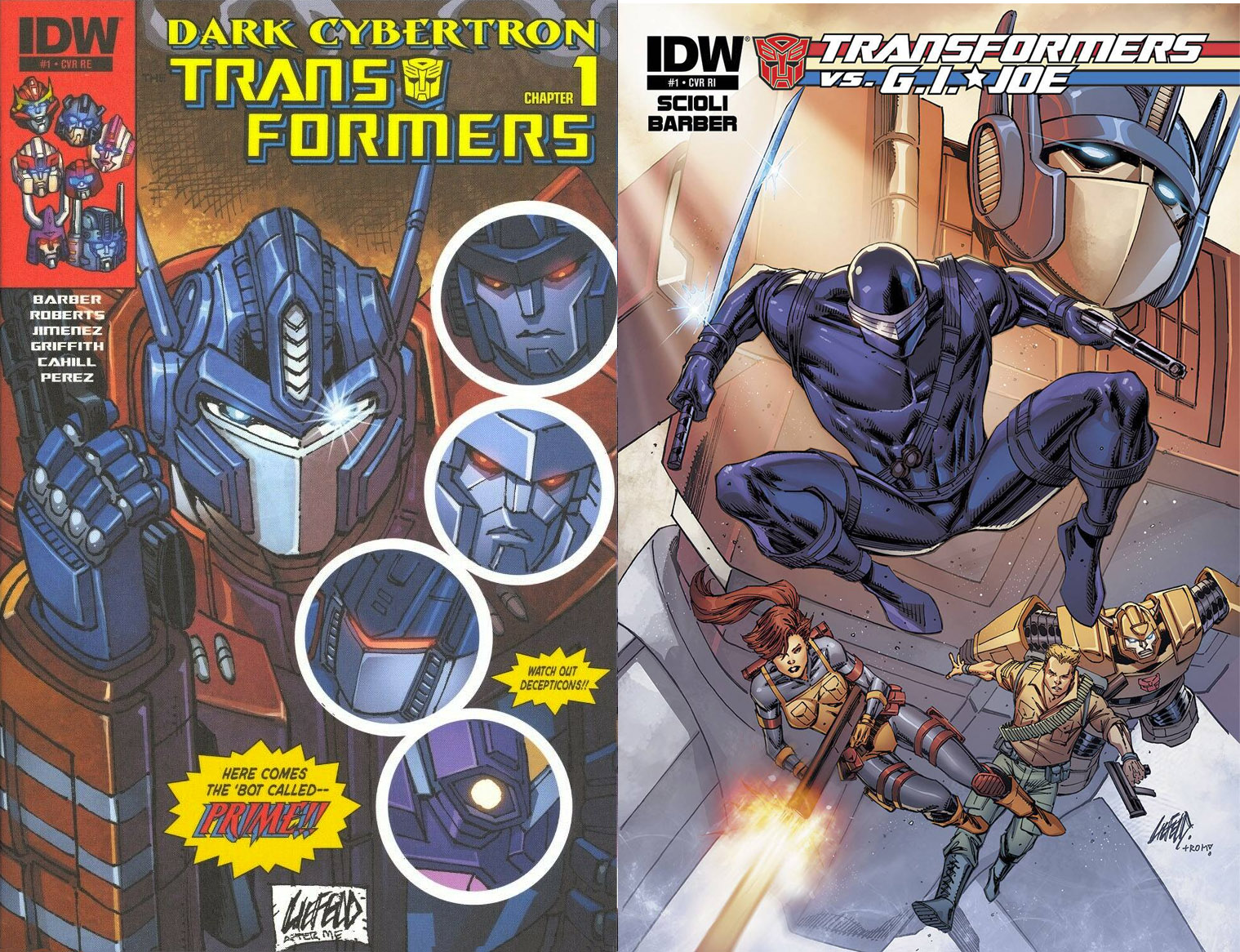
But even before Snake-Eyes: Deadgame, Liefeld officially took on Hasbro characters. About six years ago, he drew two variant covers for IDW:
He loves G.I. Joe, he sells books, IDW is interested in extending the G.I. Joe brand, and there’s a Snake-Eyes movie coming out. It all makes sense. Lots of different types of people work on G.I. Joe. We’ve had professionals who don’t know much about G.I. Joe write and draw G.I. Joe, we’ve had novice pros who’ll take any work write and draw G.I. Joe, and even as early as 1992 we’ve had fans drawing G.I. Joe. The only surprise here is that it’s not just a cover or the prelude of some event, but an issue — a whole issue — and several of them, and that this is a licensed book. Jim Lee never drew Star Trek, you know? (Although Marc Silvestri did that one time.)
-THE ACTUAL COMIC-
A few folks’ initial reaction to the online 5-page preview was “Why is Thor in this?” Not Marvel’s Thor (or Erik Larsen’s Thor), just G.I. Joe-Liefeld-Thor. “Why is there any Thor in this?” Like the feet thing, I’m not interested in that as a potential problem for a Rob Liefeld G.I. Joe comic. G.I. Joe comics have ninja who slow their heart rates so that they appear dead and Australian bikers who invade the mindscapes of captive Joes to plant hypnotic suggestions. An ancient weapon belonging to a god isn’t much of a stretch. So let’s just get to Thor and Bad Guy on the first page of this first issue, click to enlarge image:

Where I do have challenges with this premiere outing is in the pacing. Out of 27 pages, there are:
-four splash pages
-one double splash page
-let’s say five pages where one dominant panel acts like a splash to the near-exclusion of the other panels on that page, what you might call a two-thirds splash
Liefeld has a lot of story and character he’s trying to fit in: six Joes, one pet, two immortals, one MacGuffin, and a dozen troop-builder/fodder types. If he continually draws big, splashy panels, will there be enough real estate to fit in all of these elements and give them their due? I’ll give Liefeld credit in one category of fitting-in-stuff, and that is “location.” Besides variations like basic inside-this-room and outside-that building, this all takes place in one location. Although there is “time,” with the location then and the location now.
STEAM AND PRIORITIES
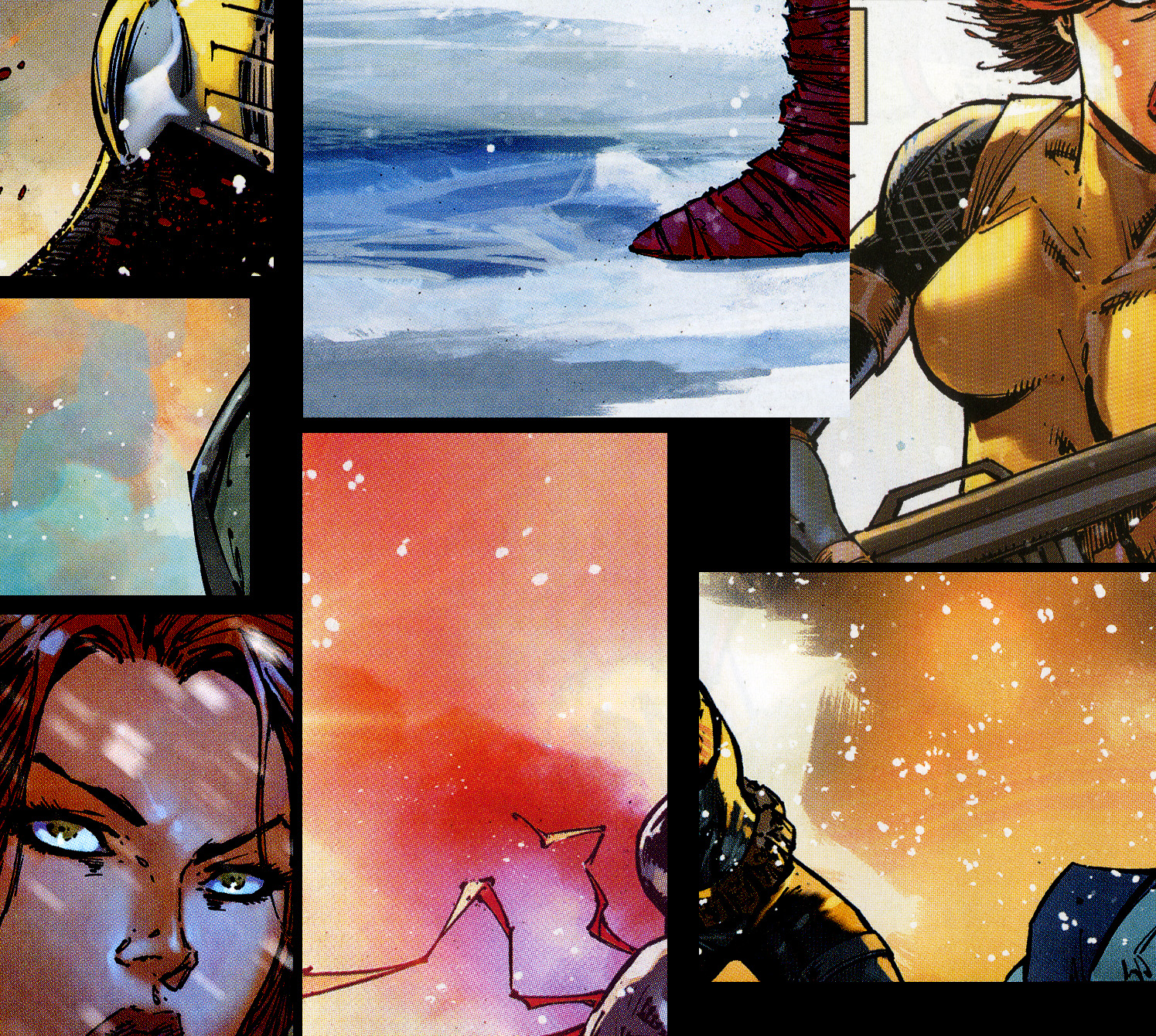
Whether creating a solo book or a team book, there are always a few panels and entire pages in a Rob Liefeld comic where it looks like Liefeld runs out of steam. Sometimes they are quiet moments, which isn’t too surprising, since quiet moments in comics aren’t particularly sexy. Here’s a panel from Deadgame #1, click to enlarge image.

That doorway has little dimension, Roadblock has no neck, and considering that Roadblock is warning his pal to “be ready,” their poses sure don’t communicate readiness. Rather, these two men stand as if there is no danger, as if they know who’s emerging. (Maybe they read the script.) Colorist Federico Blee makes the odd choice to color in Mystery Guy a textured green, like he’s glowing or behind smoke. Neither is the case.
But besides this one panel where Liefeld runs out of steam, there’s something else going on here, or not going on here. Read the whole page and the following one, click to enlarge image:

In terms of story and character, Liefeld introduces elements but doesn’t back them up with drama or motive. When Tripwire, Snake-Eyes, and Roadblock free Mystery Guy from that… Mystery Building (high atop some snowy mountains), a full-page reveal shows us it’s Joe Colton, the (1960s) original Joe. This would be really exciting, except that Joe Colton shows up For The First Time!!! in lots of other Real American Hero stories, like G.I. Joe issue #86 in 1989 and the Retaliation film in 2013. So bridging the generations here isn’t the fan thrill that I assume writer Liefeld and scripter Chad Bowers hoped it would be.
More importantly, I’m unsure if Colton has been here a long time. Was he in a jail cell? Is he skinny from lack of food? Blood stains and torn shirt from being interrogated? Was there magic or super science involved? Liefeld doesn’t show us the room/vault/cell. I can’t tell how deep it is, or how bright or dark. There aren’t any props, like a bench and a toilet and a bowl of food, or chains hanging from the wall and a mystical brazier. Liefeld aims the “camera” up, so either he doesn’t know where Colton has been, or he didn’t think to show us. This is important comics storytelling information that we need.
Further, Roadblock is pleasantly surprised that Colton is free. Great! But specifically, how am I supposed to feel? Colton looks the same age as everyone in super-hero/action comics, that uber-age of 20-35. Was he de-aged or kept from aging? (Don’t laugh — we did meet a Norse god eight pages ago.) He’s got a twelve o’clock shadow. I can grow a beard in three weeks. Was Colton only imprisoned for one? Did he actually arrive there at the same time as them and come in from the back and they’re all coincidentally bumping into each other?
If you think I’m nitpicking, I disagree. All of these questions distract me from the story. They take me out of the reading experience. Some aren’t answered anywhere in this comic book. It’s a G.I. Joe issue #1 — of course I want to sink in and enjoy it! But that’s tough when Liefeld avoids depicting important concepts.
Here’s the third previous occasion in which Real American Hero characters met 1960s GI Joe, in Devil’s Due Press’ 2007 crossover with Transformers. It has a remarkably similar scene featuring, again, the original Joe Colton on a right-page reveal, click to enlarge image:
![]()
But in that case, writer Tim Seeley and artist Andrew Wildman make clear through dialogue, staging, and acting that Colton has been imprisoned and that this is a bad thing. Wildman includes a little texture to show what kind of jail cell it is on the outside and the inside.
But in Liefeld’s hands, Colton looks just fine, so I’m not worried about him, so I don’t care that he was imprisoned, if he was even imprisoned at all.
Okay, to be fair to Liefeld and Bowers, on the page following Liefeld’s big splash of Colton rushing out, he explains he doesn’t know who grabbed him, and that he’s been captive for perhaps a month. So some of my questions from above are indeed answered. But again, Colton doesn’t look like he’s been prisoner for a month, he looks like he’s been prisoner for an hour. On the plus side, there’s a crafty bit here as Colton explains how he manipulated Snake-Eyes to get to this place, but on the minus side Liefeld still avoids depicting any backgrounds, the fourth character is this scene isn’t shown (Did he walk away? Teleport out? Is he just three feet out of view in all five panels?), and again, nothing about Colton’s costume or body language shows me anything about his captivity. I still don’t see into his cell, much less its doorway, and any sense that we’re even in a hallway is lost. (I’m not scanning this page, so you’ll have to imagine some talking heads and a waist-up shot of Snake-Eyes leaning forward with fists clenched, decent body language for the moment.) Roadblock’s dialogue does tell me something vague, that Colton isn’t in great shape. But here the writing and the art don’t match, and neither provides enough.
PRIORITIES: TINY “GREEN” MEN
Here’s something much less important, but equally distracting.
At this point, you might wonder if scripter Chad Bowers is adding much. Bowers worked on that Deadpool OGN and added some neat bonus material to an IDW G.I. Joe miniseries last year, so he’s a fine fit for this project. But Liefeld comes up with a story, draws it, and hands it off for dialogue, for specificity. Bowers can add some specificity, but if Liefeld doesn’t know anything about Colton’s captivity, there’s little for Bowers to work with.
This is one of several places where a firmer editorial hand would benefit the project. John Barber has crafted dozens of stunningly memorable comics with Hasbro characters for IDW Publishing, and I was happy to see him go from freelancer to Editor in Chief, but I get the sense that one doesn’t edit Rob Liefeld as much as say “We have received your pages.” This is not the intertwined back and forth of Barber’s relationship with Tom Scioli, which merited dozens of pages of annotations when these two guys handled Joes and Cobras and Autobots and Decepticons all together.
Back to Deadgame #1, let’s look at this one again. Click on it to embiggen. Go ahead.
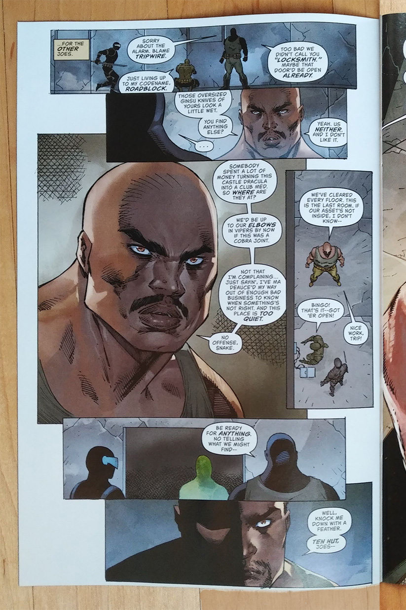
In panel 1 I see three Joes treated equally — small, mostly silhouetted. Roadblock calls out Tripwire. But I can’t tell which one that is. Maybe he’s off panel, a few feet to the right. Maybe he’s back at base. Okay, the dialogue indicates that’s Tripwire kneeling at the door. Great! And he’s doing a Tripwire-thing: he’s deactivating a booby trap or something. When Tripwire finally gets more dialogue in panel 4, Liefeld still keeps the “camera” far away, as if he doesn’t want to actually draw the guy. I really need to see something that spells out visually that this is Tripwire, like his green jumpsuit with gloves, or his recognizable backpack (if we’re seeing him from behind), or, I dunno, his face?
This is the entirety of Tripwire’s appearances in this comic book, click to enlarge:

Yes, he gets a little dialogue, and Roadblock does call him by name, so the script tells me he’s here. But the art, the storytelling, go out of their way not to. I sorta wonder if Rob Liefeld definitely drew Roadblock and definitely drew Snake-Eyes into this scene, along with Some Third Guy, and Chad Bowers thought “Oh, I should make this a specific character!” I appreciate that effort, I guess, but you could fit a lot more Tripwire into this scene if the giant Roadblock head-and-shoulders in panel 3 were diminished, so either Liefeld doesn’t know what he’s doing as a visual storyteller or he’s being too lax with that skill set.
Liefeld and other “hot” artists from the ’90s are known for treating comics pages more like comics covers, where the characters tend to face out to the reader. This made the comics sexier, pulled in casual browsers faster, and increased the sale value of the original art. No one purchases that interior page of Batman where Batman doesn’t appear, and it’s just Commissioner Gordon’s new beat cop knocking on the apartment door of a witness, shown from behind. Who’s going to buy a page that’s mostly background? But such a scene of people in a hallway could be awfully dramatic. This Deadgame page seems to be about how cool a big drawing of Roadblock’s head and shoulders is, to the exclusion of the important beats that Tripwire is doing something key for the scene and the fact that Tripwire is in the scene.
Colorist Blee doesn’t help by making Tripwire’s green so similar to Snake-Eyes’ grey. I don’t need bright green for the guy wearing green and deep black for the guy in black, and the lighting in this scene does properly dull out the colors, but throw a guy a bone, click to enlarge:

Color can be subjective (an all red panel for someone angry) and light sources can be cheated (that rim light adding dimension to Roadblock’s head on this page), so there should be lots of ways, color and art and storytelling, to establish and re-establish that that is Tripwire kneeling in this scene.
MORE RUNNING OUT OF STEAM
Rob Liefeld doesn’t just run out of steam now and then when drawing quiet scenes. He does so for the entirety of fight scenes. Check out pages 4 and 5, the start and finish of a melee, click to enlarge:

Liefeld has always employed assistants. Usually they get credit (like here, Adelso Corona), and sometimes they don’t (1991’s X-Force #5). I can’t help but look at these two pages and think that Liefeld loosely broke them down and handed them off. Fight scenes in comics, in G.I. Joe comics, can be dynamic. They can be too in Liefeld’s work. These aren’t. More importantly, they don’t take advantage of black ink or shadow as a design element. This looks like a fight scene Liefeld had to draw, rather than him coming up with the coolest poses and choreography possible. This is what we’re paying for, right? Snake-Eyes unleashed? The two comparisons below aren’t ideal, but in the interest of keeping my research for this blog post to a minimum, I’m going to use two examples that fell in my lap in the last seven days while randomly reading old comics I was about to give away. (No slight against them, I often give away comics.)
The first is from 1992, just as Liefeld was leaving Marvel for greener pastures. It features Liefeld’s signature character, Cable, and is penciled by John Romita, Jr., (can I stop reminding you to click to enlarge? All pics here and below, click to enlarge):

Interestingly, JRJR is bulking up these Liefeld characters to Liefeldian proportions. Again, this isn’t actually a fight page of silhouettes, but there’s depth and excitement in those black shapes in panel 1. And look how carefully JRJR tracks this team through this interior. They’re moving from the doorway they made, down the hallway, around the corner, to those bad guys. But where’s Snake-Eyes going in Liefeld’s blue-tinted interior? If the Joes’ ninja commando has traversed any of this space, it’s not clear.
If you draw a hallway that’s the same on one end as the other, and you rely on your colorist to create the backgrounds, there’s nothing to anchor your character to any point in the hallway.
Second example, coincidentally also penciled by Romita Jr., from four years earlier. By the way, I’m blanking out the narration so you focus on the space and movement.
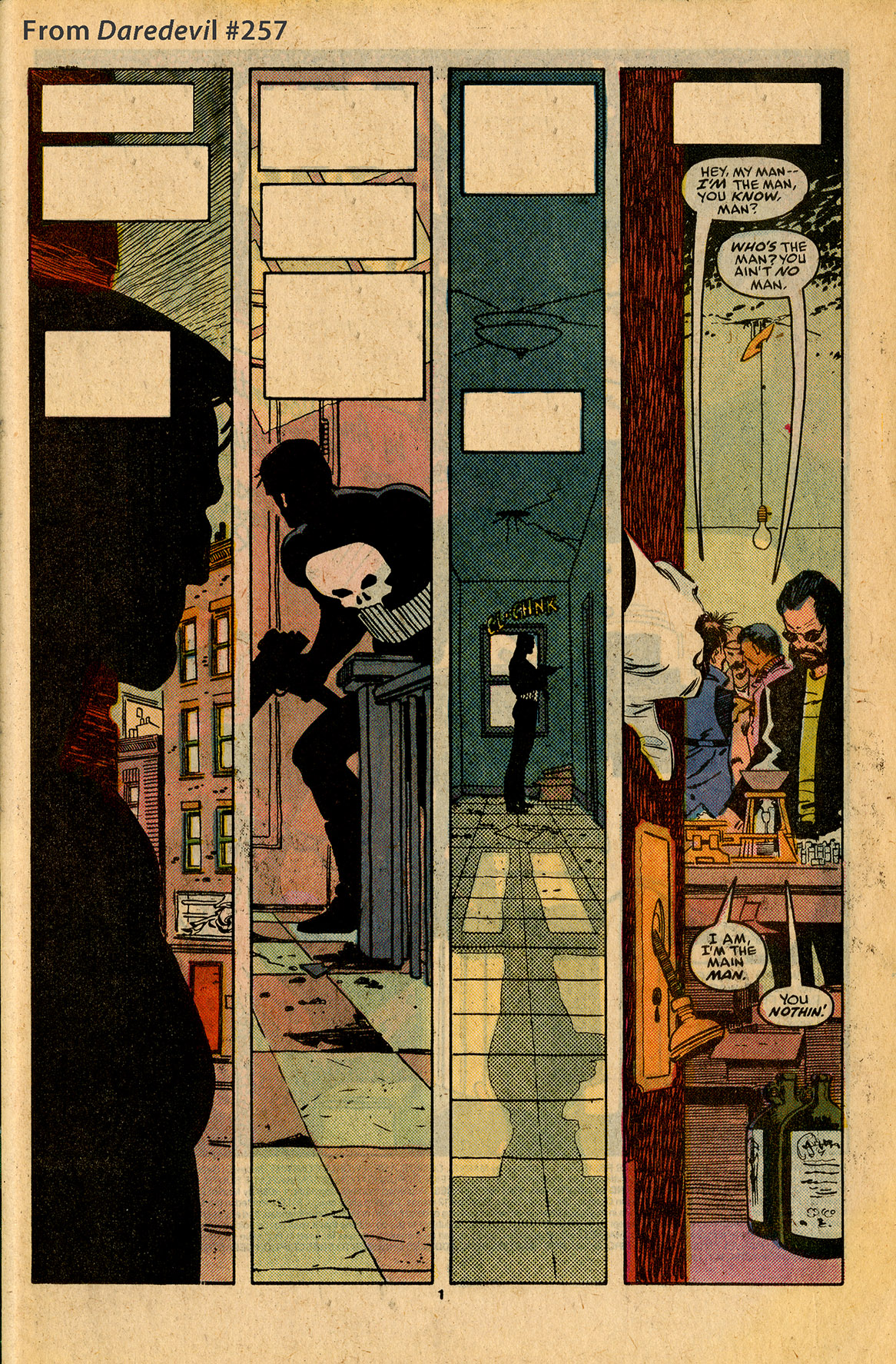
Geez, what a dramatic scene of people just talking in a hallway! Notice how JRJR establishes the building and its windows in panel 1. Then we see light coming through those windows or analogous skylights in panel 2 to show (not state — the Punisher doesn’t say “Now I’m inside the building) that the Punisher is now inside that building. His size changes from panels 1 to 3 — big, medium, small. Panel 3 reinforces the window both as an object to frame this bold silhouette, and also as a source for the Punisher’s shadow. And then the Punisher is barely in the final panel, but his hand connects him to the space and us back to him. And again, we see the door in 3, and we definitely see it in 4. This builds tension and anticipation. Boy, are we sure excited to see the Punisher blow away these bad guys on the next page! (And that’s exactly what happens.)
Look at how much storytelling, how much point of view, is in panel 4! So much with just a bit of hand and a sliver of door, and those four drug dealers are carefully placed in this tiny space. That is compositional design excellence! (See the triangle in panels 1 through 3 leading you to 4?)
But in Liefeld’s hands, what should be one of the coolest things in the whole comic, Snake-Eyes sword-fighting some bad guy soldiers, is a chore through which Liefeld must slog. This points to another challenge in reading a Rob Liefeld comic. All the fight scenes are cool and all the hero-getting-ready scenes are cool and all the villain-posturing scenes are cool, so whatever scene is supposed to be coolest competes with every other scene because they’re all cool. If every part of a song is loud, no one part stands out as the loudest. What makes a loud part even louder is coming after a quiet part. Contrast. Yes, there are calm talking scenes in Deadgame #1 that aren’t Snake-Eyes (or Thor!) fighting, but let’s jump to the end for a moment and look at the issue’s double-page spread:

This is a pretty standard, exciting, cool-pose moment of cool characters promising themselves and us that they’re going to be bad asses in the next issue. And I’m fine with that idea. Lots of comics in the last 20 years end with a single-page splash of the protagonist saying they’re going to go get the antagonist, or vice versa. And I’m fine with last-page splashes. But this is an awful lot of space to give over to this idea of being cool, and it’s pretty vague.
Once in 1992, a G.I. Joe comic had roughly this many characters lining up to promise each other (and me!!!) that they were going to go get that bad guy. They stand around, holding their weapons and looking angry. They are cool, but the anger is more important. Penciller Ron Garney pulled it off in one modest panel:

This is a quiet moment that feels bigger than it is. They’re simmering. The panel is no bigger than it needs to be. In Liefeld’s hands, to go back to this music analogy, the song he recorded is quiet and he’s turned up the playback volume all the way, so Scarlett, Snake-Eyes, Roadblock, and Joe Colton are loud in a false sort of way. I’m hearing the noise floor and distortion through the stereo speakers. The format (two-page spread) doesn’t at all fit the moment (let’s go get that bad guy), even if Comic Book Logic dictates that comics should end on a cool splash. They shouldn’t always.
LOCATION
Let’s go back to location and establishing a sense of space. If that Cable example above didn’t quite work for you, here’s a different one from that same comic. Don’t forget you can click to enlarge:

Again, think of Snake-Eyes standing in the middle of a glowing, blue hallway. It’s not clear if he starts on one end and gets to the other, of if the fight stops him halfway, or if he started halfway and stayed there the entire time. Here’s how much physical movement John Romita, Jr puts into his scene:

Now you could say that it’s not a fair comparison because Fabian Nicieza’s Cable script calls for Domino to climb down and swim, and clamber up and swim back, whereas Snake-Eyes is just fighting in a hallway. But he’s a ninja commando, and Liefeld entirely concepted this scene. There’s no reason Snake-Eyes can’t jump off the walls and swing from the ceiling, or again, just clearly end up in a different spot than where he started. But that word I typed into that final panel above, “Resolution,” that says a lot. The Cable scene is exciting because there is narrative closure. The story and action take me some place different from where I started. That’s not much on display with Liefeld’s Snake-Eyes.
Let’s look at these three panels again:

Snake-Eyes is next to… computer screens? Windows with blinds? Well, they can’t be windows, because the building doesn’t have any in panel 1. And if they’re computer screens, then… why? The story starts in ancient times with magic (Thor, Mjornir, an immortal dead villain), and this scene takes in a stone structure atop a mountain in Norway. This seems to be about magic, rather than technology.
So Liefeld’s strength is not in tracking physical space. Let’s flip back to page two, an exciting splash:

What’s Snake-Eyes jumping out of? A quonset hut? A massive land tank? An airship? The narration doesn’t tell us, and Liefeld doesn’t show us. Is Snake-Eyes high up in the air? This… transport plane[?] isn’t shown on the previous page or the next.
I don’t think Liefeld writes a script before he starts drawing. That’s totally fine. One well-known G.I. Joe writer only writes page 2 after he’s concepted page 1, and makes up the whole issue as he goes along. And to use another Image founder example, Todd McFarlane would draw half an issue of Spawn and then put the pages on the floor and re-arrange them. That is the creative process and I totally dig that. But I don’t get the sense that Liefeld even asks half the questions that this script, that any script, would suggest — How long was Joe Colton locked up? What are the characteristics of this mountain-top “base” that Snake-Eyes is infiltrating?
Here’s the thing. For all the weirdness, I actually like how Rob Liefeld draws. I spent a long time despising it, but kinda like Gail Simone says, I can’t not look at it. Liefeld would benefit from working off a more structurally rigorous scripter’s material. And absolutely he needs to work off someone else’s layouts. I would be awfully excited if this comic had a stronger narrative and carefully designed visuals, and Liefeld could go to town within that framework. But a little like no one saying “no” to George Lucas for three whole movies, a Rob Liefeld comic book is never more than the sum of its parts. When left to his own devices, it’s clear that he’s most interested in drawing the most dramatic half of this comic book, which is some of the fight scenes and (most of) a page like this:

Yes, that big panel of Snake-Eyes running, that’s keeping Liefeld’s interest. That important… two-star general[???] in panel 2 that Liefeld clearly didn’t care about? Well, that says it all.
By the way, this page comes right after that splash you just saw of Snake-Eyes jumping out of something. So I guess he jumped out of a vehicle in the air with no parachute and skidded safely to a stop on the incline of this lower mountain. Or he jumped from a little building on a higher mountain that overhung this one. Either is fine from a story perspective, since Snake-Eyes’ abilities are super-heroic. But neither is presented visually.
Also, I think that’s a duffel bag in panel 1 just above. We never see that again. Snake-Eyes doesn’t take it with him. We don’t see him bury it, like paratroopers do with their chutes.
RAAAAAANNGE
Rob Liefeld has a narrow range, and my biggest problem with his comics is that he doesn’t do his best work within such confines, even as he’s picking and choosing his projects. Yes, this is only the first issue and there are four more to go, but there is so much dimensionality and potential to this short list of attributes: Snake-Eyes, immortal villain, Roadblock, ancient Norse killer god, imprisoned Joe Colton, and yet what I experience in issue #1 of Snake-Eyes: Deadgame takes no advantage of them. For a $5 book, it’s a lot to ask of a reader.
And just as I’m not interested in Liefeld’s feet as a problem, I’m not interested in his pistols and machine guns as a criticism either. Rob Liefeld has never been known for using photo reference. When a 1969 Ford Mustang Mach 1 Fastback shows up in Real American Hero issue #88, cover dated July 1989, of course it’s important to the story that such a specific automobile is present and that it’s drawn correctly. But no one’s ever bought a Rob Liefeld comic thinking “he’s going to draw such a realistic M-16!!!!” This isn’t The ‘Nam, you know?

I don’t mind that Liefeld can’t draw an accurate firearm. I mind that he doesn’t try. He’s not using all the tools in the toolkit of comics. The specific cars that show up in G.I. Joe #35 and #88 are part of the story — Clutch and Rock n’ Roll love cars and impress the kid at the pump. The Americans at the border are entitled jerks and their Mustang is a representation of that. Those ideas enhance the characters and move the story ahead. But Liefeld has never drawn a specific car in a comic book. Again, that’s okay. Automobiles are tough and some artists reasonably avoid their weaknesses. Mike Mignola doesn’t want to draw cluttered cities and buildings in complicated linear perspective, so Hellboy is always in the countryside or a catacomb, mostly at night or in shadow, with optical perspective. But those churches and tombs sure are engrossing. From vehicles to weaponry to landmark buildings to styles of footwear, Rob Liefeld has almost never drawn anything that is specific.
This points to something larger. His range is shockingly narrow. His entire oeuvre is a kind of shorthand. He doesn’t make crime comics, or historical fiction, or autobio (except for that charming three-pager where he proposed to his now-wife). He only makes action comics, and the action in them is repetitive. It’s a little like a teenage garage punk band. The songs are of course all three chords, but they’re also all two minutes, and the lyrics are all about yelling at the principal. In this regard, a G.I. Joe miniseries is likely a missed opportunity. I write “likely” because I might be surprised in the remaining four issues, but I’ve never been surprised by a Rob Liefeld comic. Okay, that’s not true. I’ve been surprised twice, but that was 1991 and 1992 – the Stryfe reveal in the New Mutants finale, and the Youngblood guy killing “Saddam Hussein” by telekinetically exploding his head.
Rob! It’s been a long time! Surprise me!
But that might be a tall order. I mean, Liefeld doesn’t even track Snake-Eyes’ costume from one page to the next. Which is rather low-hanging fruit. And everyone involved in this should have caught it:

Left page: Snake-Eyes holding one sword. Single strap on his thighs.
Right page: Snake-Eyes holding two swords. Double strap on his thighs.
That’s not a training montage that takes place over days. That’s Snake-Eyes stabbing that guy, striking a pose, looking down the hall[?], standing up, and then taking off down that hall. All sequential, one moment after the other.
-WHAT’S AWESOME and IN CONCLUSION-
There’s a lot to like about Snake-Eyes: Deadgame. I’ll point out two attributes.
1) Federico Blee’s stunning colors. Oh, if all G.I. Joe comics could look this good. What a gorgeous sense of light. Some local color, yes, but scenes depict time of day and colored light. Gradients and highlights enhance, but don’t distract. Liefeld has long benefited from striking and talented colorists who add dimension and spice to his work, from Kiko Taganashi in the early days of Youngblood to Romulo Fajardo, Jr. on those latter day Deadpool graphic novels. Blee is no exception, and if he’s not getting top rate now, I don’t think it’s long before he will, whether that’s on a future Liefeld project or not. My one complaint about Tripwire’s green being too grey is insignificant compared to the gorgeous and thoughtful work Blee puts on display here.

2) That this miniseries even exists. This is the point I wanted to make in the opening paragraph, but I needed to wade through everything else. This comic is a miracle. G.I. Joe as a brand has been in a tough spot for five years. Movie 3 in development hell, toys canceled for awhile, the official fan convention yanked, and yet IDW kept the fan base primed with its continuation of the Marvel “Real American Hero” continuity. But as importantly, IDW has rolled out non-Marvel takes, and in particular, has experimented with two different auteur miniseries: Tom Scioli’s grand Transformers Vs. G.I. Joe, and Michel Fiffe’s valiant-effort Sierra Muerte.
It doesn’t matter if you liked these or not. That they were published was a daring move on Hasbro and IDW’s part, and a vote of confidence in all that is G.I. Joe, that G.I. Joe is big enough and can be varied enough to sustain such visions. This is something reserved for a few historically established characters or brands like Batman — Pick a name writer/artist creator and let them do whatever they want. It might be an “Elseworlds” story, or it might match “current” continuity if you care for that sort of thing, or it might very much not. Up until recently, G.I. Joe didn’t have that. I wish the monthly “Real American Hero” series was a prestige series. Let’s be honest. It’s not. It’s a sleeper and a workhorse. It’s monthly Batman, but it’s not Batman: White Knight. Say what you will about Rob Liefeld, but that he wants to draw a G.I. Joe miniseries and that IDW is excited to let him is a revelation.

Great article! I love how you break down the storytelling skills of the different pencillers. Thank you for puting all this effort into explaining the techniques. Much appreciated, I look forward to your next review.
Thanks, Brian. At this rate, that would be “Real American Hero” #300!
Oy veh.
I’m neutral on Liefield as a whole. Some of his covers are decent and as a person he’s interesting. But this Snake-Eyes book is terrible. The energy he puts in his covers doesn’t translate into his page work. The story is all over the place. I’m glad someone high profile is doing GI Joe. Maybe Marvel will get it back. I don’t think the Hama stories have been very good either. I don’t need a superstar artist but I’d like one that can draw guns and vehicles.