In Part 1, I offered some context for the new G.I. Joe 40th Anniversary Special via a trio of Marvel Comics “Tribute” issues wherein top artists of today each redrew a page from a classic Marvel story. I started making an analogy that comics like these resemble popular song remakes. I’m going to return to that analogy later, but since the selling point of this new G.I. Joe work is each new artists’ take, and the ability to see this story anew, first thought I would riff on each page.
Continue readingTag Archives: Silent Interlude
Silent Interlude Redux: a Review of the G.I. Joe 40th Anniversary Special, Part 2
Filed under Comics Reviews, Reading comics
Silent Interlude Redux: a Review of the G.I. Joe 40th Anniversary Special, Part 1
I can’t write about this week’s double-sized G.I. Joe comic book special without first looking back a few years at something similar published not by IDW, but by the House of Ideas. In 2020 and 2021, Marvel Comics created a precedent with a trio of oversized remake comics. These were Fantastic Four Anniversary Tribute #1 (that premiere issue plus the wedding of Sue and Reed from FF Annual #3), Captain America Anniversary Tribute #1 (Cap’s origin/Red Skull’s debut from 1941’s Captain America Comics #1 plus Cap’s return in Avengers #4) and Giant Size X-Men Tribute #1, a double-sized redo of just that original issue from 1975). But these weren’t reprints.
Continue readingFiled under Comics Reviews
Hub Comics in the news

Photo by Jamie Meditz
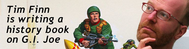
Not much touted here is the fact that I own a comic book store. It’s a recent development, and with our renovations still ongoing (shelves, paint, lights, awning, website), it’s a little harder to blog and write. On the plus side, our customers always have IDW’s full line of G.I. Joe comics and graphic novels to choose from. Both myself and the store are in this week’s issue of DigBoston, a free arts and nightlife newspaper, and I manage to give some attention to Real American Hero.

 A longer version should be online in a week. Thanks to interviewer Corey Estlund, photographer Jamie Meditz, and art director Scott Murray for the kind coverage.
Filed under Back issues, Hub Comics, Reading comics
