
Congrats to the creative and editorial team on issue #1 of IDW Publishing’s G.I. Joe: Saturday Morning Adventures. It is so much fun, and pitch perfect. Kudos to Burnham, Schoening, and Delgado for completely capturing the look and feel of the ’80s cartoon. Also a tip of the hat to Uyetake that the lettering font is different from the monthly Real American Hero, to subtly differentiate it.
Burnham efficiently jumps right into the story (as with Destro arriving at the start of the very first episode of G.I. Joe — Cobra Commander immediately has the thing in his possession!) with Cobra Commander holding the object of power on page 1. And Burnham picks a fun story motivator here with a wish-granting genie of the lamp. This is a trope found in other ’80s cartoons, and it fits in here, a G.I. Joe story that wasn’t, but could have been. The scale of it also works, as Cobra Commander starts simple, allowing for a heightening of stakes in the back half of the issue as well as presumably bigger and more complicated threats in issue #2.
But I have three quibbles. One, everyone knows that G.I. Joe was not a Saturday morning cartoon, right? It was a weekday cartoon. Certainly the dual 5-part miniseries of 1983 and ’84 align with a Monday through Friday “strip,” but Joe was not ordered in increments of 13. (Transformers did start as a weekend show for its first season — the opening 3-part miniseries plus 13 episodes.) The order for the full Season 1 for 1985 brought up Joe‘s tally to 65 episodes, again, a quantity for weekday syndication. Did the occasional local station run the show on Saturday or Sunday? Sure. Was this a part of the phenomenon of Saturday morning cartoons? No. “Saturday morning cartoons” tends to refer to the big three, NBC, ABC, and CBS, not syndicated programming, which was a reaction to that. I understand the naming choice, though, as “G.I. Joe Animated Adventures” is perhaps too general. But the animation historian in me can’t help but see a factual error in the title of this series.
(But nice work on the ’80s color and font treatment of the “Saturday Morning Adventures” banner. Another feather in Mr. Uyetake’s cap? That lettering is more He-Man-episode-title-card than I’d want for Joe, but if the goal of the cover is to show people what this is, Cover A is a big success.) And before I get to the other quibbles, I’ll focus a bit on the covers.
Cover A is nearly perfect. It recalls two previous animation tie-ins, the front of Kid Rhino’s 2003 “Two Original Mini-Series” DVD set (Cobra Commander’s face, front-on, on top, fire behind him, Joes below him comin’ atcha), as well as the sleeve art to Hasbro’s “M.A.S.S. Device” DVD Battles Pack (Cobra Commander looming over Joes also comin’ atcha). This new Schoening/Delgado piece acts like a poster for this story-as-animated miniseries. It’s general enough with a team of Joes not doing anything specific, with Cobra looming over them, but then with a key prop that does specifically connect to the Macguffin of this story. Where Cover A needs a small fix is in Flint’s pose. He’d fall forward with that leg placement.
Megan Huang’s cover B is nice, and while I do get “G.I. Joe animation”-in-general as a vibe, I don’t get “1980s Marvel/Sunbow G.I. Joe animation” enough from this, so I’d like Huang to split the difference between her style and the show style. Also, those vehicles don’t work. There aren’t any F-4s in Joeland, and that tank is too general. And if Cobra is riding a tank, it wouldn’t be green, so the story snags here, like for some reason the Baroness and Destro have commandeered a Joe tank? But a Joe tank from before the ’82 miniseries when the Joes had no specific tanks, like how Major Bludd pilots MiGs before Cobra gets Rattlers in “the M.A.S.S. Device”? Ideally Baroness and Destro would be on a HISS or a Stun. This is a fun drawing, but needs a revision at the sketch stage.
The Retailer Incentive cover (shops could order one copy for every 10 of A and/or B) is fun, but doesn’t quite live up to the promise of a home video box cover because the regular logo is slapped across the top. The three “stickers” and the VHS bit are left adrift as Penn’s home video cues are at odds with the standard comic book logo treatment. Stated another way, this cover should look more different from Covers A and B, whether that means more of a straight homage to the F.H.E. boxes or something else evocative of cassette sleeve design. I do like Billy Penn’s plastic shrinkwrap highlights at the top, but they’re somewhat lost around the logo. The shading, color, and composition of this give me more of a ’70s pulp novel vibe than an ’80s VHS box vibe.
Penn shared his three sketch ideas for this cover online and I must admit to finding that the two unused ones are bolder compositions, but C looks a lot like Dan Schoening’s published cover, and the one they went with is most different from both of the other actual, published covers, so I understand the choice. Click to enlarge.
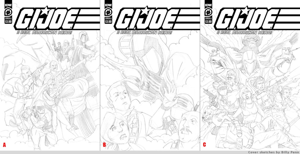
(This is not a blog post about Billy Penn, but if you missed the Talking Joe episode after he was our guest where I flashed back to laud his drawing skills, take a look at much he’s doing with so little in those characters and the lighting in “C,” above — this guy really knows how to draw, even if his finished style isn’t slick or hot.)
Getting back to my actual two other quibbles, these are small story moments either missing or not clearly shown, essentially a 4-panel page needing a fifth panel.
Which leads to Quibble Two: What is exploding on page 3? And where is it in the scene? Click to enlarge this, pages 2 and 3 side-by-side.
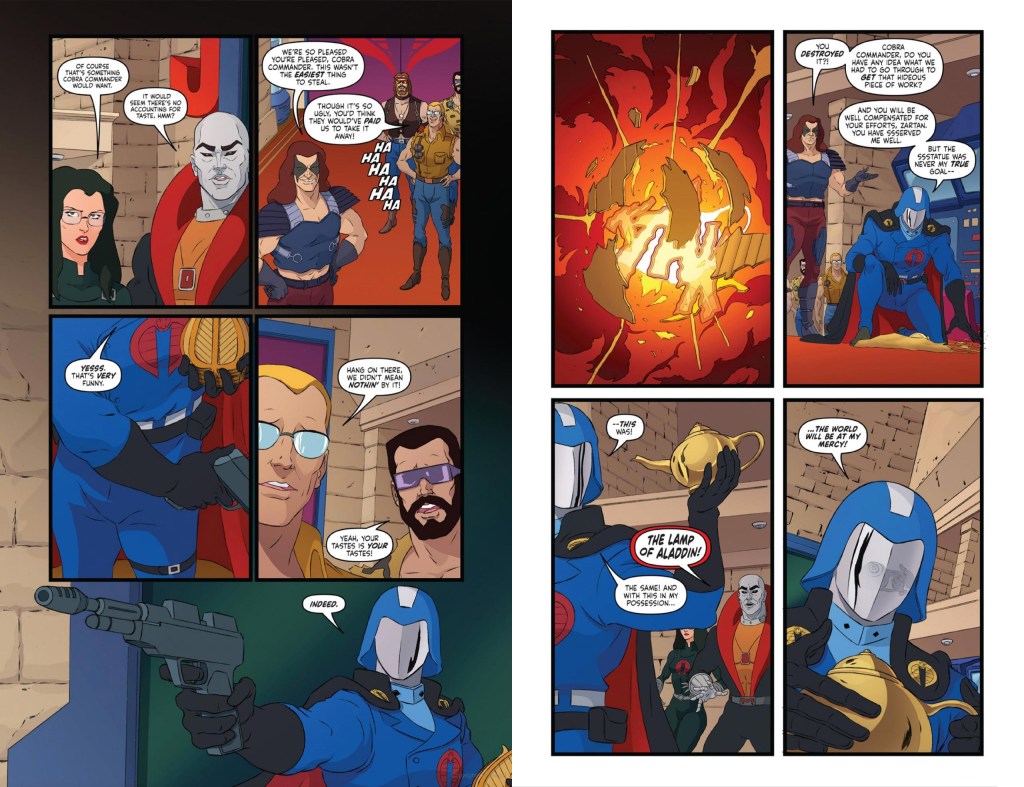
Cobra Commander is holding the artifact in his left hand, then cut to a close-up of something exploding (no laser beam shown), and then CC (without his pistol) is kneeling on the ground over debris that doesn’t look like the artifact. I was confused. Did the Commander toss up the artifact and shoot it? Was there a tiny bomb in it that detonated? Had he not been holding it on Page 2, had it instead been sitting on a pedestal in front of him, this would be clearer, but I don’t see when or how it leaves his hand, and it’s not clear that it is indeed the artifact that he’s shooting. Yes, story logic suggests and dialogue explains what is happening (“You destroyed it?” is doing a lot of heavy lifting here), but the art does not show the connective action. It actually looks like CC is going to shoot something else, something or someone across the room, certainly not the important item he’s almost cradling at the bottom of page 2. To use an animation term, the Commander’s pose at the bottom of page 2 offers no anticipation of him chucking a thing in front of himself.
I also note that the artifact is not big enough to actually hold the lamp, but no big deal there. I can pretend it was drawn 15% bigger.
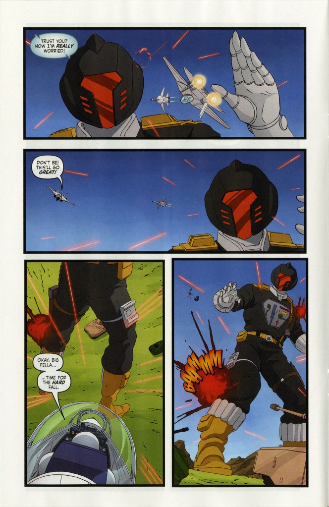
Quibble Three: That Ace and [something something] a Skystriker and the B.A.T. is oblique. Here it is, page 10. Read it, and then I’ll explain. Click to enlarge:
Did you miss it? Ace ejected and rammed his jet into the B.A.T. Here’s all of the real estate that the ejection gets:
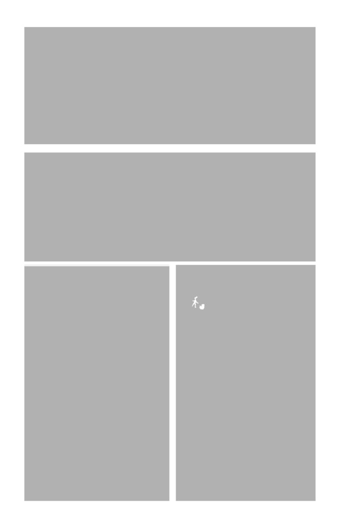
It’s almost impossible to see he’s so small, and I suspect that the wonderful Schoening lost the forest for the trees by… zooming in too much as he drew this on a computer?
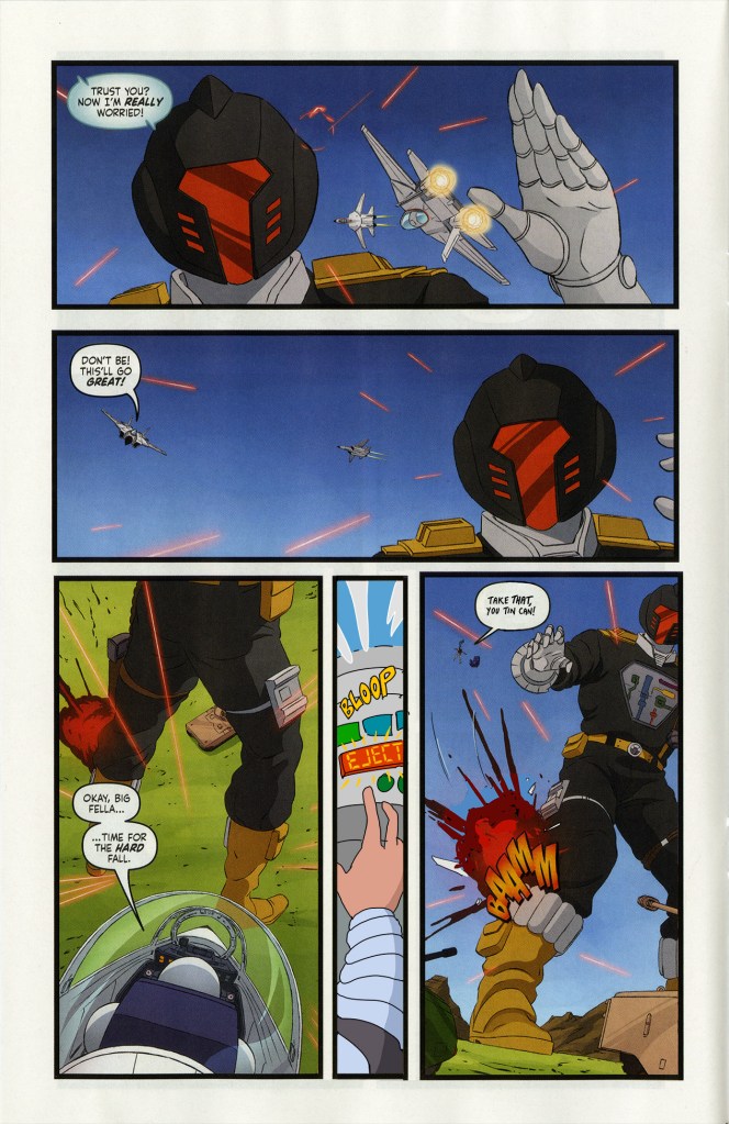
Okay, yes, it’s big and clear on the page that comes after, but above on page 10 the plane explosion doesn’t read as different from the missiles exploding in that same panel. Bigger, yes, but there’s no plane debris. Here’s a suggestion:
I added a panel, moved a sound effect, added a word balloon to draw some attention to the tiniest and most furthest-away Ace ever seen in a G.I. Joe comic, added a few speed lines, and drew a bit of debris to indicate where the Skystriker went.
It’s not that I have a problem with Ace losing Skystrikers, rather, that the action is unclear. You could swap out my finger-pushing-button panel for the cockpit bursting off, or Ace springing up in the air with a “Wha-hoo!,” just something to show Ace leaving the plane.
Again, the art is to be commended. Delgado’s backgrounds feel authentic with their soft gradients and everything in the right palette. And it’s not easy to capture the look of Russ Heath’s model sheets, which Schoening does so handsomely — and not just close, but with utter accuracy. The genie in particular is a fun design — something that didn’t exist, but that looks like it could have then and there. It’s too easy to take for granted that this would all look great — poses, faces, costumes, and backgrounds. Even the linework looks like hand-drawn pencil photocopied onto cel*. A Real American Hero #278 (a one-off issue from last year by regular writer Larry Hama that was drawn by Schoening and Delgado in a mostly animated style) proved that this all could be done, but that doesn’t make it any less hard.
I also appreciate Burnham’s pacing. This isn’t quite a 22-minute episode’s worth of dialogue and plot, but a 20- or 22-page comic book can’t actually capture that. 1992’s monthly Batman Adventures is tremendous, and I appreciate that each issue has three acts in an attempt to match the feel of an episode of the corresponding TV show, but those issues never felt like half-hour adventures — too short. Burnham somehow splits the difference with a cliffhanger. This isn’t a single “episode,” and that it’s a limited series offers something between the animated two-parter and five-parter.
Fun: I’m not sure where this falls in Season 1 or 2. Roadblock’s costume is S1, but B.A.T.s and Sci-Fi indicate S2. I can see this bothering some fans, but it’s 2022 and not 1980something, so the comic is all an approximation, a light amalgamation.
Also fun: Getting to see the B.A.T.’s action figure hand weapon attachment, which never showed up in the TV cartoon. Also, I pretended Sparks was in the big room.
More fun: Uyetake’s treatment of the “Yo, Joe!” call. I’d prefer these letters sticking out of a pointy word balloon with multiple tails aiming at several Joes, but that the letters get bigger left to right, that they’re big and friendly, and with the patriotic color fill, they are clear and fun.
A special call out to Mr. Burnham for the final page PSA, which struck the right balance of authentic and cheeky without being mocking or too modern. Everyone loves those “funny” internet remixed Public Service Announcements with the new dialogue from 2003, but I’m a grump, so I don’t. As a kid in 1985 I knew the authentic PSAs were a little too much, but they did offer helpful lessons. This new one-pager with Mainframe is just a little self-aware, and no more than it should be — a relief to this grump, and a small fist pump for nostalgia.
Oh, wait, am I not heeding Mainframe’s advice? Ha!
Two parting thoughts: The next issue box reveals a title for issue #2, but we don’t know what the story title was for this premiere outing because IDW doesn’t print story titles on inside front cover credits pages. Also, could we get something a little different for the back cover instead of the same black-nothing/logo from the last three years of ARAH? The cover art sans color, perhaps? (That request also applies to the main ARAH book.)
Despite my quibbles and extra quibbles, this is a fun issue that works both for this hard-to-please comic reader, as well as lapsed fans, and pop culture generalists. I laughed aloud when I saw it announced and listed in catalogs a few months back, beamed when we unpacked it at my shop this week, and smiled more over each page as I read it yesterday morning.
More, please!
And I don’t mean “I can’t wait to read the rest of the miniseries,” I mean “Please publish more than four issues!”
——
* – “Cel,” above, is indeed the correct spelling. Two L’s is for jails, phones, and microscopic bits of us.

Great write up Tim! – Mark
As always, I appreciate your thorough analysis and constructive criticism Tim!