Tag Archives: G.I. Joe cartoon
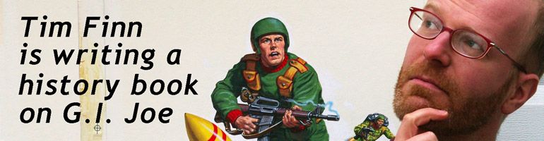
“G.I. Joe: Saturday Morning Adventures” issue #1 – The Real American Book! review
Filed under Comics Reviews
G.I. Joe Animation Art – “The Wrong Stuff”

As much as I love G.I. Joe toys and comics, I was a fan of the animation first. I went to school for animation, and teach it, and the Sunbow/Marvel G.I. Joe (along with Transformers) are my top shows. Vivid color, strong animation, smart writing, superb sound design, stellar music, and top-notch voice acting bring me back to these two series again and again. They’re charming. And their strengths are such that I can blissfully ignore their many flaws, like the ease with which a squad of Joes flies into space in F-14 jets, or return via parachute.
But Flint Dille and Stanley Ralph Ross’ “The Wrong Stuff,” for all its silliness, is one of the series’ best episodes. One day I’ll write a long post about it, but in a word, it’s funny. So let’s celebrate that fun with an original production cel and background of Wild Bill in full astronaut regalia. Click for larger: Continue reading
Filed under Animation, G.I. Joe Behind the Scenes
I Was a Teenage Sunbow Intern – Pt 9

In our last episode, ([Part 1] [2] [3] [4] [5] [6] [7] [8]), Tim spent his first day reading materials for Brothers Flub, and soon accomplished his only art-related task of the whole summer.
The real work for production interns was filing paper and dubbing tapes. Let’s start with the former.
Every morning from the Los Angeles office we received a large FedEx box, the size that holds 10 reams of copy paper. In it were photocopies of scripts, storyboards, character designs, background designs, and prop designs for Brother Flub. This was before e-mail attachments of any reasonable size, and FTP sites, so this remarkably inefficient method was the most efficient way to get these materials across the country. And they needed to be filed. Ostensibly producers Randy and Tammy were reviewing them all, but either they had already seen earlier versions, or that’s one of those jobs that no one does even though on paper it’s part of the job. Again, this was thousands of sheets of paper per day.
So I or one of the other interns would slide this very heavy box (sometimes there were two) over to the oversized beige metal filing drawers, pull open the Brothers Flub folders, and file away all this paper. There were folders for each category, for each episode. And much of the paper – storyboards and models particularly – was 8.5 x 14 inches, bigger than standard letter-sized paper. It was brainless, but exactly the kind of task someone is obliquely referring to when he or she says to you that your internship or production assistant (read: gopher) job will be a learning experience even if you don’t do anything important. Because you will observe things, overhear things, and become familiar with processes that make up the everyday at a company. And you will see physical objects up close you would not have otherwise.
So it was for me. Model sheets for costume changes of the main characters. Model sheets for props or anything that moved in the episode, like the shape of the tear a finger made poking through a newspaper. And teleplay scripts, with minimal stage direction, and names and dialogue centered on each page.
And of course there were folders for shows besides Brothers Flub. There were many for Salty’s Lighthouse, the other show in-production (and on-air at that time, I think), and there were many for The Tick, one of the last shows Sunbow had worked on prior. But the real teases were the folders for the older shows: G.I. Joe, Transformers, Visionaries, My Little Pony. (Also, shows I didn’t care about, like Conan the Adventurer.)
Sadly, those folders had very little of interest. At one point, years earlier, they would have had everything. Every script, every design. Not color cels and backgrounds, of course – those (mostly) stayed in the Orient, but many contour images on white paper. And a single half-hour of animation generates of lot of that over its six months of production. By the time I got to Sunbow, the show folders mostly consisted of episode lists, writer lists, episode summaries, and the like. I recall a box under the desk in the dubbing room had transcripts of dozens of G.I. Joe episodes – transcripts, not scripts. In the UK, G.I. Joe aired as Action Force, so here I suppose British actors could redub the parts where the Joes yelled their “Yo, Joe!” battle cry with “Full Force!” I’ve never seen Action Force, so if there are any international readers out there, please leave a comment if this rings true.
I did find two fascinating G.I. Joe documents in those files, however.
What were they? Tune in next time to find out! [Click here for Part 10]
Filed under Prehistory
“The Rotten Egg” storyboards batch 6
Sorry for the delay! Back to blogging! Thanks to all the visitors who clicked here while I wasn’t posting.
Pages [1-5] [6-7C] [7D-10] [11-15] [16-19] [20-24] [24A-28]
More storyboards from writers Steve Mitchell and Barbara Petty’s “The Rotten Egg,” this time pages 20, 21, 22, 23, and 24. Sorry, I don’t know who boarded these, but when I do I’ll update this sentence.


 Things will get a little more interesting with batch 7 when the final animation deviates a little from the storyboard.
Filed under Animation, G.I. Joe Behind the Scenes
Sunbow Productions memos

In the 1980s Sunbow Productions, based in New York but with an office in Los Angeles, oversaw production of the animated G.I. Joe cartoon. Because the show was so intensive — dozens of characters, props, vehicles, and locations, the show bible and “briefing books” were by necessity large three-ring binders filled with photocopies of model sheets, sample dialogue, photos of toys, and lists of names. All in an effort to properly and correctly feature and advertise Hasbro’s product. Today’s post is two photocopies of memos to the west coast producers and story editors, likely from Terri Gruskin in NY.

You may find posts like this — without artwork, or imagery of characters or people — to be dry. But I find such documents fascinating. In this case because it’s a reminder that the whole process was a series of revisions and rolling changes. And even though the memo is unsigned, it’s a concrete document showing a decision being made, and representing the dissemination of that decision.
Also, mid ’84 appears to be when Tomax and Xamot’s names were finalized. (Without Hasbro documents it would be unfair to call this definitive, but presumably there wasn’t a lag between the decision in Pawtucket and the directive in Los Angeles.) It’s notable that the TV ad for Marvel Comics’ G.I. Joe issue #37 (printed in spring 1985, but the ad was in the works 6 to 12 months prior) refers to them only as “evil twin brothers,” so their names were in flux while (presumably) Legal cleared them.
Filed under Animation, G.I. Joe Behind the Scenes
Russ Heath – Primord Chief

In this Ted Pedersen-written episode of G.I. Joe from 1985, “Satellite Down,” the Joes track a lost satellite to somewhere in an “unexplored region” of Africa. There they meet a tribe of primitives called Primords, who worship the satellite as a god. And Storm Shadow and Spirit fight!
Here’s Russ Heath’s original artwork (pencil on animation bond — I cropped out the punch holes) for one version, unused in the episode, for the Primord Chief.

The final design differs greatly from this drawing. In the episode, the chief is covered in body hair, has no loincloth, hood, or cape, and less face paint.

Filed under Animation, G.I. Joe Behind the Scenes
“Revenge of Cobra” 1984 Generic Joe II model sheet
 I don’t recall when this generic trooper (version two) appeared within the 1984 G.I. Joe animated miniseries, “The Revenge of Cobra,” (feel free to chime in in the comments), but here’s a little art of him. (Version one, not pictured in this post, is sans camo.) First up is a black and white photocopy of the model sheet, with cel paint color codes written in pencil.

And here’s the color model sheet — cel vinyl (like acrylic paint) on the back of an animation cel. Two or three of these were painted for every single character that appeared (standard for animation, not just the G.I. Joe production). One or two stayed in the States, and one or two went overseas with all the scripts, storyboards, and background keys to the animation studio that would produce the bulk of the show, in this case Toei in Japan.

This art is likely Russ Heath, since he’s the main designer credited on “Revenge,” but I should point out that eight other artists appear in the end credits of these five episodes. They did costume changes, props, and lesser background characters so there’s a chance one of them took a Heath drawing of Generic Joe version one and added a few details.
I don’t know if the term “greenshirts” came about in early Joe fandom, or in 2000 when Devil’s Due Press published its G.I. Joe comic book and canonized the term, but I’ve never liked the word (even though it’s wonderfully accurate) because it represents the animation’s misunderstanding of the Joe concept from almost year one. With generic soldiers running around in the background of every episode, G.I. Joe becomes a stand-in for the regular, larger armed forces, rather than Delta Force, (what it’s actually a stand-in for), akin to the A-Team or the Mission: Impossible folks. It’s not hundreds of men and women, it’s five or ten or 20 on smaller missions.
But seriously, I don’t recall when this guy shows up. Do you?
Filed under Animation, G.I. Joe Behind the Scenes
The Other Half of the Battle: “The Funhouse”
Continuing our look at key episodes of G.I. Joe (1983), G.I. Joe (1989), and GI Joe Extreme (1995)…
“The Funhouse”
original airdate 10/01/85
Written by Steve Mitchell and Barbara Petty
The plot in one sentence: Cobra kidnaps scientists and makes six Joes run the gauntlet of a deathtrap-filled funhouse.
Personal Trivia: I own a production animation cel and background from this episode. They’ll be in the book.
G.I. Joe Trivia: Steve Mitchell, co-writer of this episode, inked the covers to three issues of Marvel’s monthly G.I. Joe comic book. Before he got into writing and producing, Mitchell was an inker seen on many a Marvel and DC title, notably Norm Breyfogle’s Batman and Detective Comics runs.
Best thing about this episode: Dusty pops a balloon filled with gas and hallucinates. His reaction, and the character animation on this scene are great:

Worst thing about this episode that’s also kind of the best thing about this episode: This carnival barker Cobra Commander robot.

Best line:
Cobra Commander (from an overhead monitor): “Despite your rudeness, I offer you a sporting chance. Three doors, three choices. Two of them lead to dead ends.”
Flint: “What about the third one?”
Cobra Commander: “It leads to me.”
Alpine: “Then all the doors are losers.”
Worst example of one character finishing another’s sentence:
Lady Jaye: “I don’t know where we’re going–”
Air-Tight: “–But anywhere’s an improvement.”
Does it hold up? This episode is a strange one. It’s straightforward – Cobra, scientists, Joes, deathtraps – until you look carefully. It’s best not to think too hard about where and how Cobra comes up with its deathtraps, but the ones in “Funhouse” really beg some questions. Who built an indoor roller coaster in a Latin American step pyramid? Would Cobra Commander have been upset if all six Joes had taken one door and the other deathtraps had gone to waste? On the positive side, the character animation is so great, year one character (and discontinued action figure) Zap makes an appearance, the pacing is tight and the banter snappy, and there’s an explosion that looks suspiciously like a mushroom cloud. Not a good representation of the show at its most grounded, but definitely the pinnacle of the show’s balance of cool and zany.
![]()
I give it 5 out of 5 MacGuffins.
“The Rotten Egg” storyboards batch 2
Sorry for the lack of posts Friday.
Pages [1-5] [6-7C] [7D-10] [11-15] [16-19]
Continuing our look at the Season 2 episode “The Rotten Egg,” here are five more pages of storyboards, page 6, 7, 7A, 7B, and 7C.


Filed under Animation, G.I. Joe Behind the Scenes
“The Rotten Egg” storyboards batch 1

Sorry for the late post. Monday’s supposed to be art day, with Tuesday a reserve should Monday get swamped. Anyway, happy Wednesday!
Today we look at the first few pages of storyboards from the Steve Mitchell and Barbara Petty-written season 2 G.I. Joe episode “The Rotten Egg.”
This episode has a great premise, that Leatherneck’s old rival is now running a military academy, and invites him to graduation ceremonies, but the two have a long-standing grudge that comes to a head. Also, Cobra’s peripherally involved. The emotional through-line — that grudge — is tight, and not that you’d know if from this art but voice actor Chuck McCann gives an Emmy-worthy performance as Leatherneck. Dick Gautier, elsewhere heard as Serpentor, is similarly stellar as antagonist Buck McCann — a play on the other actor’s name.
I should know who drew these Act I boards, but I don’t. If I find out, I’ll update this post later.


Filed under Animation, G.I. Joe Behind the Scenes
