

In the numbered 30s, the monthly G.I. Joe comic was a scheduling challenge. The series was about to get a new regular artist, certain issues needed to advertise key toys based on the scheduling of particular TV commercials that hyped the comic, and of course, every issue needed to be approved by folks at Hasbro. Issues #35 and #36 had six artists between them, one of whom was Mark D. Bright.
In 1985 Bright was drawing Power Man and Iron Fist, which was only published bi-monthly but also about to be abruptly canceled, and Bright was about to start his run on Iron Man, both with the same writer. That would be Denny O’Neil, who was editing G.I. Joe. The pages in Joe #35 and #36 were smartly broken up so that each art team was basically handling one set of characters in one environment. Bright, along with inker Andy Mushynsky, got the subplot with Breaker, Clutch, and Rock N’ Roll driving cross country and having a bizarre run-in with the Dreadnoks.
When I first read this, I was disappointed because they’re in their civilian clothes, driving a civilian car, and spending a lot of time not fighting marquee Cobra characters. But now I appreciate this bit of business, that we see Joes on R&R, attempting to do something specific (surf), and specific to their characters (“Rock N’ Roll was a surfer in Malibu prior to enlistment,” explains his toy packaging). (I felt similarly about the animated episode “Flint’s Vacation,” by the way — it’s weird to see a Joe in civvies and visiting his cousin, but now I find it’s one of the more interesting episodes.)
Bright excels at drawing vehicles, but that’s not to say he had any trouble drawing faces, poses, costumes, and the like. What is striking about this page is that it’s one you would find in almost no other Marvel comic book in the entire decade. The X-Men don’t drive, they fly or teleport. And when they do fly, while we see them in their jet, it never dogfights another plane. And when the X-Men relax, they just play baseball. And as integral as the Batmobile and Batcycle are to the Caped Crusader, rarely is there an interesting chase involving Batman, his cool vehicles, and some villains. As I mentioned in my Rob Liefeld post recently, the fact that this is a 1956 Bel Air Nomad adds something to the proceedings, and not just because Larry Hama likes hot cars.
Bright draws in a crisp Marvel 1970s/’80s house style, which I mean as a compliment, and Mushynsky’s inks nicely delineate textures like hair, cloth, glass, chrome, hay, and flame. This is not a page that jumps out at me, but when I’m holding the original art and I see the light reflect off the ink, the small bits of Wite-Out, and the bluelines printed on the bristol, I am reminded that drawing even one page of a professional comic book takes talent and gusto. Click to enlarge:
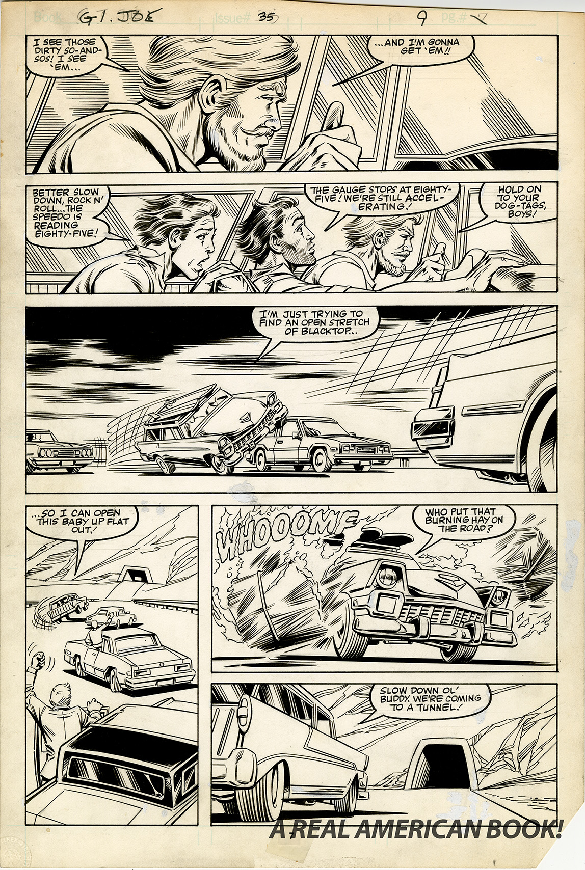
Mark Bright would become series regular artist four years later, and one day, I can properly demonstrate to all you nice readers out there just how much I appreciate Bright’s art. But in the meantime, what do you see in this page?

It’s always a pleasure seeing a new post hit the streets—thanks so much! Except for some of those Zeck covers, I’ve never really appreciated the artwork on Marvel’s GI Joe; in fact, my vague memory is that I generally felt like the art doesn’t hold up. Seeing those Bright panels and the page is forcing me to re-evaluate though. The characters look accurate, I love the “marvel style”, and you’re right about him being great at drawing cars! It makes me wish they’d publish an Artists’ Edition of GI Joe in black and white. Thanks again!
You’re welcome, Dan. One day, either in a podcast, or maybe here, I’ll blab extemporaneously for an hour or a few thousand words about each of the artists who contributed to Marvel’s G.I. Joe. As for a black and white book scanned and printed in color, in 2016 IDW did solicit an 11×17 hardcover of just what you’re referring to. It was to reprint six full issues plus a bunch of covers — I provided a few scans. Unfortunately the project didn’t happen, but not for the usual reasons. But back in 2013 IDW did publish a portfolio of Yearbook issue #2, each of the 22 pages printed as a separate plate, Michael Golden firing on all cylinders. Quite extraordinary.
Is the reason behind the Artists’ Edition’s cancellation a secret or can you spill the beans? I was quite looking forward to that book.
I heard that a collector who owned some of the art passed away, so the project lost momentum. I hope one day it can be reconstructed.
I’ve loved reading each blog update. Do you have a rough estimate of when you think the book will be published?
Thanks, John. As for your question, sorry, I don’t. This year things slowed down, but January should be productive.
I know Doc Bright was there from the start, but his turn-of-the-90s art was so hurried and mangled that I started to fear when he was on a book. His Joe issues, and the Iron Man work he did, they made me question his basic anatomy and storytelling choices. I ranked him and Bagley near to each other, which isn’t fair considering the level they engaged the craft in.
Huh. I fully disagree. I think Bright’s Iron Man and Joe work are the tops. Quantum and Woody, that Transformers issue, that Untold Tales of the New Universe, it’s all great. And different inkers brought out subtle differences in the ’80s, ’90s, and 2000s. Me and my short box of Bright fill-in issues, annuals, and specials are here to say you’re wrong, Bill. But we can stay friends.