“The Rotten Egg” storyboards batch 6

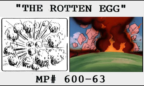
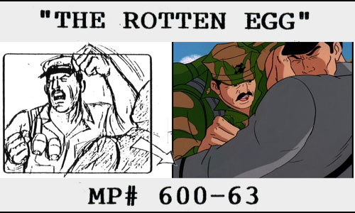
Sorry for the delay!  Back to blogging!  Thanks to all the visitors who clicked here while I wasn’t posting.G.I. Joe season 2 storyboard to animation still comparison "The Rotten Egg"

Pages [1-5] [6-7C] [7D-10] [11-15] [16-19] [20-24] [24A-28]

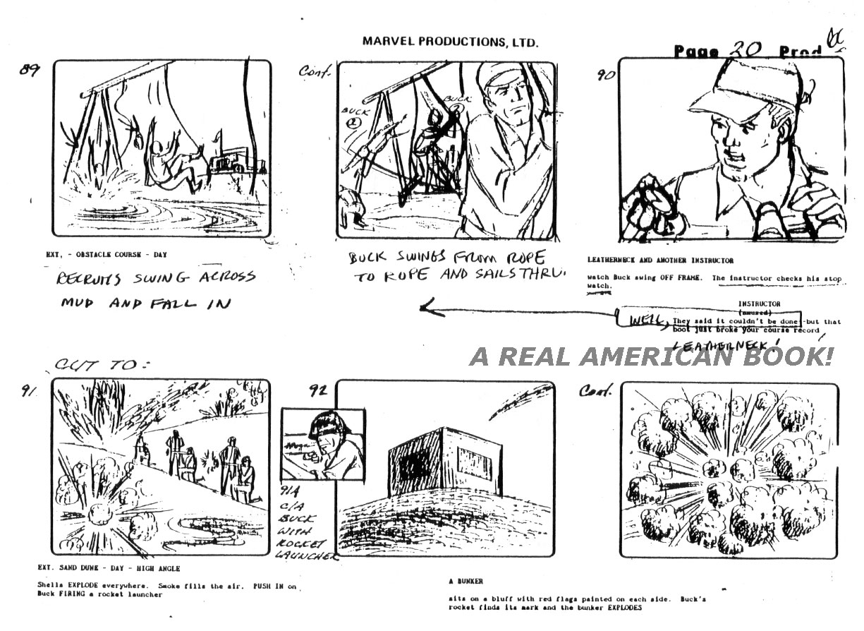
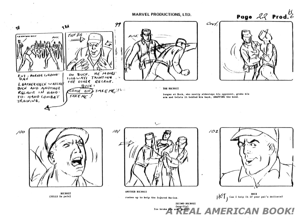
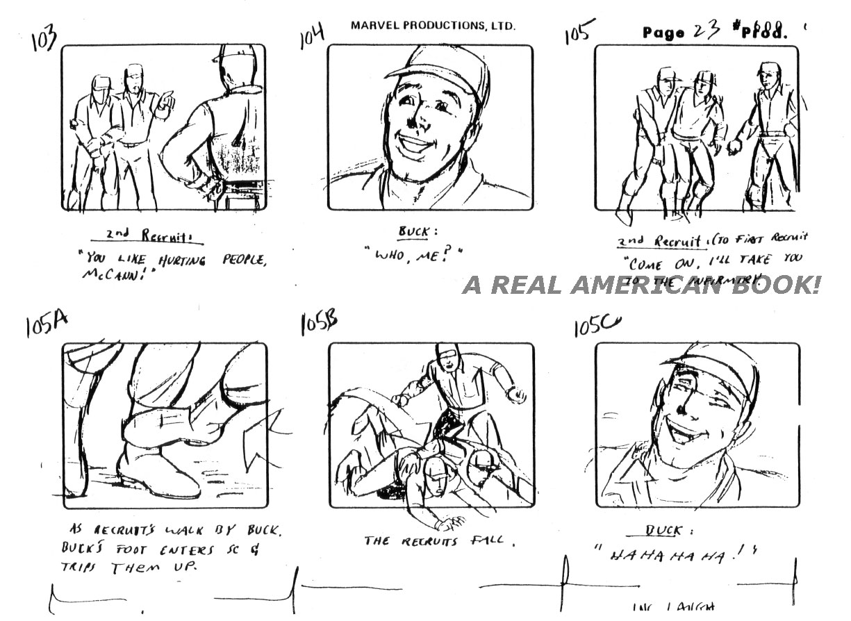
More storyboards from writers Steve Mitchell and Barbara Petty’s “The Rotten Egg,” this time pages 20, 21, 22, 23, and 24.  Sorry, I don’t know who boarded these, but when I do I’ll update this sentence.

G.I. Joe "The Rotten Egg" Season 2 storyboard page 020

G.I. Joe "The Rotten Egg" Season 2 storyboard page 021

G.I. Joe "The Rotten Egg" Season 2 storyboard page 022

G.I. Joe "The Rotten Egg" Season 2 storyboard page 023

G.I. Joe "The Rotten Egg" Season 2 storyboard page 024Things will get a little more interesting with batch 7 when the final animation deviates a little from the storyboard.

Pages [1-5] [6-7C] [7D-10] [11-15] [16-19] [20-24] [24A-28]

1 Comment

Filed under Animation, G.I. Joe Behind the Scenes

Cobra Night Raven designs by Steve Reiss

Cobra Night Raven by Steve Reiss tease image for Tim Finn's G.I. Joe blog

Steve Reiss attended CCS, the College for Creative Studies, before it had that name, back when it was called Society of Arts & Crafts in Detroit.  It had long been a school with a reputation for vehicle design.  After Reiss joined Hasbro in 1985 he was soon designing G.I. Joe vehicles, like the stunning 1986 Cobra Night Raven, based on Lockheed’s also-stunning SR-71 “Blackbird.”  For your reference, here’s the real thing:

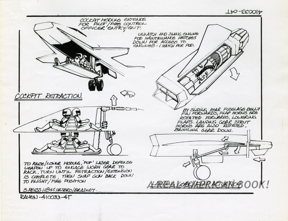
SR-71 NASA photo by Judson Brohmer as comparison to Steve Reiss G.I. Joe Cobra Night Raven toy for Hasbro    And here are Steve Reiss’ six pages of designs, the basis for a rough, three-dimensional model.

Cobra Night Raven design pg 1 by Steve Reiss for G.I. Joe 1986 toy line

Cobra Night Raven design pg 2 by Steve Reiss for G.I. Joe 1986 toy line

Cobra Night Raven design pg 3 by Steve Reiss for G.I. Joe 1986 toy line

Cobra Night Raven design pg 4 by Steve Reiss for G.I. Joe 1986 toy line

For play value, Reiss added a one-person drone that latched onto the top of the larger jet:

Cobra Night Raven design pg 5 by Steve Reiss for G.I. Joe 1986 toy line

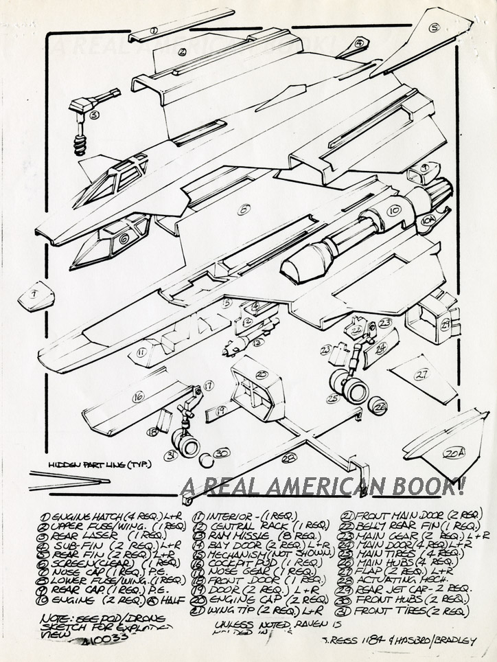
And here’s the parts breakdown.

Cobra Night Raven design pg 6 by Steve Reiss for G.I. Joe 1986 toy line

The final toy is black with opaque red accents, and the clear red cockpit windows are a lovely, extra detail.  The Night Raven is also quite long, and I recall always needing two hands to support it.  It’s one of the most attractive products in the entire Real American Hero product line — elegant, sleek, and aggressive.

11 Comments

Filed under G.I. Joe Behind the Scenes, Toys and Toy Art

“The Rotten Egg” storyboards batch 5

G.I. Joe season 2 storyboard to animation still comparison "The Rotten Egg"

Pages [1-5] [6-7C] [7D-10] [11-15] [16-19] [20-24] [24A-28]

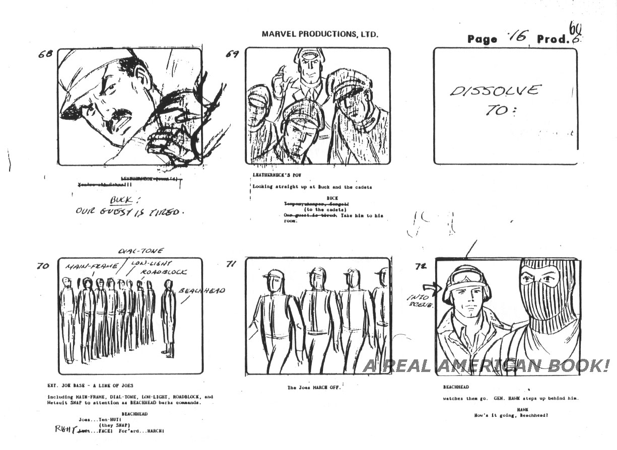
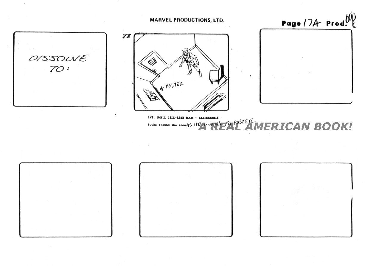
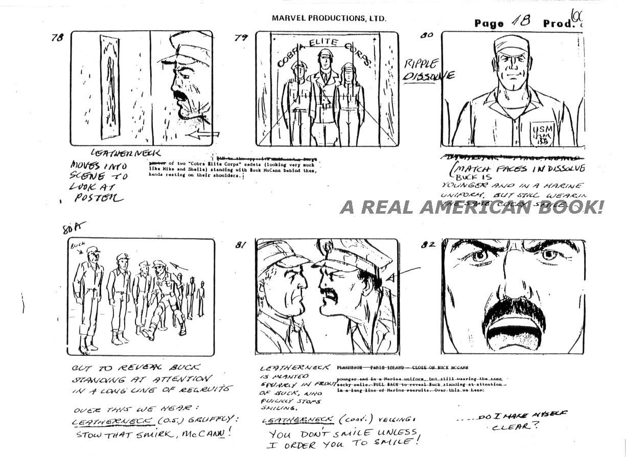
More storyboards.  This time it’s pages 16, 16A, 17, 18, and 19.

G.I. Joe "The Rotten Egg" Season 2 storyboard page 016

G.I. Joe "The Rotten Egg" Season 2 storyboard page 017

G.I. Joe "The Rotten Egg" Season 2 storyboard page 017A

G.I. Joe "The Rotten Egg" Season 2 storyboard page 018

G.I. Joe "The Rotten Egg" Season 2 storyboard page 019

Pages [1-5] [6-7C] [7D-10] [11-15] [16-19] [20-24] [24A-28]

Leave a comment

Filed under Animation, G.I. Joe Behind the Scenes

I Was a Teenage Sunbow Intern – Part 8

1980s Sunbow Productions logo as title card for Tim Finn's blog post

In our last episode ([Part 1] [2] [3] [4] [5] [6] [7]), Tim began his internship exploring production materials for The Brothers Flub.

In the first week, there were two art-related tasks given to the interns.  The first was for MIP or MIPCOM, annual markets where networks, producers, and studios meet to buy, hype, and sell programming for television.  Much as ToysRUS’s year revolves around Christmas, Sunbow’s year revolved around these.  I don’t know who attended, but presumably our top Sales, Production, and Development people from the New York office.  I think they were in different cities each year, and the two different conferences were six months apart.  And one was exclusively for kids shows?  Notably, these weren’t just about American studios and English-language programming.  These were global, where a small network in Chile might plan its broadcast year, or a French studio might sell its first package of 52 half-hours and finally get on the map.  Both names you have heard of and lots you haven’t are in attendance.

My boss Randy explained what needed doing.  Some large color artwork for Brothers Flub was to be mount spray mounted on foam core.  Presumably at a Sunbow table at one of the conventions there would be an easel to display it.  Thinking back, studios probably brought (or rented?) TV/VCRs, and certainly brought VHS tapes, but I doubt they had portable video projectors.  So besides small printed ad slicks and press kits, an old-fashioned sign might be the best way to attract eyeballs.  Two other interns handled this, and I think they did the work in the back stairwell that no one ever used, probably not known for its proper ventilation.

I don’t recall what the other task was for, but it may have been a network or the Los Angeles office.  But I got to do it, and I was thrilled to be working with Sunbow assets, even if Randy said something like “It’s not a big deal/it doesn’t have to be perfect,” meaning the stakes were not high and no one was actually relying on my ability to color match.  It had something to do with communicating what colors the main characters in Brothers Flub were, and the client/end user/mystery person was then going to… print out their own version?  Better know what the paint colors would look like as a broadcast signal?  I don’t remember.  But for some reason, it wasn’t being done with actual paint or the code numbers for animation cel vinyl paint.  I had some oversized Brothers Flub printout, and was matching the colors as best I could to Pantone colors.  But instead of comparing to a Pantone chart and writing down the color codes, I had a Pantone swatch keychain with plastic chips for each color, and Randy had encouraged me to cut a small piece from each and glue it into the poster next to its analog.  I think the New York office lacked some prop for doing this the correct way.  I didn’t understand why it was okay to ruin this presumably expensive item, but Randy was unphased.

And so I did, a little distressed that I was chopping up a fancy Pantone tool because we were missing some other tool, and disappointed that this job was not important.  On the other hand, I was happy to be doing something rather that sitting in the intern room, and I could somewhat put to use the small bit of color theory I had taken two years prior.  I mean, not just anyone could match color swatches, right?

There were two other main tasks for production interns, one which led me to treasure I had seen on my tour, and the other that led to buried treasure the likes of which I could not imagine.

What were they?  Tune in next time to find out!  [Next Part]

[Part 1] [2] [3] [4] [5] [6] [7] [8] [9] [10]

Leave a comment

Filed under Prehistory

Larry Hama’s Fury Force Helicopter

Close up of Larry Hama handwriting from Fury Force helicopter pencil sketch

Told at many conventions and in many interviews is the prehistory of G.I. Joe, how Larry Hama pitched a military comic to Marvel called “Fury Force.” He sketched out six heroes — covert military types — along with a motorcycle, a van, and a secret base underground base. And later grafted it onto Ron Rudat’s G.I. Joe action figure designs, and made it the through line for the monthly G.I. Joe comic book.

Fury Force had a helicopter, too.

Fury Force helicopter sketch by Larry Hama

1 Comment

Filed under Comic Books, G.I. Joe Behind the Scenes

Unproduced: Towed Artillery Missile System

Unproduced G.I. Joe vehicle concept, TAMS, 1984

Sorry for the delay in posting.  School starts and trips accrue in September.  To get back into it and take a break from “The Rotten Egg” and my exciting internship today we’ve got Rich Rossi’s color rendering of a vehicle concept, the Towed Artillery Missile System, which I’ll call the TAMS for short.  In all honesty I don’t know anything about it, so we’ll play the reasonable assumption game.

Concept art for Unproduced G.I. Joe vehicle, TAMS, 1984

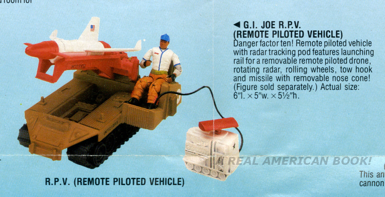
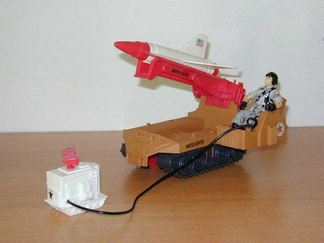
Drawn in ’84, it would have been pitched for ’86 or ’87.  But often concepts would get shot down, only to resurface later, or inspire a later idea.  In 1988 a different vehicle showed up, the similarly monikered RPV, or Remote Pilot Vehicle — boy did the names not flow for these two.

G.I. Joe RPV vehicle 1988 catalog scan

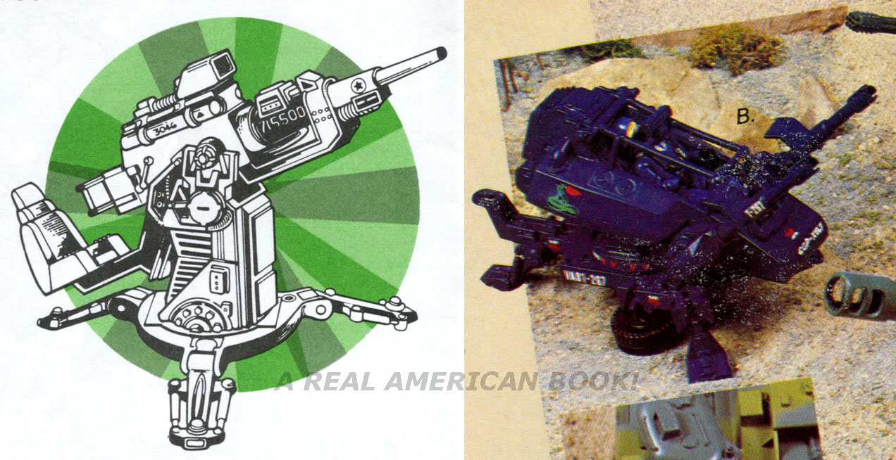
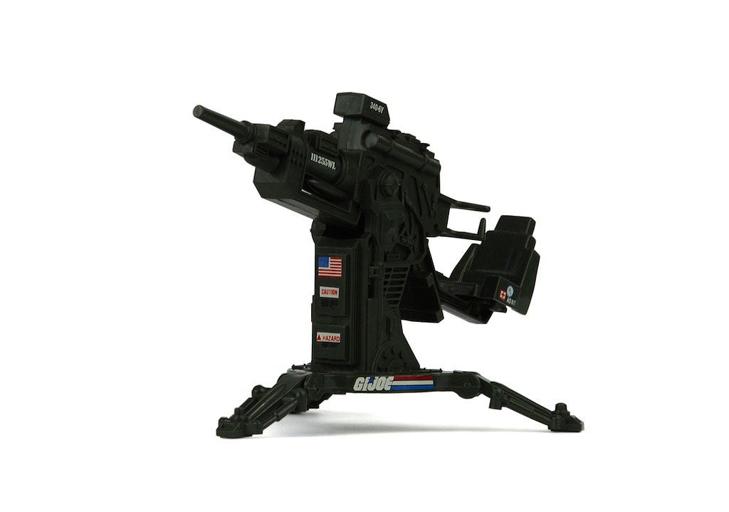
I don’t wish to draw a straight line between them, that one inspired the other, but it’s safe to say they both filled a specific price point, play pattern, and concept.  But notably the TAMS seats no driver and carries no figure, even by precarious foot peg.  And to further differentiate it from the RPV, by ’88 scale, detailing, and concepts were getting exaggerated and moving away from strict military realism.  The structure of the TAMS more resembles the detailing on earlier vehicles like the FLAK and the ASP, shown here.

G.I. Joe catalog scan details FLAK and ASP

There’s a stronger sense of parts and bolts and hardware, whereas the late ’80s styling smoothed out edges and surfaces.  Since these catalog scans aren’t too enlightening, here are links to much nicer photos of each, from the fine folks at yojoe: the FLAK, the ASP, and the RPV.

One thing’s for sure — Real American Hero had no shortage of small artillery accessories.  These were great for populating a small-scale battlefield with variety, even if they weren’t as much fun as “regular” vehicles like Jeeps and tanks, or as story-driving as a headquarters playset.

6 Comments

Filed under G.I. Joe Behind the Scenes, Toys and Toy Art

“The Rotten Egg” storyboards batch 4

G.I. Joe season 2 storyboard to animation still comparison "The Rotten Egg"


Pages [1-5] [6-7C] [7D-10] [11-15] [16-19]

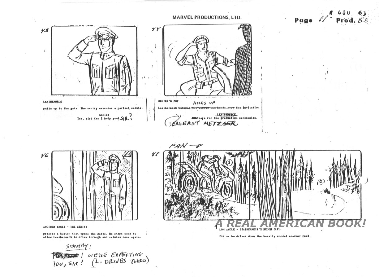
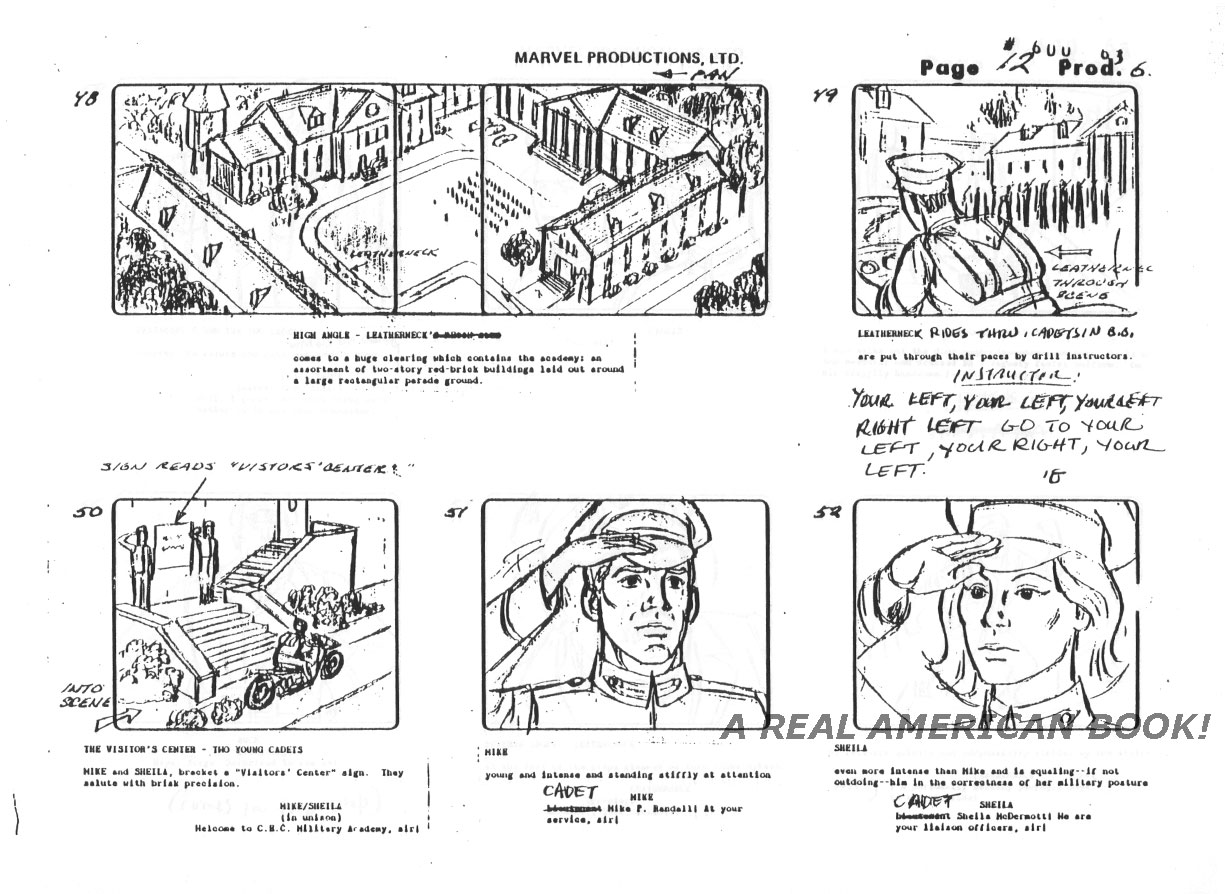
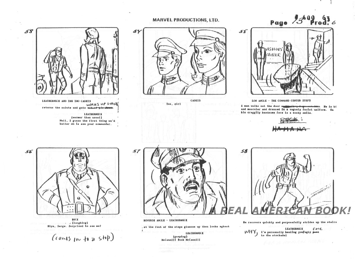
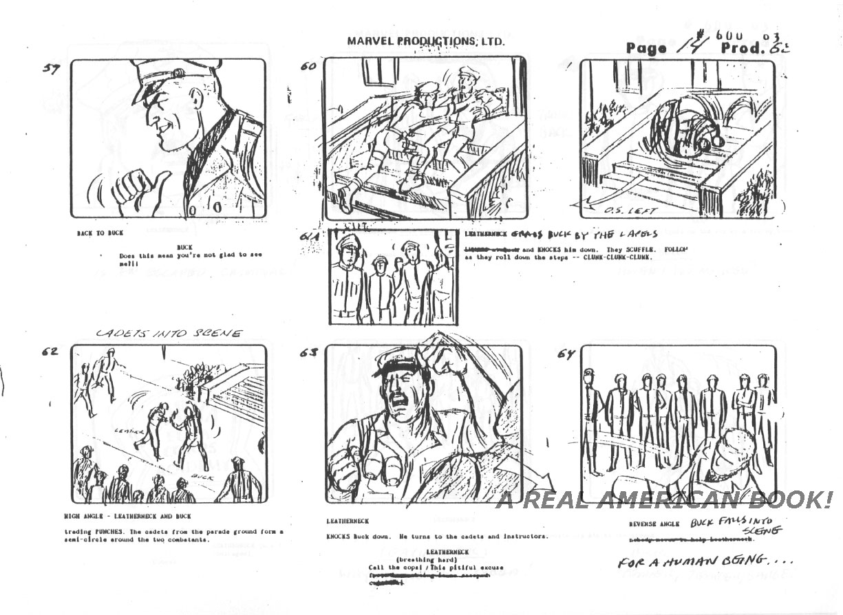
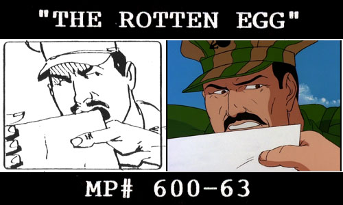
Something that simultaneously delighted and bothered me as a kid watching G.I. Joe was how obvious certain traps were that the Joes walked headlong into.  Whereas in Larry Hama’s comic-verse, a Cobra military academy in the next state over would have felt right at home with Broca (note the anagram!) Beach and the Cobra Consulate Building.  But here CEC was trying to have it both ways — secret and yet in plain sight.  So it bothered me then, though amuses me now, that Leatherneck tools over on the Silver Mirage, outnumbered a thousand to one, and is actually surprised when what are clearly bad guy cadets turn out to be bad guys.  But Barbara Petty and Steve Mitchell crafted a strong script with great characterization, that delivers something new for the series — a rivalry begun in the past — and manages to be filled with tension and action — mostly sans weapons, while eschewing the “regular” Cobra Command.  No small feat.  Clunky animation, yes?  (See still above, YIKES)  But great boards, of which here are five more pages:

G.I. Joe "The Rotten Egg" Season 2 storyboard page 011

G.I. Joe "The Rotten Egg" Season 2 storyboard page 012

G.I. Joe "The Rotten Egg" Season 2 storyboard page 013

G.I. Joe "The Rotten Egg" Season 2 storyboard page 014

G.I. Joe "The Rotten Egg" Season 2 storyboard page 015

Pages [1-5] [6-7C] [7D-10] [11-15] [16-19]

Leave a comment

Filed under Animation, G.I. Joe Behind the Scenes

“The Rotten Egg” storyboards batch 3

G.I. Joe The Rotten Egg storyboards TEASE

Pages [1-5] [6-7C] [7D-10] [11-15] [16-19]

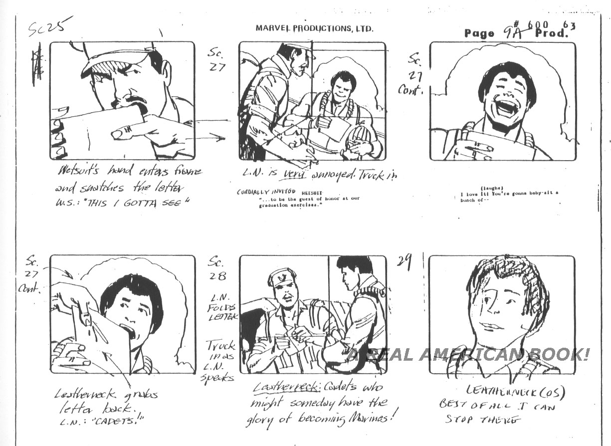
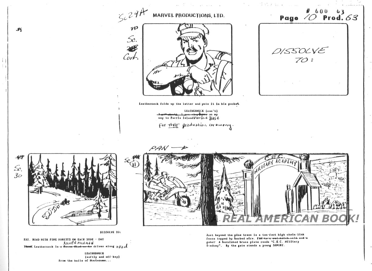
Back to the storyboards for the Season 2 episode, “The Rotten Egg.”  These pages below are drawn by two or three artists, unusual for a Joe board as one artist tended to handle each act.  There may have been deadline trouble, or a change from the director (or Hasbro) necessitated altering shots, and perhaps whoever originated these had already moved on to the next episode.  What is certain is that Mike Vosburg drew some of what’s below — everything but the Wet-Suit close-up on the first page, the top tier of the second page, all of the third page, the first two panels of the fourth page, and probably none of the final page.  Vosburg’s figure work (see big panel above) is angular, and he spots blacks — no sketchy pencil lines, no rounded or bulbous anatomy.  Vosburg is a tremendously talented artist, a post for another day, but for fun trivia I’ll point out he was the only artist who both drew the monthly Marvel comic and also storyboarded for the daily cartoon.  Coincidentally, to boot.  Pages 7D, 8, 9, 9A, and 10:

G.I. Joe "The Rotten Egg" Season 2 storyboard page 007D

G.I. Joe "The Rotten Egg" Season 2 storyboard page 008

G.I. Joe "The Rotten Egg" Season 2 storyboard page 009

G.I. Joe "The Rotten Egg" Season 2 storyboard page 009A

G.I. Joe "The Rotten Egg" Season 2 storyboard page 010

Next five pages!

Pages [1-5] [6-7C] [7D-10] [11-15] [16-19]

2 Comments

Filed under Animation, G.I. Joe Behind the Scenes

I Was a Teenage Sunbow Intern – Part 7

Title card for Tim Finn blog post about Sunbow Entertainment animation internship

In our last episode ([Part 1] [2] [3] [4] [5] [6]), Tim got the lay of the land of the Sunbow office in New York City.

I remember very little of my first day.  On my dad’s advice, Nick and I had taken the subway from our apartment on Roosevelt Island into Union Square the day prior.  A practice run.  I was nervous about being late, nervous about getting lost on the subway, and nervous about sweating too much.  New York was hot that summer.  So were the subway platforms.  The office was suitably air-conditioned, though.

I didn’t wear a tie, and probably did not wear a button-up.  Everyone dressed casually – no jackets, no ties – but nicely.  A few people wore blue jeans.  My t-shirt was probably a solid color, and I was two years into growing my Jesus hair, which is to say that that June I looked like “Vs.”-era Eddie Vedder.  With a beard, but no moustache, my preference for three years of college.

In addition to meeting everyone who was paid to be at Sunbow, I also met those who weren’t – the other interns.  Whom I hated.  But not for any good reason.  That was just an unfortunate chip on my shoulder.  I was a RISD Animation student.  I went to a fancy art school, I was a decent animator, I was working four days a week, and I knew much about Sunbow’s past product – I was a fan.  I was going to be the best intern of all that summer, and the best intern Sunbow had ever had.  The other interns, three gals and a guy, were… just… somebodies.  They were probably Communications majors, or Business students, or they knew someone who knew someone who had casually said “Oh, you should work at that company where so-and-so works.”  They weren’t art students (actually, one was), and they weren’t fans.  They couldn’t care as much as me.  So I didn’t get too close, didn’t make conversation, and didn’t make friends.

I was jealous that they were there, that they might perform a task better, or that they would be asked to do something first.  Fortunately, there was very little for us to do.  Sunbow had, in fact, too many interns that summer.  One or two days a week I was the only one there, so I would always at least look busy, but sometimes an intern or two would hang out in the intern room waiting for something to do.  I did that a little on my first day.

Then producers Randy and Tammy gave me the bible for The Brothers Flub, a tape of an episode, a script, and a suggestion to familiarize myself with the property.  I was thrilled.  This was an easy task, a nice way of easing into my two months as a Production Intern, and a peek behind the curtain that was both fun and informative.  Even though I knew how animation was made, there were still loads of details to absorb from an actual show on actual television in an actual studio.  The sample dialogue on each character’s bible page, the episode summaries – paragraphs outlining potential half-hours should a network approve the bible, model designs for one-off props that would only appear in a single episode, or a background packet of interiors for the main locations.

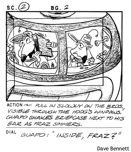
Brothers Flub was a lot like Futurama, although it predates the latter by two years.  Since it was airing on Nickelodeon, and I had no affinity for that network and wasn’t 8-years old, Brothers Flub wasn’t my speed.  But it was cute, harmless, mildly distracting, and crafted by talented hands.  In the show, two cartoonish couriers (Fraz and Guapo) deliver packages to differently themed planets, getting into trouble and learning lessons.  One is organized and worries, while the other is a messy buffoon.  Characters and attitudes are cartoony and silly as if made by Klasky Csupo.

Dave Bennett storyboard panel from The Brothers Flub "On My Case," Tim Finn's G.I. Joe blog

In watching a tape, I was hoping to hear G.I. Joe alumni – voice talent like Bill Ratner, Michael Bell, and Mary McDonald-Lewis.  No such luck, although Charlotte Rae (The Facts of Life) was Fraz and Guapo’s boss, a fun surprise.  I didn’t watch any whole episodes after that, and only saw bits throughout the summer, but Michael Bell does contribute to at least episode 5A, “Flub, Flub, & Away,” as Very Evil Man on a super-hero themed planet, his raspy delivery unmistakable.

If Production Intern Tim didn’t draw anything, what did he do?  Tune in next time to find out!
Leave a comment

Filed under Prehistory

Sgt. Savage by Joe Kubert

Sgt Savage G.I. Joe detail by Joe Kubert

As the Real American Hero line was winding down, Boys Toys in Pawtucket had in mind something new for late 1994.  It would be bigger than 3 3/4 inches, and it would look back to World War II rather than the slightly futuristic angle G.I. Joe had carried for twelve years.  Sgt. Savage and his Screaming Eagles were greatly inspired by Nick Fury and his Howling Commandos (Marvel Comics), and Sgt. Rock and the Combat-Happy Joes of Easy Company (DC Comics), so much so in fact that Boys Toys VP hired Sgt. Rock artist Joe Kubert to draw the initial designs, package artwork, and insert comic.

Sgt Savage G.I. Joe by Joe Kubert

Joe Kubert passed away last weekend at the age of 85.  Amazingly, he was still writing and drawing comics, and his work only got better with age.  While the Watchmen prequels aren’t my cup of tea, I very much enjoyed the last major Rock story by Kubert, and both as a reader and retailer look forward to his upcoming Joe Kubert Presents 6-issue anthology for DC.

Leave a comment

Filed under G.I. Joe Behind the Scenes, Toys and Toy Art